This is it. This is how it ends.
A whole week of dashboard creation from start to finish. A whole week of daily challenges that gave us a variety of things to figure out and learn. A whole week of practicing our presentation skills and continuing to learn how to talk about each aspect of the dashboard creation process.
I wouldn’t say this has been my favourite week of training, but it has definitely been an interesting challenge. Some moments were disappointing, in some moments I felt accomplished, but most of all I appreciated the practice.
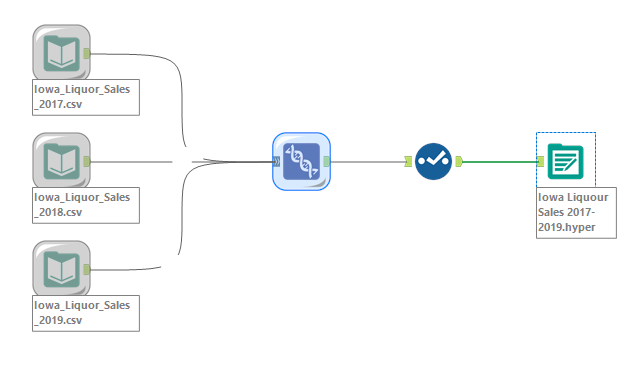
Today’s data set is about Iowa liquor sales from 2017 to 2019. This dataset contains the spirits purchase information of Iowa Class “E” liquor licensees by product and date of purchase. An invoice number can have more than one type of alcohol as part of the purchase. We also received a data set about the population of Iowa split into the different counties, but I chose not to work with that data.
On the Iowa open data website, they have data from 2012 to current, however, we were only interested in 2017 to 2019. Instead of downloading over 200 million rows of data, you can use the website’s query tool to filter the date so that it only includes the years we’re interested in. I had some trouble downloading all the years in one csv, so I downloaded the years separately. This meant I needed to go into Alteryx to union these three files and change them into a hyper file extract so that it would be more performant in Tableau. I also used Alteryx to change the data type of some of the columns.
As usual, the next step was to brainstorm some ideas of what questions I might want to answer using this data set. My thoughts immediately went to seasonality – would there be trends to show that more alcohol is being bought around holidays or festive seasons and how would I represent this in a chart. Since I didn’t have the chance to create an advanced chart I haven’t tried before, I thought about finding an interesting chart type to display this information.
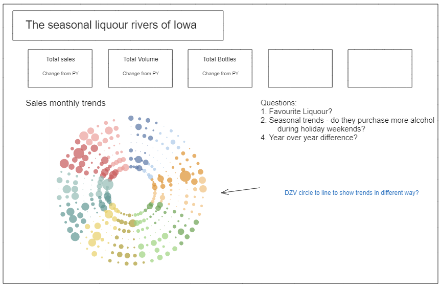
Some other things I wanted to look into was the total sales or volume or bottles sold versus previous years. If time allowed it, I could also look at the comparison between the same month of different years.
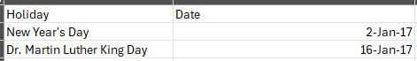
Since I was interested in seasonal trends, it made sense to see what the trends were like for months that have federal holidays. I had to create a small csv file with the holiday information for the three years in the data set so that I had the exact dates.
It took me quite some time to figure out the circle calendar chart to show the daily sales by year. I really wanted to have it coloured by whether or not the month had a holiday, but I couldn’t quite figure it out. I think writing a blog about how to create the circle calendar chart and how to colour it would be a great idea! The reason for colouring it with less colours is to show the distinct difference between the months without overwhelming the user with a variety of colours.
The finished product is a quick glance into the trends of a selected metric on a daily or monthly level with some KPIs showing the year-on-year difference. See the dashboard here: