Dashboard Week Day 3:
Another day, another dashboard! Today we're looking at yellow taxi ride trip information from the New York City Taxi & Limousine Commission (or TLC for short). This agency is for licensing and regulating the yellow taxi cabs, as well as other vehicle types. For more information, you can visit this link:
https://www.nyc.gov/site/tlc/about/about-tlc.page
To give you some background on the data: for today we were tasked to download the parquet files for the ‘Yellow Taxi Trip Records’ for each month of 2023. The files consist of 19 fields with various information about each ride – from pickup to drop off time, location, fare amount, payment information, and so on.
The first challenge was to find a way to read and parse parquet files. Since I haven’t worked with parquet files before, it sent me on an adventure into the world of Google for exploration and discovery. What is a parquet file you might ask? To put it simply, a parquet file is a column-oriented format represented in binary form, whereas something like a csv file is a row-based data format represented in text form. Parquet files are designed for efficient data storage and retrieval – since you can call each column independently – and it is often preferred over csv when the datasets are extremely large.
Read more about it here: https://datos.gob.es/en/blog/why-should-you-use-parquet-files-if-you-process-lot-data
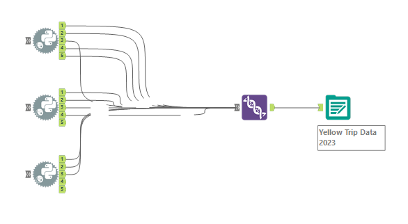
To open a parquet file in Alteryx, you need to use the Python tool to write a simple Python code that converts your file to csv format. This was a very slow and tedious process since the Python tool takes a quite a bit of computing power to run. I would have liked to have more time to play around with finding ways to optimize the flow instead of just copying the same code over and over. Maybe that’s a future personal project and possibly another blog idea!
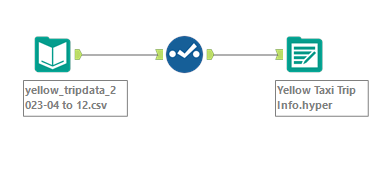
For today, however, I wrote a line of code in the Python tool that would read the parquet file, convert it to csv and then output it to one of the anchors. Since the tool has five output anchors, you only needed three tools to get all twelve files converted. After adding the Union tool to bring it all together, the data was then run through the Output tool to get one csv. I then created a separate flow to input the csv into Alteryx, change the data types to represent the correct types and then output it as a hyper file for Tableau.


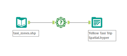
The TLC website also includes shape files for the different zone locations. That can be plugged into Tableau directly, however in order to make routes on the map, I needed latitude & longitude information for each zone. To get that information, I was able to pull the spatial file into Alteryx, run it through the Spatial Info tool and get the centroid for the polygons as x and y coordinates. This was output to my local drive as a Tableau hyper file.

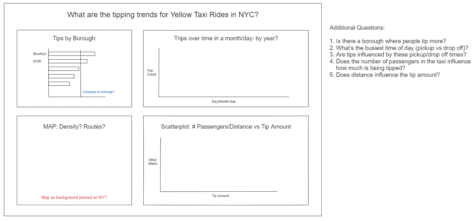
While Alteryx was taking it’s time to process the Python tool code, I spent some time in Excalidraw brainstorming what I wanted my dashboard to be about. One of the columns in the data set is called Tip Amount and that immediately drew my attention – we all know tipping culture is a sensitive topic. I wanted to see if there were any trends in the tipping amount, based on other metrics in the data set.
Some of the questions I was looking to answer:
1. Is there a borough where people tip more?
2. What's the busiest time of day (pickup vs drop off)?
3. Are tips influenced by these pickup/drop off times?
4. Does the number of passengers in the taxi influence how much is being tipped?
5. Does distance influence the tip amount?

After all this work and waiting, it was finally time to step into Tableau and see if I could find answers to the questions above and make them come to life… Or so I thought.
Unfortunately, the join in my Alteryx flow was not set up right and the Alteryx flow ran for hours on end not giving me the output I need. I also ended up with other years in my data set and I’m not sure how that happened. Eventually I was able to create a dashboard with all the charts that I initially planned, but my dashboard definitely needs more formatting and revision!
For now, though, this is what I have: https://public.tableau.com/app/profile/lorrainef/viz/YellowTaxiTrips_17115679106590/Dashboard1?publish=yes
Sometime in the future I hope to fix this and make my original vision come true.
