The morning has dawned with grey skies in anticipation of the fourth day of dashboard week where we’ll be looking into squirrel data. Specifically the Eastern grey squirrel (Sciurus carolinensis) in New York City.
Before delving into what I wanted to create today, I downloaded the data sources form the squirrel census website (https://www.thesquirrelcensus.com/data) to look at what information they’ve given. The squirrel data includes the location of a specific squirrel sighting, the colour of their fur, what they were doing, etc. The park data includes information about what time of day a sighting happened, the number of squirrels sighted, their location, if other animals were present, etc.
Two suggestions for today’s challenge were supplementing the data set with additional information and creating charts we haven’t tried before.
I must have been hungry during the data exploration stage because my mind immediately went to what kind of food do squirrels enjoy and would I be able to find data about the type of food in these parks to see if there is a correlation. Instead of looking for specific data on food in parks, I figured it would be easier to look at the types of trees in the area and if there is a certain type of tree where more squirrels were sighted.
I found the NYC tree census data here: https://data.cityofnewyork.us/Environment/2015-Street-Tree-Census-Tree-Data/uvpi-gqnh/about_data.
Every ten years, a group of trained tree identifiers go about NYC to identify and count the types of trees we have. They record this information for the health and wellbeing of the tree population, and include things like the exact location, the status (is it alive or a stump or dead), and other important tree information.
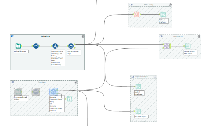
Before I could use this information in Tableau I needed to play around in Alteryx. I did some data preparation to ensure I created Tableau hyper files that only included information that would help me answer my questions. I did not need any transformation tools, just the select tool to get the latitude and longitude into the right data type, remove unnecessary columns, and filter out boroughs in the tree data I was not interested in (since the squirrel data only included Brooklyn & Manhattan).
Moving into Excalidraw, I wanted to brainstorm some ideas around how I would present the information to ask my main question. Since we were challenged to try some chart types we haven’t done before, I wanted to look into radial and coxcomb charts to see if I could use that to represent some information.
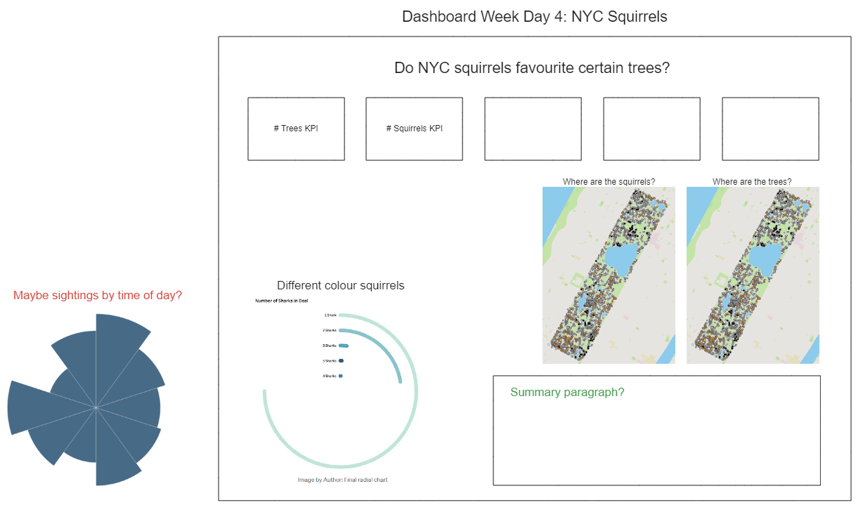
My dashboard ended up just having some key performance statistics about the squirrels and trees. Instead of having one map where the trees were plotted with the squirrels in each park, I ended up having to do two separate maps with some metrics and a tree chart showing what kind of trees were in each park.
Looking back now, I realize my crux was not finalizing my thoughts in Excalidraw before I delved into the tree data. I also took way longer than expected to figure out how to map the different coordinates together and how to connect the data sets through a mutual column.
This dashboard and analysis definitely need some more attention and ideas. For one, I could look at the specific nuts that squirrels eat and only include those trees. I also want to play around with the spatial data and create polygons for each park so that only the trees within the park are included and not all the trees within a zip code.