Day 2 of dashboard week is upon us and today we were tasked to explore the UNICEF website and find a data source to create an informative dashboard that will raise awareness about the issue. UNICEF is the United Nations International Children's Emergency Fund and they are responsible for providing humanitarian and developmental aid to children worldwide.
After looking through some topics on the UNICEF website, I decided to work with data on Water, Sanitation & Hygiene (or WASH for short). We all know how important it is for us to live, work, and receive education in healthy environments. The WASH data includes information about the level of these three different services in countries around the globe from 2000 – 2021.
Each type of service has different levels. This data set focused on the three main levels: Basic, limited, and none.
Water services:
1. Basic: Drinking water from improved sources, collection time less than 30 minutes
2. Limited: Drinking water from improved sources, collection time more than 30 minutes
3. None: No drinking water facilities, or unimproved
Sanitation services:
1. Basic: Improved facilities not shared by others
2. Limited: Improved facilities share by others
3. None: No restroom facilities, or unimproved
Hygiene services:
1. Basic: Availability of a handwashing facility with soap and water
2. Limited: Availability of a handwashing facility lacking soap and/or water
3. None: No handwashing facilities, unimproved
After downloading the data and opening it in Excel, I realised that some data cleaning and pivoting was required to get the data in a shape that made send to use in Tableau. Below is a snapshot of what the table originally looked like. You can see that there are multiple headers with important information that needed to be extracted and placed in rows instead of column names.
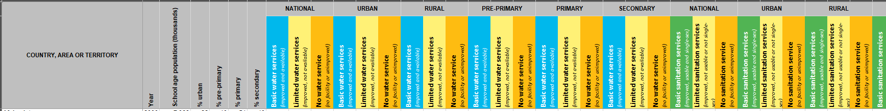
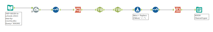
The cleaning steps were done in Alteryx. First, I renamed the columns using the second row of data instead of the first. Then I added the category prefixes to each service section. After pivoting to get the new column names into rows, I split the information so that I could pivot back and only have the three different services as column names. Some of the row entries has ‘<’ symbols which also needed to be removed. Lastly, I changed the data types to what they should be before I exported the data to a hyper file.
Next came the brainstorming. Now that I understood what the data was about, I needed to figure out what I wanted my dashboard to say. Some of the questions that came to mind:
1. Which countries have the most/least number of children?
A simple bar chart that can be filtered by user chosen number and changed to be top or bottom
2. What is the distribution of the levels for the different services in these countries?
Stacked bar chart to show parts of a whole
3. Have these levels changed over time to improve or deteriorate?
Straight line to display difference between selected years
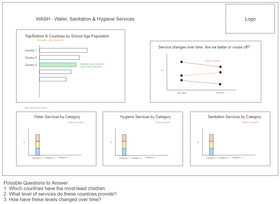
To bring these questions to live in Tableau, I created the charts, changed the colours, created some parameters and calculations to add dynamic functionalities to my dashboard, and I also added some actions like going to a URL for the data source or clicking on a bar to filter the other charts.
Now the user can work through the dashboard to look at the top and bottom 1-20 countries (by number of school age children) to see what percentage of these children have basic, limited, or no services. The line chart shows the difference between two years and whether a country has improved a specific service by increasing the percentage.
If you’d like to see this dashboard in action, click on the link below: