This week, we sourced our data from https://www.nyc.gov/site/tlc/about/tlc-trip-record-data.page. They have tables with information on all taxi rides in NYC going all the way back to 2009! For our project we focused just on yellow cabs in 2023. Still, it was a huge amount of data. There were 12 tables, one for each month of the year.
The tables were Parquet files, a different file type from the usual CSVs and Excel Spreadsheets we usually work with. Parquet files are more performant when handling large amounts of data.
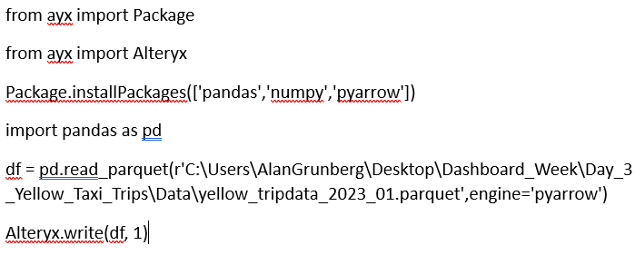
The problem is, they can't be natively imported into Alteryx for data prep. To make this work, I searched online and found a few sources saying you could use the Python tool in Alteryx as a workaround. I also found a custom Alteryx Macro someone designed to do the job.
The macro didn't work right off the bat, but by combining the Python code I found inside the macro with the articles I found online, I was able to figure it out. The main issue I ran into was that Python was trying to import a module before installing it. By changing this to install first, I was finally able to get it to work. Here's what the final code looked like:
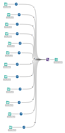
The next issue I ran into was how slowly Alteryx ran the code for each Parquet file. I tried to do all 12 in the same workflow and Alteryx froze. To get around this, I converted them all separately, then imported them as CSVs into Alteryx to union. To speed up the union a bit, I first used the select tool for each one to choose only the columns I needed and to change the file types.
The unioned table ended up having over 38 million rows! I converted it to a .hyper file to make it more performant in Tableau, but it was still extremely slow and made the application freeze. Therefore, I went back to Alteryx and used the random sample tool to select just 10% of the data, or 3.8 million rows. Credit to my colleague Dan for coming up with this idea! It worked and I was finally able to start working in Tableau.
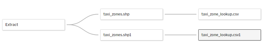
The next step was to join the ride data with the shape file and the lookup table. The shape file contains the spatial data Tableau needs to map the different zones the cabs pick up/drop off passengers from. The lookup table contains the neighborhood names that correspond to each row. I joined the ride data to the shape file and lookup table twice, once for pick up locations and once for drop off locations.
Finally, I was able to start creating my dashboard! Compared to the data prep stage, this part was pretty straight forward. I decided to focus just on rides in Manhattan. I ended up making 4 KPIS, 2 maps, 2 area charts and 1 pie chart. The KPIs show the overall average distance, average fare, average tip, and average tip percentage. The maps show a neighborhood breakdown of Manhattan, one for pick ups and one for drop offs. You can use a parameter to color the neighborhoods by number of rides, average distance, average fare, and average tip. The area charts show the number of rides by month and by day of the weekday. The donut chart shows the payment type breakdown, cash vs. credit card.
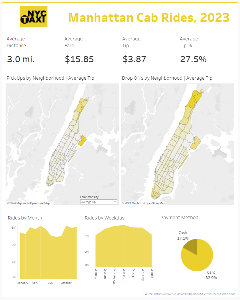
There are quite a few insights to uncover through the dashboard, such as the drop in rides during the summer months and the increase in rides mid-week. Check it out at https://public.tableau.com/app/profile/alan.grunberg/viz/Taxi_Sampled_Workbook/Dashboard1 and see what else you can find!