For Day 2, our assignment was to create an explanatory dashboard with data from UNICEF (United Nations Children Fund). We were instructed to create a dashboard raising awareness and highlighting insights.
First, I went through UNICEF datasets at https://data.unicef.org/, decided to focus on child/adult education rates for countries around the world. I downloaded 3 datasets from UNICEF about literacy, computer skills, and foundational education, plus a dataset on GDP per capita from the World Bank at https://data.worldbank.org/indicator/NY.GDP.PCAP.CD
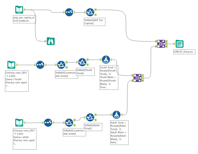
It took quite a while going through the data and cleaning it, so I ended up scoping down to the literacy table and GDP per capita table in the interest of time. I cleaned and joined them into one table in Alteryx as shown below.
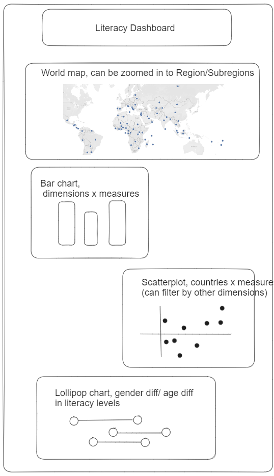
I then drew up a rough outline of my dashboard using Excalidraw. I wanted to highlight the differences in literacy rates between countries, identify higher and lower performing countries when accounting for GDP per capita, and look at differences between genders and ages within countries.
Unfortunately, due to time constraints I had to scope down again, drop GDP per capita and focus only on literacy rates. Luckily, the literacy data included a a field which showed the level of development of each country: more developed, less developed, and least developed. This allowed me to still look at the correlation between countries' wealth and literacy rates.
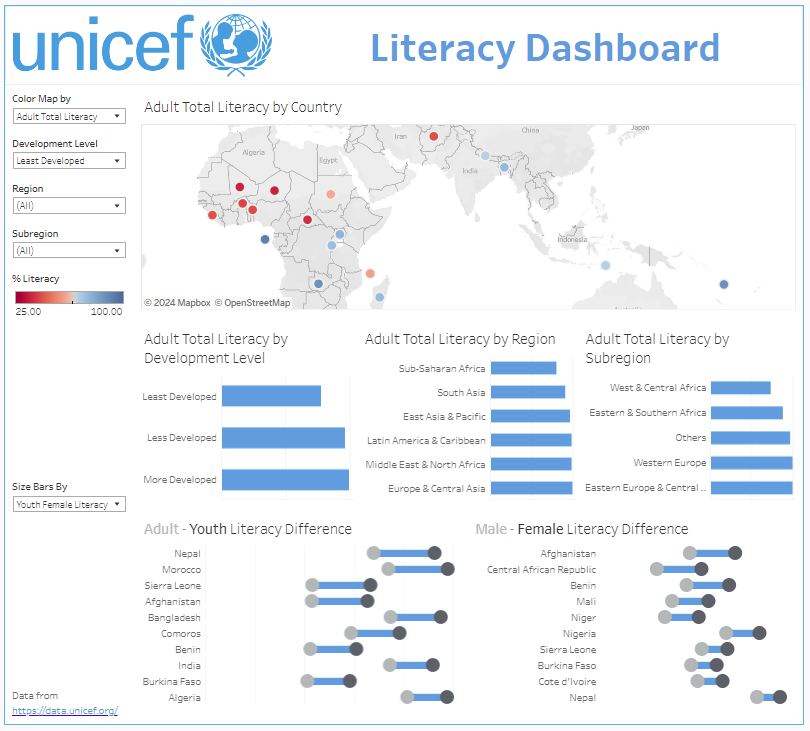
For my final dashboard, I made a map showing literacy rates by country, bar charts showing literacy rates by development level/region/subregion level, and dumbbell charts showing the countries with the greatest differences between adult/youth literacy rates and male/female literacy rates. You can check out the dashboard here: https://public.tableau.com/app/profile/alan.grunberg/viz/UNICEF_Dashboard_17114845853430/Dashboard1
Looking back, my dashboard is a bit too exploratory and not explanatory enough. I give the user lots of opportunities to customize of the view and discover their own insights. But I don't emphasize my own findings enough.
If I were to do it again, I would drop the bar charts and focus more on the map and dumbbell charts, adding text to highlight interesting findings. For instance, I was surprised that in nearly every country the female literacy rate was higher than the male literacy. Furthermore, the biggest gap was in Afghanistan, where around 43% of men are literate vs. around 65% of women. This can almost certainly be explained in part by when the data was collected: 2019, before the Taliban retook control of the country.