Today marks our final week of training, where it’s tradition at the Data School to have “Dashboard Week.” Each day of Dashboard Week, we’re given a random dataset and have to understand and clean the data, make a Tableau dashboard, and write a blog post about the process.
For the first day of Dashboard Week, we were given a dataset from the US Department of Education that includes information about U.S. colleges and universities (https://collegescorecard.ed.gov/data/).The first of two main files included information about the universities, such as tuition costs, debt, location, and demographic information about students, and the other file focused on programs of study, giving more information about academic fields and degrees offered for them at different universities. There were two main challenges with this data:
- The tables contained an absurd amount of columns. Particularly the first table, which contained over 3,000 fields and took a very long time to load in Alteryx. The second table contained only 160 fields, however many of these columns were mostly populated with “PrivacySuppressed” so I opted to use the first table that contained much more information.
- The fields in the data were titled using codes that were essentially strings of numbers and letters and were often hard to interpret. For example, the field representing the mean earnings of students 9 years after university was titled “MN_EARN_WNE_P9.”I used the data dictionary Excel file on the website to interpret the meaning of fields and find ones I was interested in.
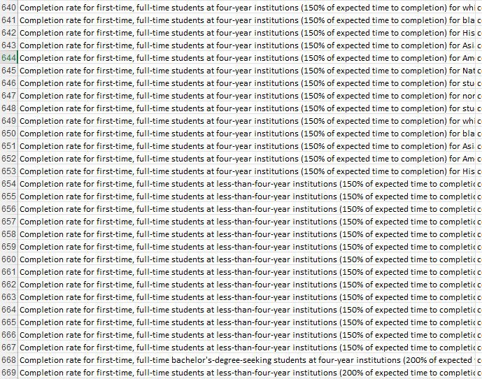
I was originally interested in making a dashboard that would help prospective college students find universities that fit their preferences. For instance, they could input the geographic area(s) they would like to attend university, what major they would like to study, how much they’re willing to spend on tuition, if they’re likely to be accepted based on their test scores, etc. However, when I looked at the data, I realised that many of the metrics I would need were unnecessarily broken up into many different fields. For example, if you wanted to explore the completion / graduation rate of students, you would have to reference all of these fields that are each mostly null and broken down by several other categorical variables:
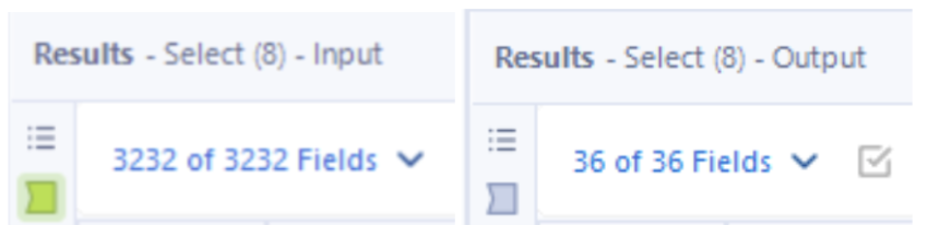
Upon seeing fields about student earnings after graduation, tuition, and other financial metrics, I decided to change my dashboard plan to explore the relationship between college tuition cost and earning potential after graduation. Not a lot of data preparation was required, but the main task was using a Select Tool in Alteryx to remove the vast majority of the fields, going from 3,232 to 36 columns.
When I had the columns I was interested in, I changed the data types (the file was a .csv so all data types were strings and many had to be converted to numeric formats).
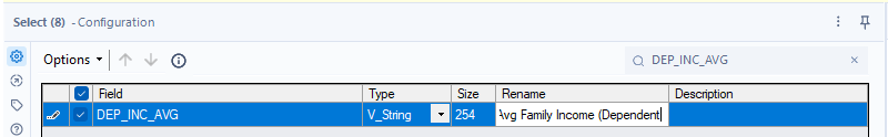
I unticked all of the fields and then used the search bar in the Select tool to find the fields I wanted - this method was very helpful for navigating all of the fields.
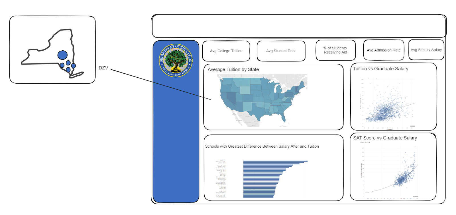
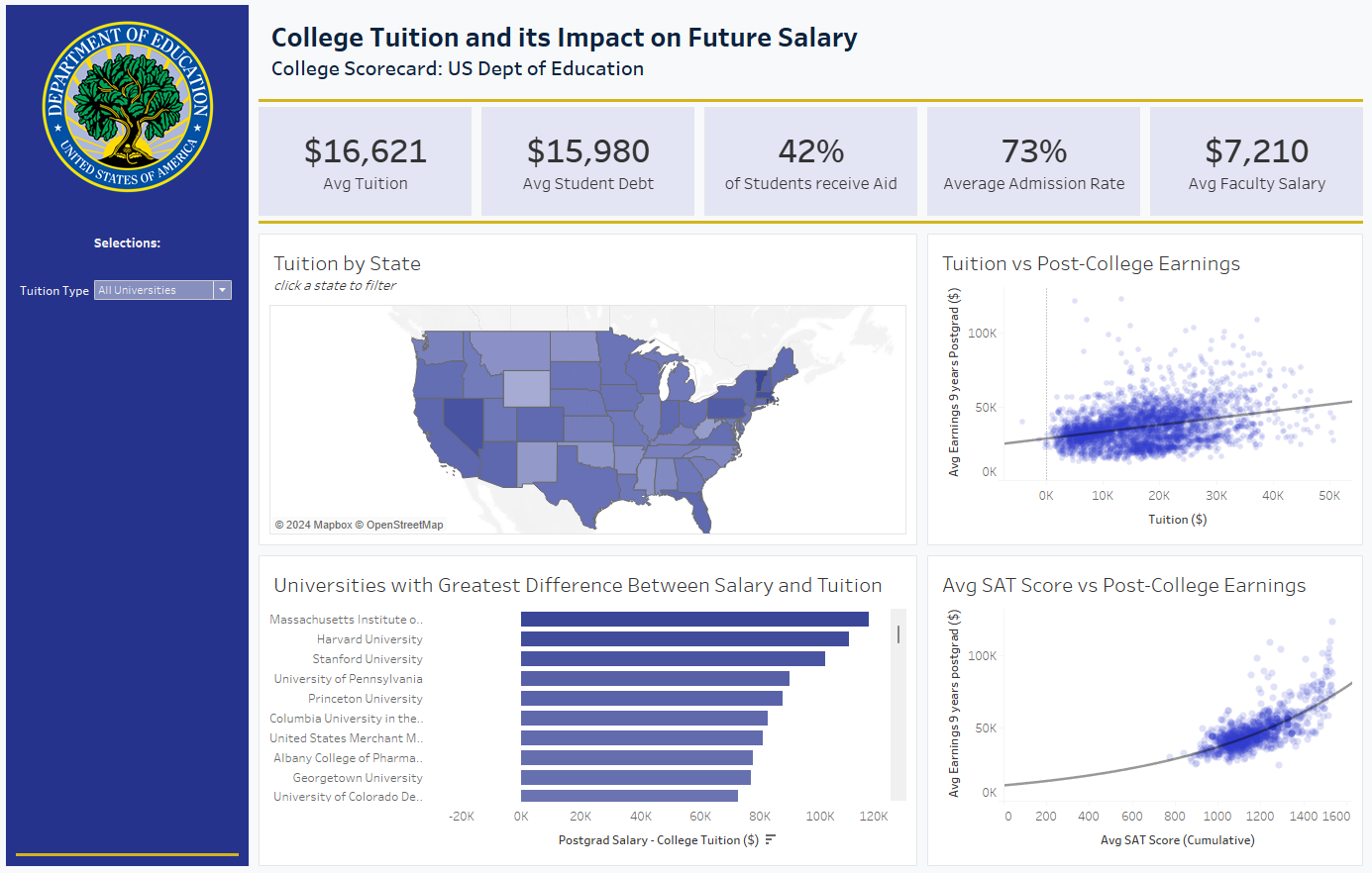
Next, I planned out my dashboard in Excalidraw. I wanted to focus on the relationship between tuition and postgraduate salary, so most of my charts relate to one or both of these variables. Firstly, I planned on having a map to show the average college tuition by state, and I planned on having drill-down functionality to show universities as points within that state, using color or size to differentiate tuition costs. I also planned two scatter plots: one examining if more expensive universities (in terms of tuition) produce higher postgraduate salaries. When I made this chart in Tableau, there is a slight correlation between the two, and you can explore universities in the lower right of the scatterplot (high tuition, lower earning potential) - I noticed a few of these were art-focused schools - as well as those in the top left (relatively low tuition, high earning potential) - I noticed some of these were engineering-focused schools like MIT. I also created another scatter plot to show if the earning potential of graduates has more to do with their standardized test score performance (which showed a stronger relationship), perhaps suggesting that more expensive / prestigious schools select students who will have higher earning potentials. Finally, I have a bar chart that subtracts avg tuition from earning potential to show which universities might be considered the best financial decision to attend.
My dashboard is quite similar to the Excalidraw. There is a lot of room for more interactivity and filtering, and there were other variables in the data such as family income and college that I would want to explore in the future.
This was a challenging project, especially due to the limited time allotted. My work laptop unfortunately needs repair so I had to spend the first few hours of the day setting up a replacement laptop and working with IT so I ended up with only about 2 hours to work on this project. That said, I’m happy with the results.