For Day 4 of Dashboard week, we were given data from the Squirrel Census, a fun collective effort of New Yorkers to collect data on squirrels in parks across the city. On March 1, 2020, several volunteers combed NYC parks, wrote down observations about squirrel colors and activities, and plotted their latitude and longitude points.

The website had three datasets: one for the squirrel data that included information around squirrel appearance, location, and what they were doing when spotted, another table that included information on the parks they searched, and a final file that included additional observations.
I chose to work with all three of the files and eventually joined them together, but primarily relied upon the squirrel table. The datasets were fairly small, but there were several fields that needed to be cleaned up due to the manual input of variables. The field that recorded the activities of squirrels is a good example - there were originally 67 possible values, but many of them were slight variations of the same thing or merely a combination of different activities separated by commas. Here’s what some of the activity values looked like:
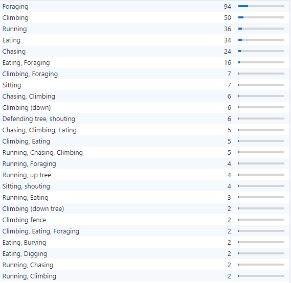
I chose to use a Text to Columns tool in Alteryx, using the split to rows option, for this and other fields that had multiple values separated by commas. This gave multiple rows for some squirrels, but made analysis of activities and their frequency much easier. Once the values were split to rows, I used Tableau Prep to group similar activities like “Climbing,” “Climbing (down),” “Climbing (down tree),” etc. I repeated this for other columns in the dataset that had a similar structure. Aside from splitting to rows and then grouping values, I also used Data Cleansing and Formula tools in Alteryx to remove trailing spaces and random strings like “ ÛÓåÊ” that were interspersed into the data.
Once I had my data ready to go, I began planning my dashboard. Here is my sketch of my dashboard plan:
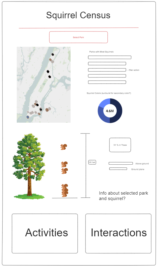
My main chart is a map of squirrel sightings, where each squirrel icon represents one squirrel and is colored based on their fur. I also planned on having a chart showing the average height above ground of squirrels when it was recorded as a dot plot, with a tree as reference. I originally planned a donut chart showing the percentage of fur colors, but I changed this for a plum pudding chart (maybe I'll make a blog on how to make one soon) where each icon represents 1 percent of squirrels and is based on an generated X Y coordinates. In my dashboard, I also included several bar charts showing the prevalence of squirrels by park, what activities were most common, how friendly they were toward humans, and where they were spotted. Here is a snapshot of my dashboard, which I will update in the future to improve the design and layout:
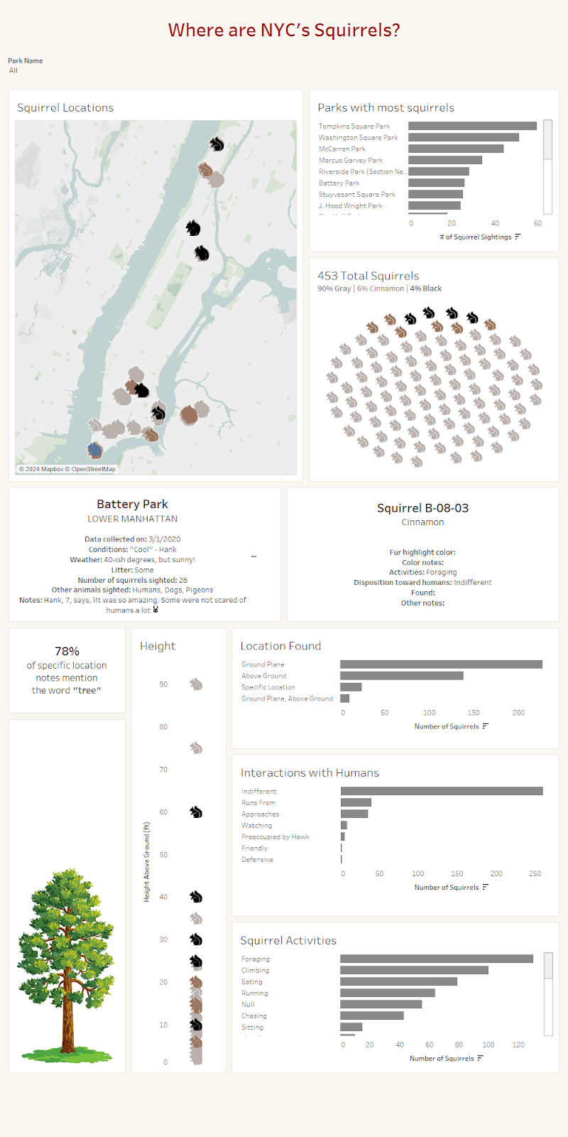
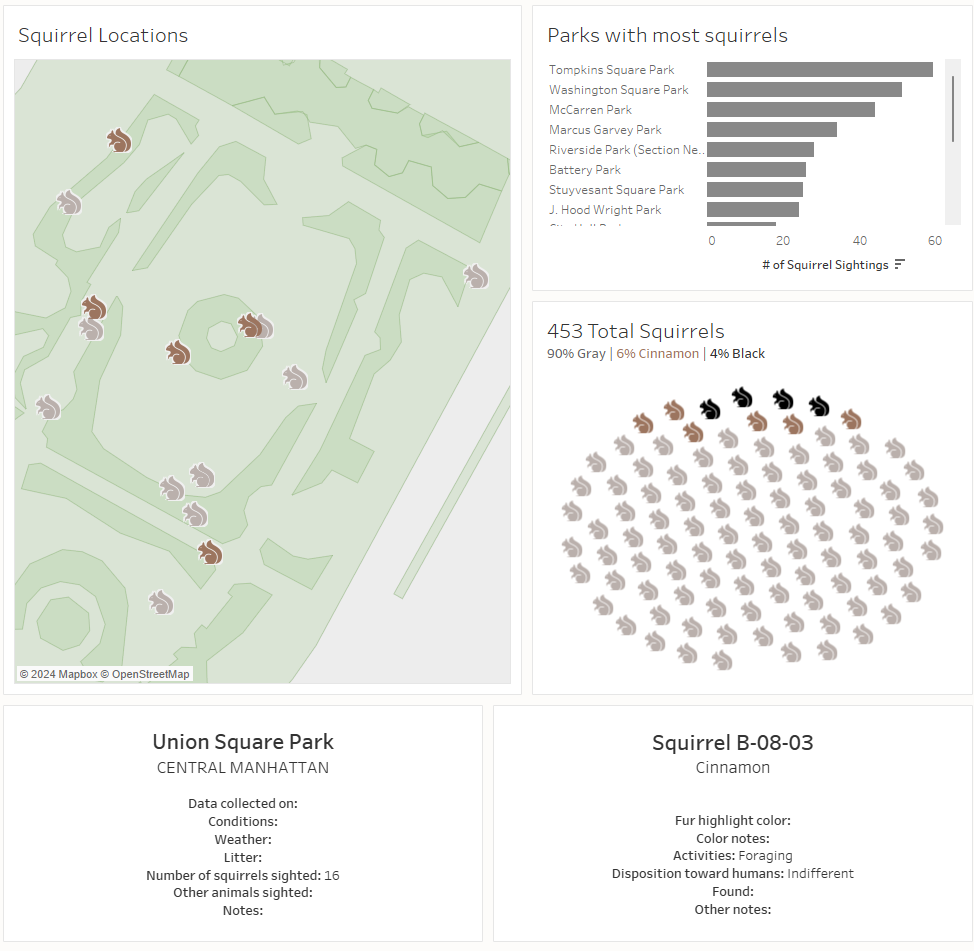
This dataset included a lot of textual and qualitative data, so I also created two info cards that give information about the selected park and selected squirrel. The map and its view are filterable by a drop-down box, and then you can click on one of the squirrels in that park to show information about it. Here’s an example of filtering the map to Union Square park and clicking one of the brown squirrels:
This was a very fun project and I look forward to revisiting this dashboard in the future.