A trellis chart is a grid where each cell in the grid is the same chart type with the same x- and y-axes but filtered to a different value for some dimension. For example, you could have a grid where each cell is a line chart of sales over time with each cell showing sales in a different state. These can be a useful way to view and compare many values at once.
Read on to get your trellis chart set up and find links to further reading to build a few common chart types in your trellis!

Here's a step-by-step guide using Tableau's built-in Superstore data with screenshots of each step.
Set up your trellis
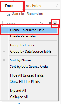
- Create calculated fields 'ROWS' and 'COLS.'
These will be used to split the view into a grid based on the number of values in the [Breakdown Dimension] you use to split the view.
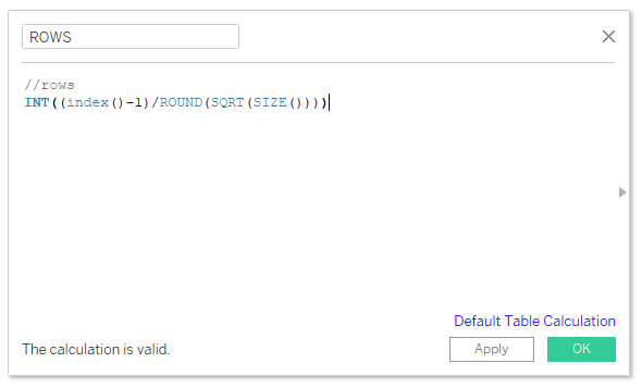
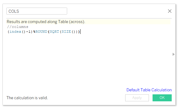
Use the following calculations to create calculated fields:
//columns
(index()-1)%ROUND(SQRT(SIZE()))
//rows
INT((index()-1)/ROUND(SQRT(SIZE())))
*Note: These calculations will automatically create a grid as close to square as possible, changing both the number of rows and number of columns depending on the number of values in your [Breakdown Dimension]. If you want a fixed number of columns and a variable number of rows, you can use (index() - 1) % (desired number of columns) for COLS and INT((Index() - 1) / (desired number of columns) for ROWS. Shoutout to Stanley Chen for showing me these alternative calculations!
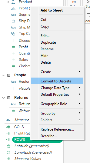
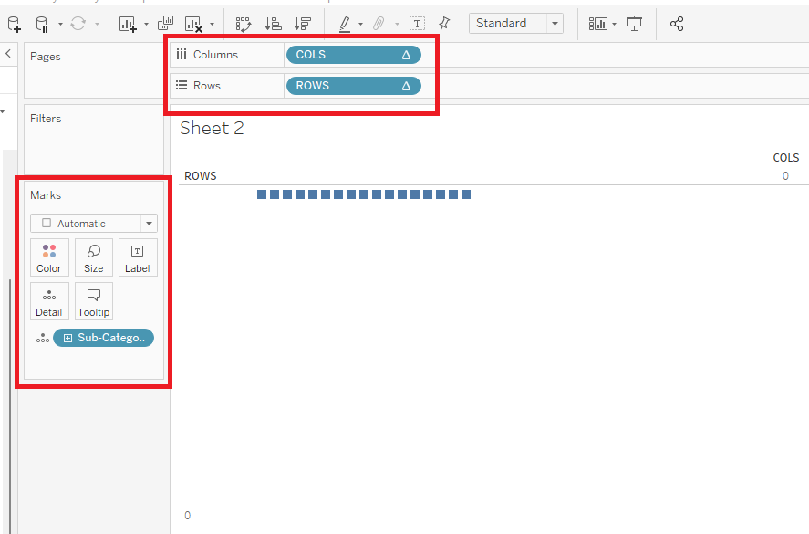
- Convert the "ROWS" and "COLS" pills to discrete measures.
Right click on the "ROWS" pill and select "Convert to Discrete." Do the same for "COLS."
- Drag the "ROWS" pill to the "Rows" shelf, the "COLS" pill to the "Columns" shelf, and your desired [Breakdown Dimension] to "Detail" on the Marks Card.
We will use "Sub-Category" as our breakdown dimension throughout this tutorial.
- Configure your table calcs.
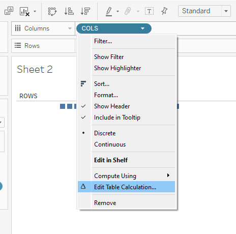
- Click the △ on the "COLS" pill on the "Columns" shelf and select "Edit Table Calculation..."
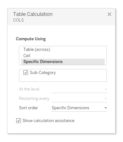
- In the dialogue box that pops up, set "Compute Using" to "Specific Dimensions" and check off your [Breakdown Dimension] ("Sub-Category" in this case).
- Close the dialogue box and repeat this for "ROWS."
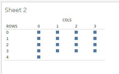
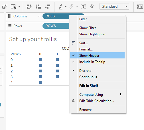
- Format your trellis by hiding the row and column headers.
- Right click the "COLS" pill in the "Columns" shelf.
- Uncheck "Show Header."
- Repeat for "ROWS."
- Create your charts.
This step will vary depending on what chart type you want. I'll walk you through creating bar, donut, and line charts. Many of the steps will be familiar, but you'll sometimes have to reconfigure your table calcs, and dates can be a bit tricky. In general, when your trellis chart isn't looking right, fiddling around with the table calcs on "ROWS" and "COLS" will get you where you want to be. Once you understand the basics, you can create any chart type within the trellis.
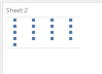
Voila! You've created a trellis!
Add charts to your trellis using my How-Tos:
These How-Tos build off the grid you created here.
- How-To: Build a Trellis of Bar Charts in Tableau
- How-To: Build a Trellis of Donut Charts in Tableau
- How-To: Build a Trellis of Line Charts in Tableau
See all these charts in action with embedded How-Tos here: