A trellis chart is a grid where each cell in the grid is the same chart type with the same x- and y-axes but filtered to a different value for some dimension. These can be a useful way to view and compare many values at once.
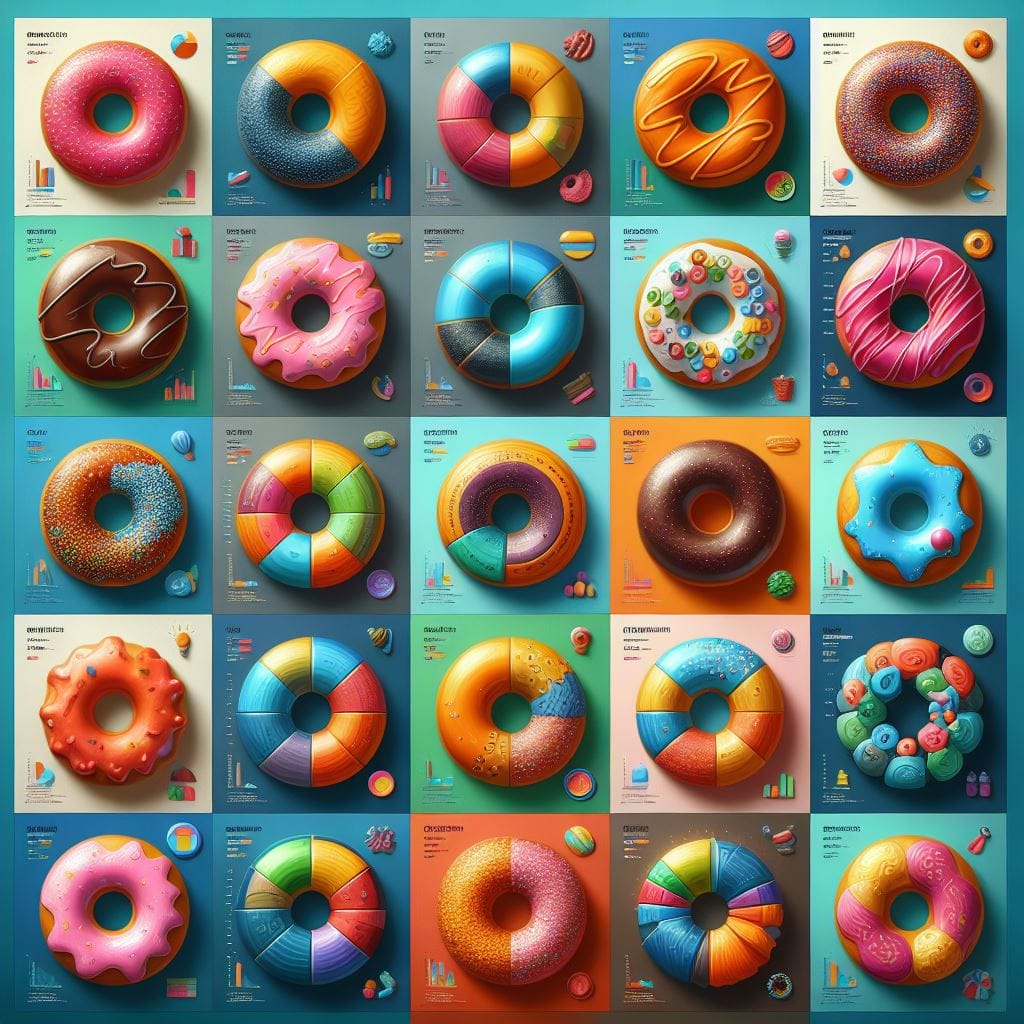
In this tutorial, we will build a grid where each cell is a donut chart of sales per region with each cell showing sales in a different sub-category.
Read on to build your trellis of donut charts and find links to further reading to build a other common chart types!
Here's a step-by-step guide using Tableau's built-in Superstore data with screenshots of each step.
Build a Trellis of Donut Charts
- Set up your trellis.
If you haven't done this already, read my blog: How-To: Set Up a Trellis Chart in Tableau.
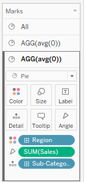
- Set your "Marks" to "Pie"
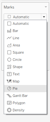
- Drag a [Secondary Dimension] onto "Color" on the Marks Card.
This is the dimension you want as the segments of the donut. We will use "Region" as our secondary dimension throughout this tutorial.
- Drag a [Measure] onto the "Angle" on the Marks Card.
This determines the size of each segment on the donut. We will use "Sales" as our measure throughout this tutorial.
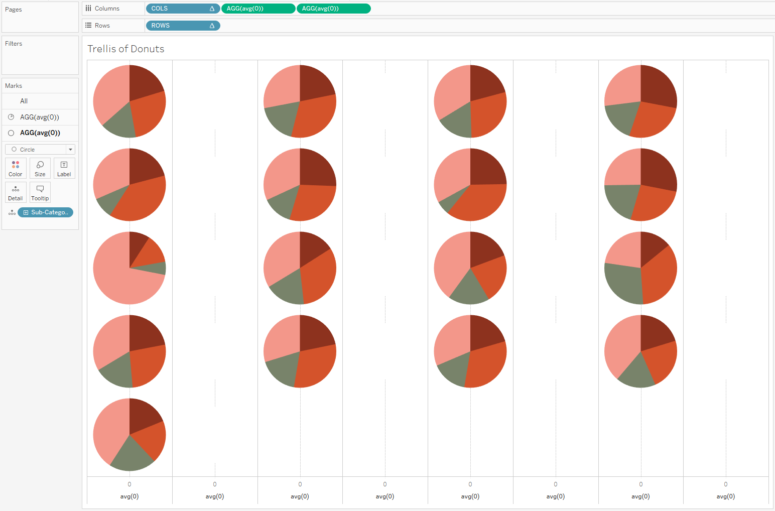
At this point, you should have a trellis of pie charts.
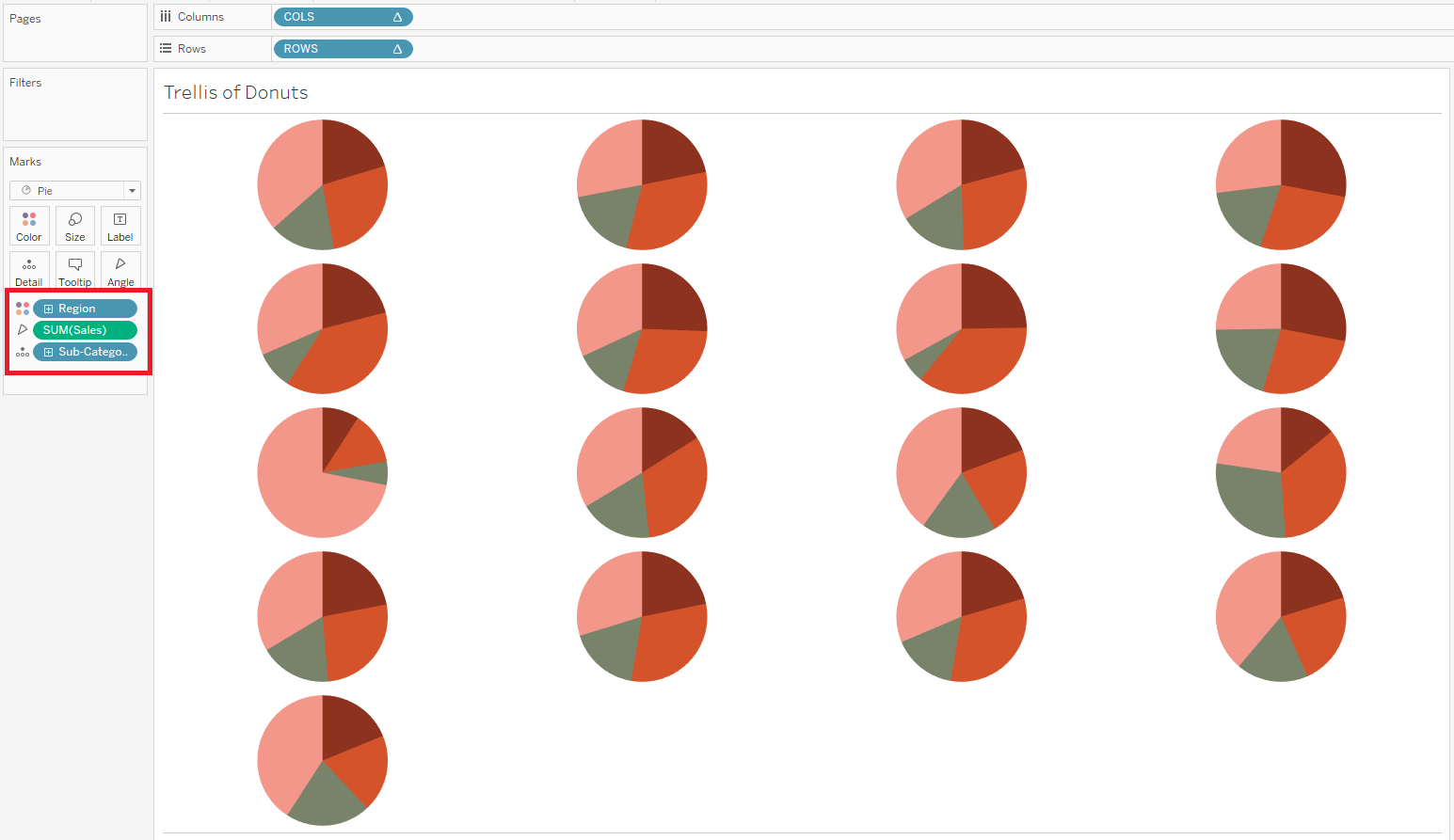
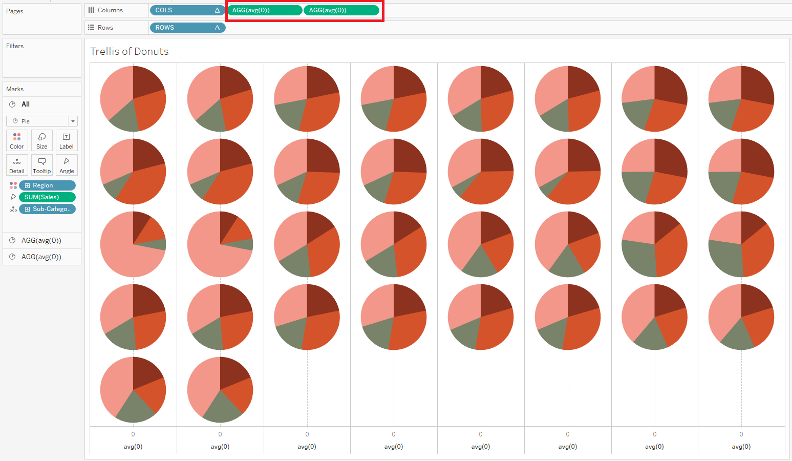
- Create the donut holes: Double click the "Columns" shelf and type "avg(0)" to create a pill. Do this twice.
You will now have two copies of your pies. The second copy will become the donut hole.
- Format the donut holes:
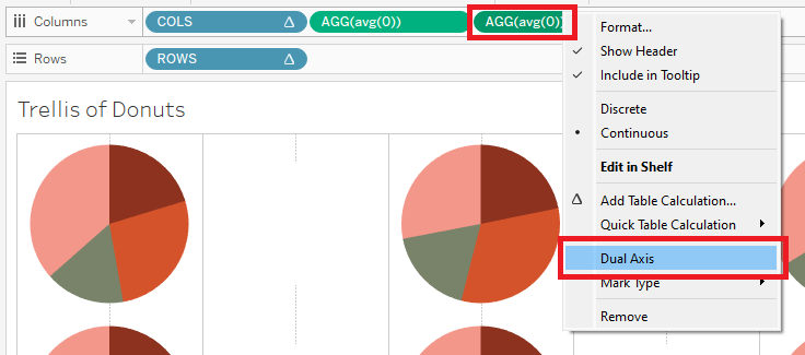
- Click the second instance of "AGG(avg(0))" in the Marks Card.
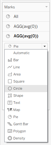
- Change the Marks type to "Circle"
- Remove the pills for your [Secondary Dimension] and [Measure] from this Marks Card.
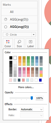
- Click on "Color" and change the color to white.
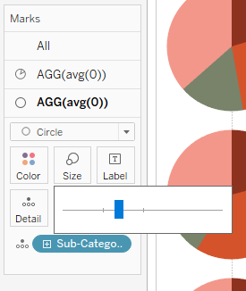
- Click on "Size" and decrease the size by about 20%.
- Put the holes in the donuts: right click on second "AGG(avg(0))" pill on the "Columns" shelf and select "Dual Axis."
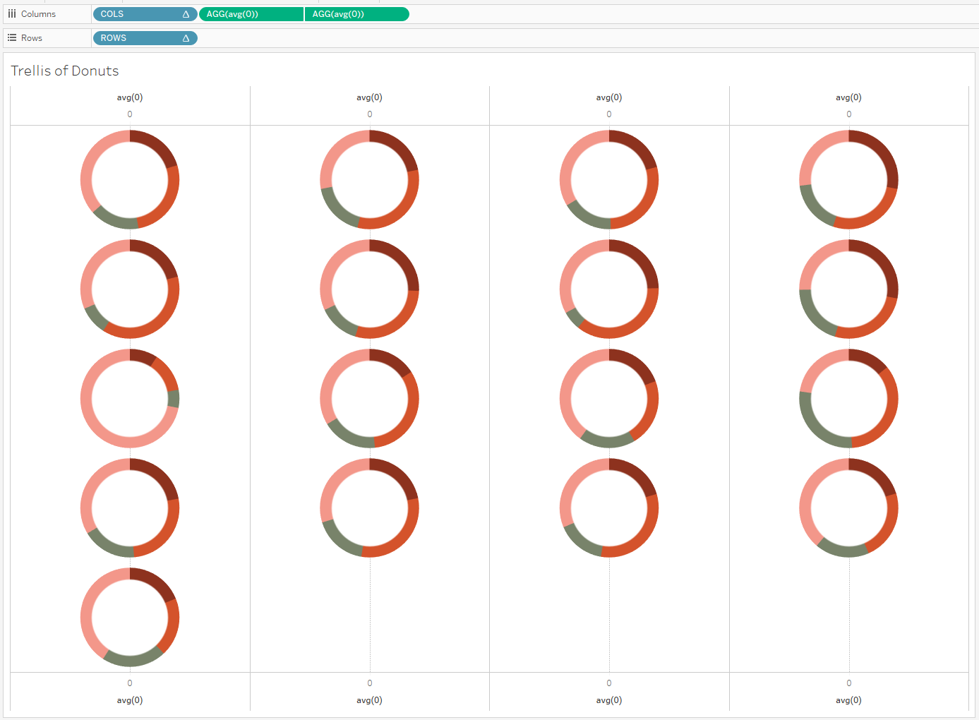
- Format your trellis of donuts.
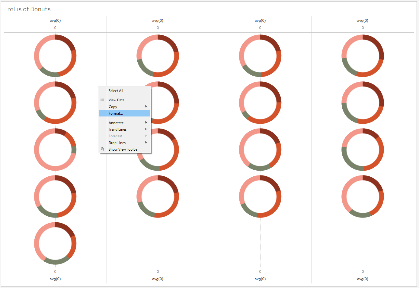
- Right click on your viz and select "Format...." The "Format" pane will open on the left hand side, where your "Data" pane usually is.
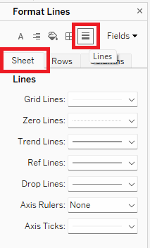
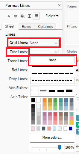
- Click on the "Lines" icon to open "Format Lines," and make sure you're on the "Sheet" tab. Set the dropdowns for "Grid Lines:" and "Zero Lines:" to "None."
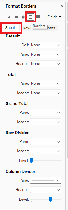
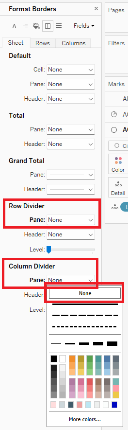
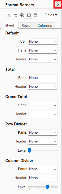
- Click on the "Borders" icon to open "Format Borders" and make sure you're on the "Sheet" tab. Under "Row Divider," set "Pane:" to "None." Do the same for "Column Divider." You can now close the "Format" pane with the "x" in the upper right hand corner.
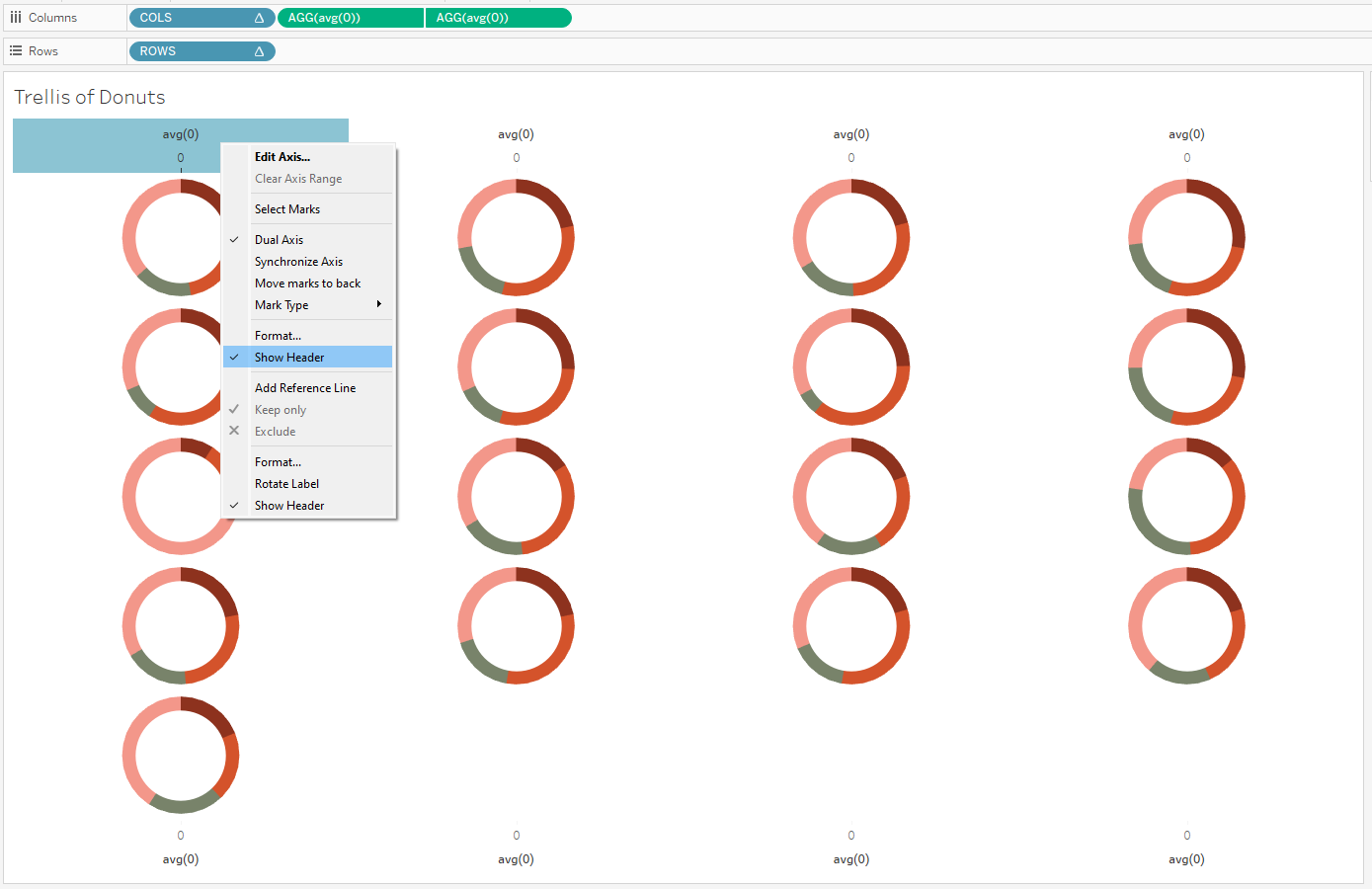
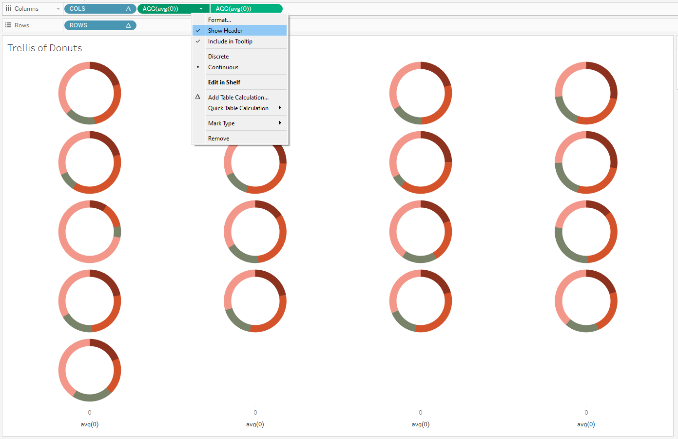
- Hide the "avg(0)" headers: Either right click on the headers themselves (above/below your donuts) or right click on the "AGG(avg(0))" pills on the "Columns" shelf. In either case, uncheck "Show Header."
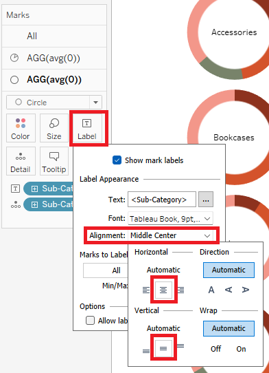
- (Optional) Add labels to your donuts:
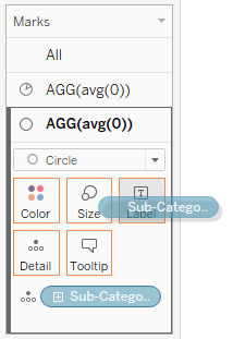
- Click onto your second instance of "AGG(avg(0))" in the Marks Card. This is the one with Marks type set to "Circle."
- Duplicate your [Breakdown Dimension] pill and drag it onto "Label."
- Click "Label" and set "Alignment" to "Middle Center."
- Add any other desired formatting.
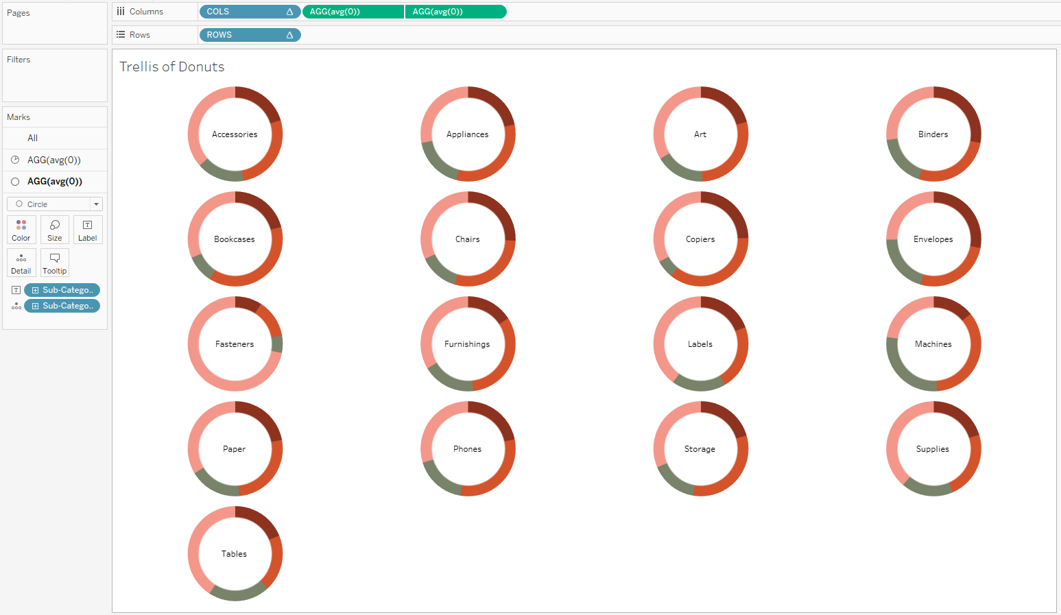
Voila! You've created a trellis of donut charts!
Add other chart types to your trellis using my How-Tos:
- How-To: Set Up a Trellis Chart in Tableau.
- How-To: Build a Trellis of Bar Charts in Tableau
- How-To: Build a Trellis of Line Charts in Tableau
See all these charts in action with embedded How-To blogs here: