A trellis chart is a grid where each cell in the grid is the same chart type with the same x- and y-axes but filtered to a different value for some dimension. These can be a useful way to view and compare many values at once.
In this tutorial, we will build a grid where each cell is a line chart of monthly sales over time with each cell showing sales in a different sub-category.
Read on to build your trellis of line charts and find links to further reading to build a other common chart types!

Here's a step-by-step guide using Tableau's built-in Superstore data with screenshots of each step.
Build a Trellis of Line Charts
We use line charts to look at change over time, so you will need a [Date Dimension]. We will use "Order Date" throughout this tutorial.
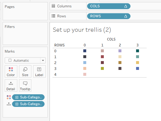
- Set up your trellis.
If you haven't done this already, read my blog: How-To: Set Up a Trellis Chart in Tableau.
- (Optional) Copy your [Breakdown Dimension] onto color.
This can help you ensure your table calcs are configured as desired while building the chart.
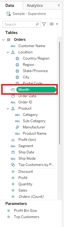
- Create a [Custom Date] from your [Date Dimension].
- In your Data Pane, right click your [Date Dimension] and hover over "Create ▶." Select "Custom Date..."
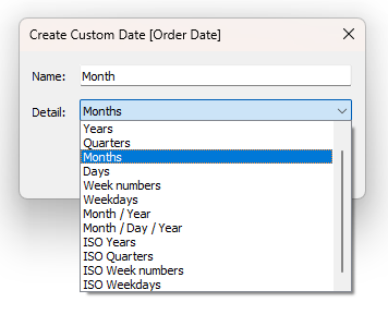
- In the window that pops up:
- Set "Detail:" to your desired level. This tutorial uses "Month"
- Change "Name:" to correspond with your desired level. This tutorial uses "Months"
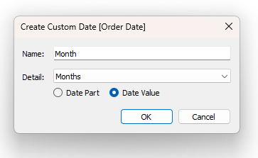
- Make sure the radio button under "Detail:" is set to "Date Value."
- Click "OK." You now have a new [Custom Date] dimension available in your Data Pane, with the name you specified.
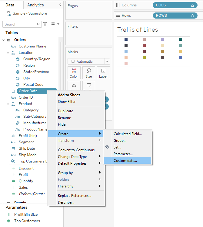
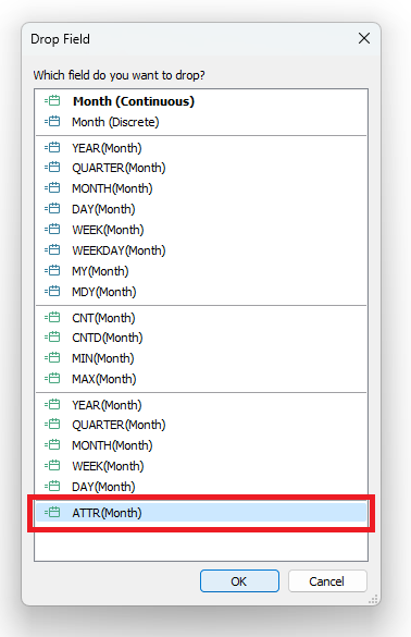
- Right click and drag [Custom Date] to the "Columns" shelf and select "ATTR([Custom Date]" in the "Drop Field" window that pops up. Click "OK."
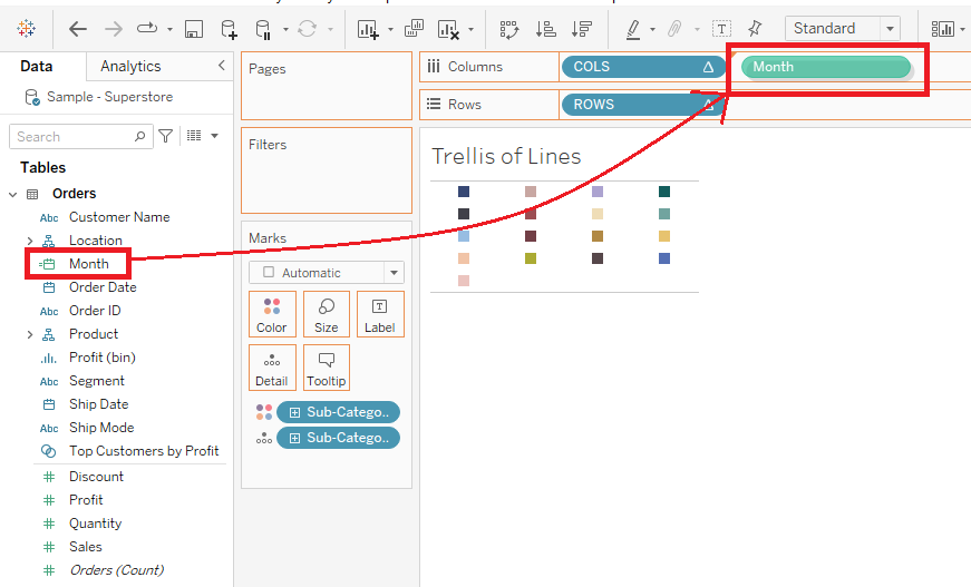
- Drag your [Measure] onto the "Rows" shelf.
We will use "Sales" as our measure.
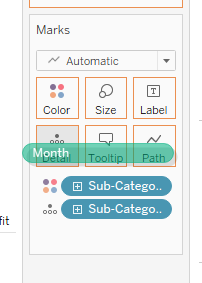
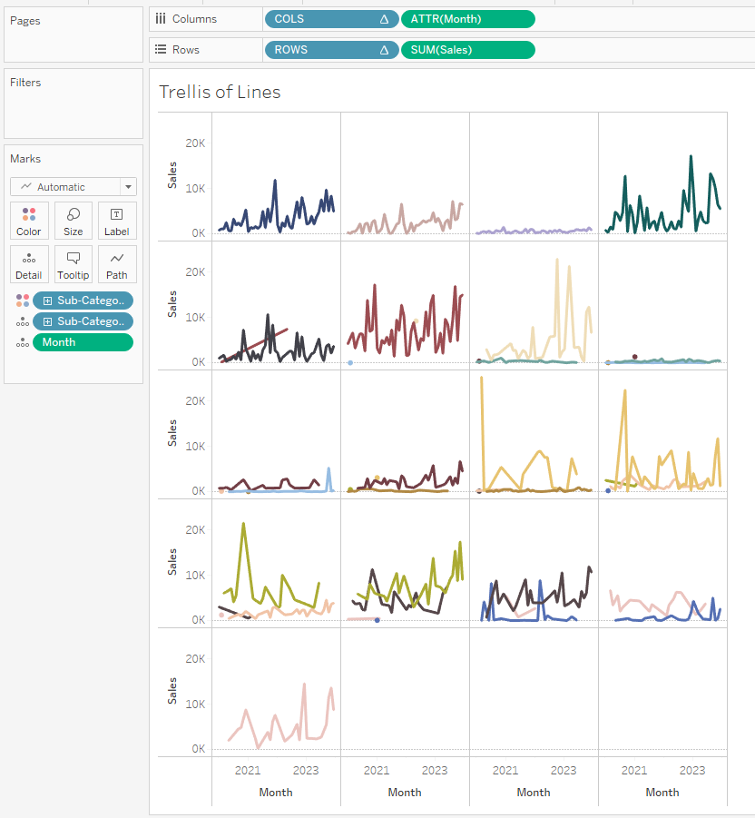
- Drag your [Custom Date] to "Detail" on the "Marks" card.
This will enable you to use [Custom Date] in your table calcs for rows and columns. We can see that our line charts are using data from multiple sub-categories on one chart. We will fix this by adjusting our table calcs.
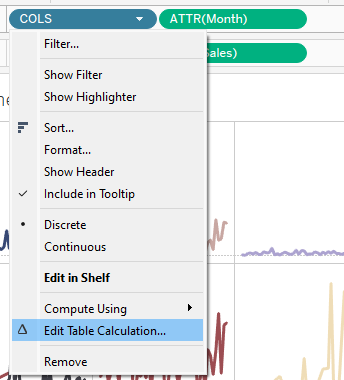
- Edit the table calcs.
- Click the triangle on the "COLS" pill on the "Columns" shelf.
- Select "Edit Table Calculation..."
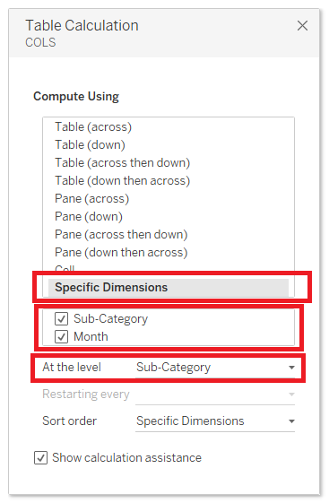
- Choose "Specific Dimensions" under "Compute Using" in the "Table Calculation" pop-up window.
- Check the boxes for both your [Breakdown Dimension] and your [Custom Date].
- Set "At the level" to your [Breakdown Dimension]. You can now close the "Table Calculation" window.
- Repeat for the "ROWS" pill on the "Rows" shelf.
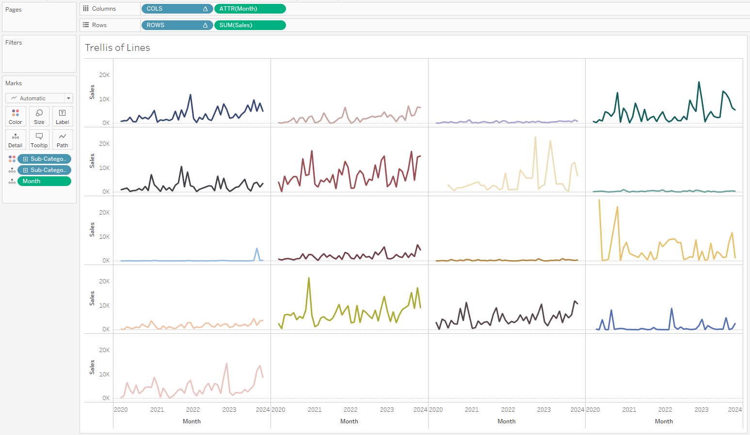
Voila! You have created a trellis of line charts!
Add other chart types to your trellis using my How-Tos:
- How-To: Set Up a Trellis Chart in Tableau.
- How-To: Build a Trellis of Bar Charts in Tableau
- How-To: Build a Trellis of Donut Charts in Tableau
See all these charts in action with embedded How-To blogs here: