Today was a data prep heavy task. The dataset came from the TLC Trip Record Data, specifically the yellow taxi trip records where the files came in a file type of ‘parquet’.
Since Alteryx and Tableau were not able to read parquet files, it was necessary to parse the files either through python or R. I attempted to to use R to parse the files using the following code:
library(arrow)
trips1 <- read_parquet('yellow_tripdata_2023-01.parquet')
write.csv(trips1, "trips1.csv", row.names = FALSE)
While this method worked and can output the files into a csv format, it was time consuming to parse 12 of these files (each representing one of the months in the particular year).
Hence, I returned to the python tool in Alteryx and used a batch macro to repeat the data parsing step 12 times.
To parse a parquet file in Alteryx, first set a text input with one cell containing the full path of your local parquet file.
Then use another Python tool including the following code:
Package.installPackages(['pandas','numpy','pyarrow'])
import pandas as pd
import pyarrow.parquet as pq
path = Alteryx.read('#1')
path.iloc[0,0]
# Read Parquet file into a DataFrame
table = pq.read_table(path.iloc[0,0])
df = table.to_pandas()
Alteryx.write(df, 1)
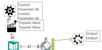
Finally attach a output file to the first anchor.
Since I made a Batch Macro, I used the macro on a text input.
After running the batch macro, I outputted 38 million rows into a hyper file for tableau.
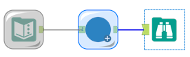
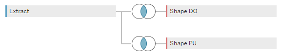
In addition to the trip data, the website also provided a shape file of the various zones in NYC which I joined with the trip data to map out the pick up zones and the drop off zones.
Now that I have my dataset ready for analysis, I began exploring the data to see the story I would like to convey in my dashboard. After some time to explore the data, I came up with the following sketch of what my dashboard might look like:
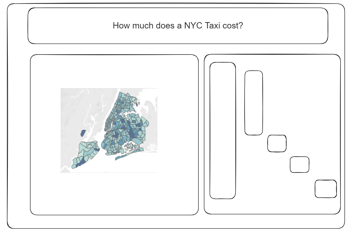
After more time spent on making the charts and given the time constraints, the waterfall chart would be difficult to create. Hence, my final dashboard was slightly different from my draft.
Photo by Lexi Anderson on Unsplash