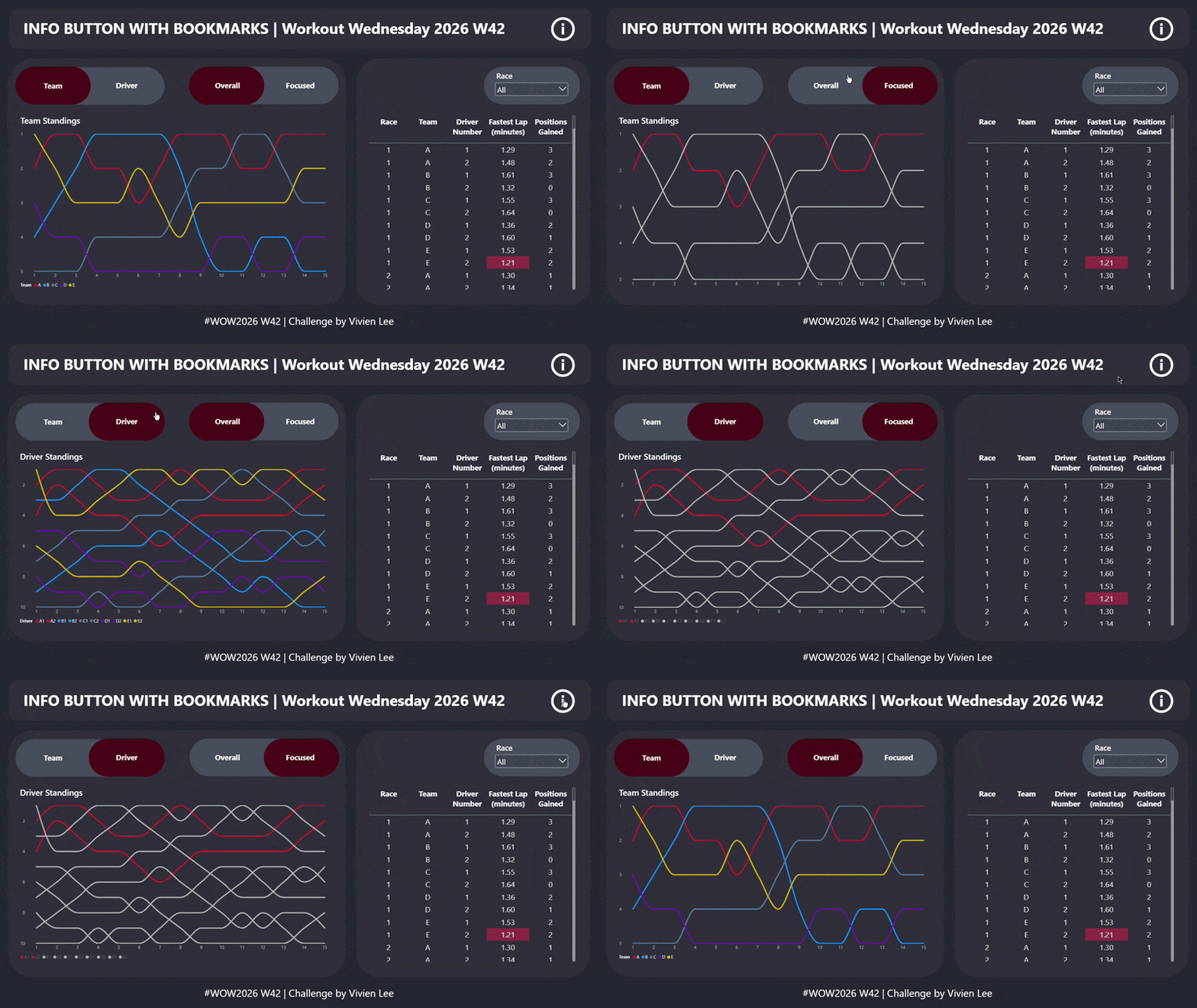
This is a step-by-step guide of how to create this week's challenge and the bonus challenge.
Challenge
So for the main challenge you need to create the table, the charts, and the info button bookmark.
Table:
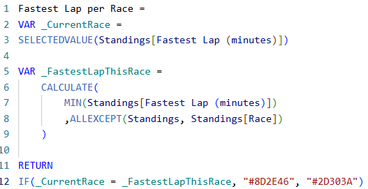
- Create the measure for the Fastest Lap per Race.
Create a variable for the "Current Race" and a variable for the "Fastest Lap This Race". Then we want to return one colour if the "Current Race" is equal to the "Fastest Lap This Race", otherwise return the same colour as the background.
- Add Race, Team, Driver Number, Fastest Lap, and Positions Gained into a table.
- In the table settings → go to cell elements → then under "apply settings to" choose the Fastest Lap column → turn on background colour → in the fx - change format style to field rules and base this on your Fastest Lap per Race measure.
- Add a slicer for Race number and later on you can change the interactions so that this slicer only affects the table.
Bump Charts:
- Insert a line chart and put Race on the X-axis, Team Standings on the Y-axis, and Team on the Legend. Invert the range for the Y-axis so that whoever is 1st is shown at the top.
- Create the second bump chart but replace Team Standings with Driver Standings and put Driver ID on the Legend. Invert the Y-axis again.
- Line them up so they overlap.
Design:
Finalise where you want everything to go now because it's hard to move things around after you start using the bookmarks. Think about any extra shapes or text boxes you want to add (either as background containers or titles).
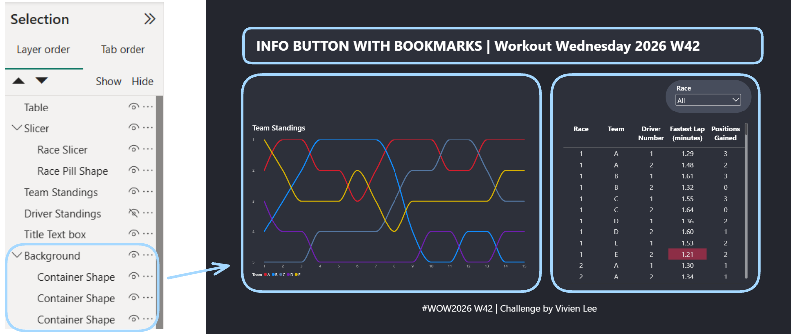
- In the View Tab make sure you can see the Bookmarks and Selection panes.
- In the Selection Pane name your layers so you can set your bookmarks easier later.
- Move any shapes to the bottom, the charts to the middle, and the table and slicer to the top. Group layers together to make them easier to deal with (e.g. the background shapes, the slicer and the shape behind it).
Bookmarks:
We need to create four bookmarks, a Team bookmark, a Driver bookmark, and the two Info Button bookmarks (on and off).
- Have the Team Standings chart showing and the Driver Standings chart hidden. Select both of these charts, create the Team bookmark, and set it to selected visuals.
- Now have the Team Standings chart hidden and the Driver Standings chart showing and create the Driver bookmark (again making sure the charts are selected and setting the bookmark to selected visuals).
- Add two bookmark buttons and set the actions.
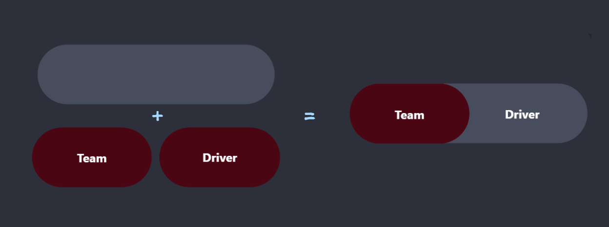
To get the toggle design you can use pill shapes underneath your bookmarks. I used one longer grey one and two smaller red ones. You'll need to update your bookmarks so that when the Team bookmark is selected the Driver pill shape is hidden and vice versa.
- Now we want to create our instructions view with arrows and text boxes to explain different parts of the dashboard.
- Add two information buttons - you can make them different colours to help you differentiate which one is on/off.
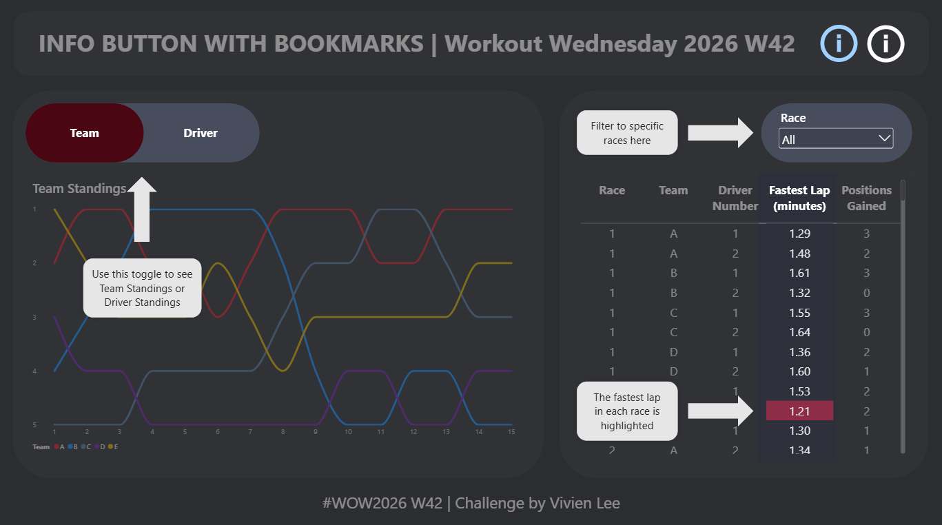
You can also add a shape to cover the whole dashboard, change the opacity to 50%, and put it "behind" your arrows, text boxes, bookmarks, or anything else you would like to highlight (as seen above).
- Group all the shapes and text boxes together and make sure all the correct layers are selected. My selection included the group of shapes/text, the two info buttons, and the shapes I used to blur the background.
- Create a bookmark for when the instructions/information is showing and hide one of the info buttons. Call this bookmark "Info Button On" and set it to selected visuals.
- Hide all of these visuals and show the info button you hid in the previous step. Then create another bookmark called "Info Button Off" and set it to selected visuals.
- Now set the actions for the info button, the one that is showing when everything is hidden should be "Info Button On" and vice versa. Don't worry if you get them mixed up it's easy to switch the actions around anyway.
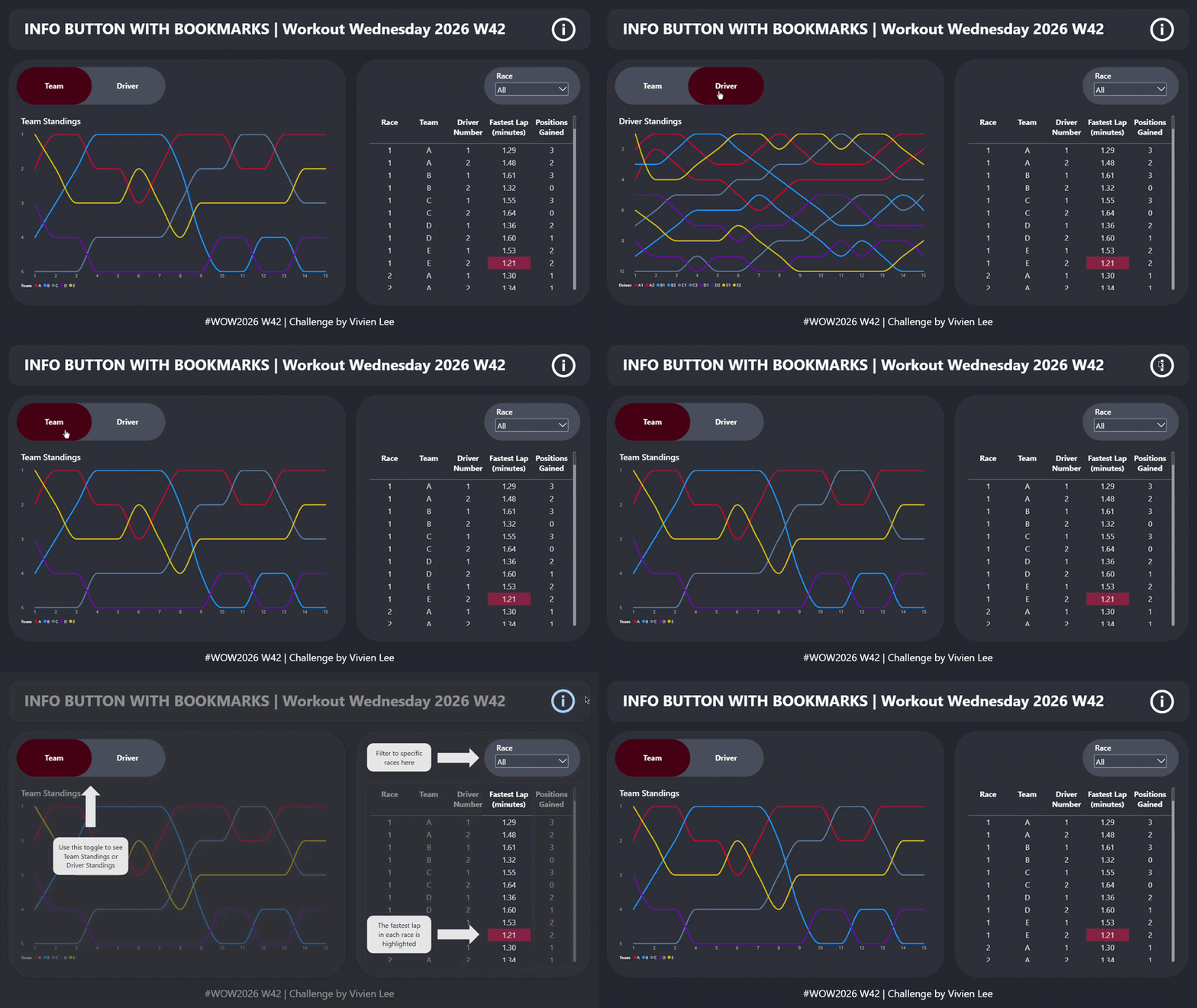
Now you can test your bookmarks out and it should look something like this!
Bonus Challenge
The bonus challenge is to add another set of bookmarks that changes the chart from the overall view (where all the teams are different colours) to the focused view (where only Team A has an assigned colour and all the other teams are grey). You can do this using a switch measure and a slicer but this Workout Wednesday is about bookmarks so that's what I used.
Charts
- Duplicate the two bump charts and change the colours so that Team A is one colour and the other teams are grey.
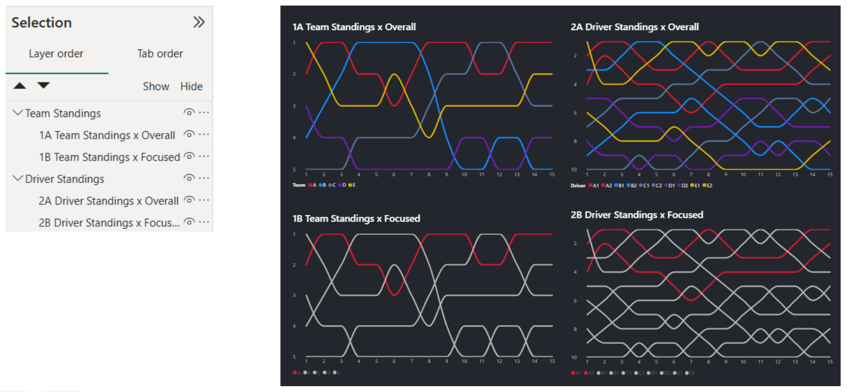
- You should now have four charts. It would be helpful at this point to temporarily rename them something like 1A 1B 2A 2B and to group them so the two Team Standings charts are together and the two Drivers Standings charts are together like this:
- We can now make four corresponding bookmarks. Give them the same names as your charts e.g. have the 1A Team Standings x Overall chart showing and create a bookmark called 1A Team Standings x Overall or 1A.
- Add these four new bookmarks as buttons and format them.
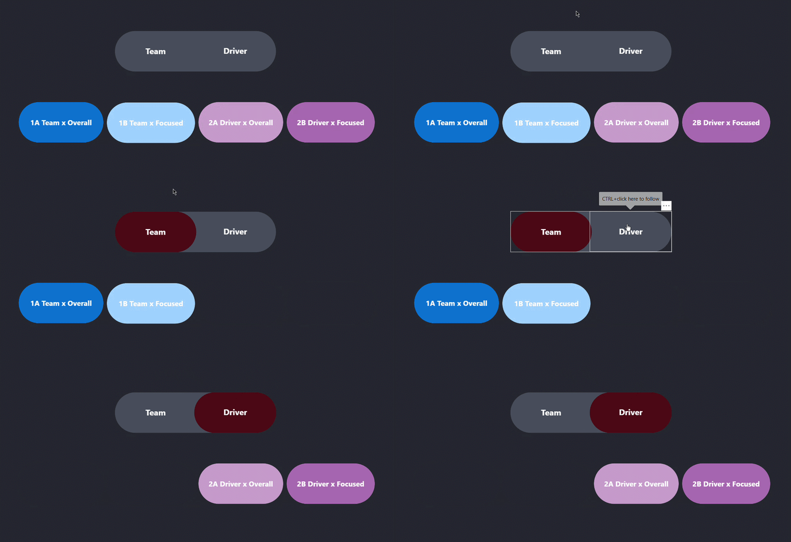
- Now we can update our old Team/Driver bookmarks so that when Team is selected, only the 1A Team Standings x Overall and 1B Team Standings x Focused bookmarks are visible, and do the same for the Driver bookmarks.
In the example below, all four bookmarks are lined up at the beginning just so you get an idea of what the bookmarks are doing, but you should actually align them so 1A and 1B are on top of 2A and 2B so that the switch is visually seamless.
- Add in one more arrow & text box pointing to your new bookmarks and update the info button bookmark.
- The last step is just about formatting. Rename your charts and bookmarks, and make sure everything is aligned.
Finally you can test out all of the bookmarks! You should be able to toggle between Team and Driver Standings and between the Overall and Focused view. You should also be able to click the information button to see some instructions or explanations of the dashboard. Here's what mine ended up looking like!