It's my first full Power BI blog! Today I'm running through some charts we built that uses AVERAGEX and average lines.
My favourite thing about Power BI is how it automatically connects visuals on the page. If I click on a data point in a chart, the other charts on the page will cross-filter without me having to set it up first!
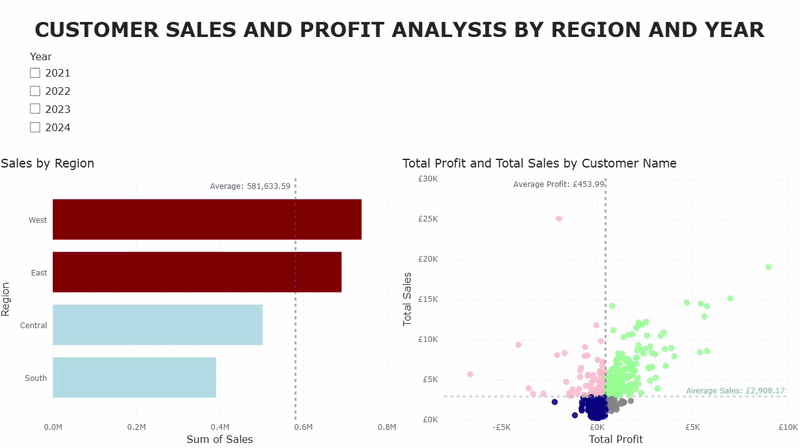
Linking Regional Sales to Customer Sales
The first example involves a bar chart with sales by region and a scatterplot with profit and sales by customer. There will also be average lines for both charts, colours for if it's above or below the average, and a slicer for the years.
Bar Chart
1 - Let's start with the bar chart
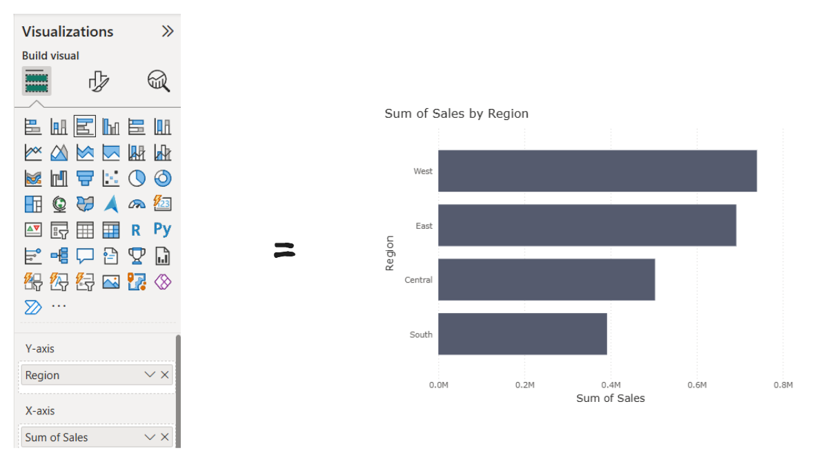
Create a bar chart and add Region and Sales.
2 - Add the Average Line
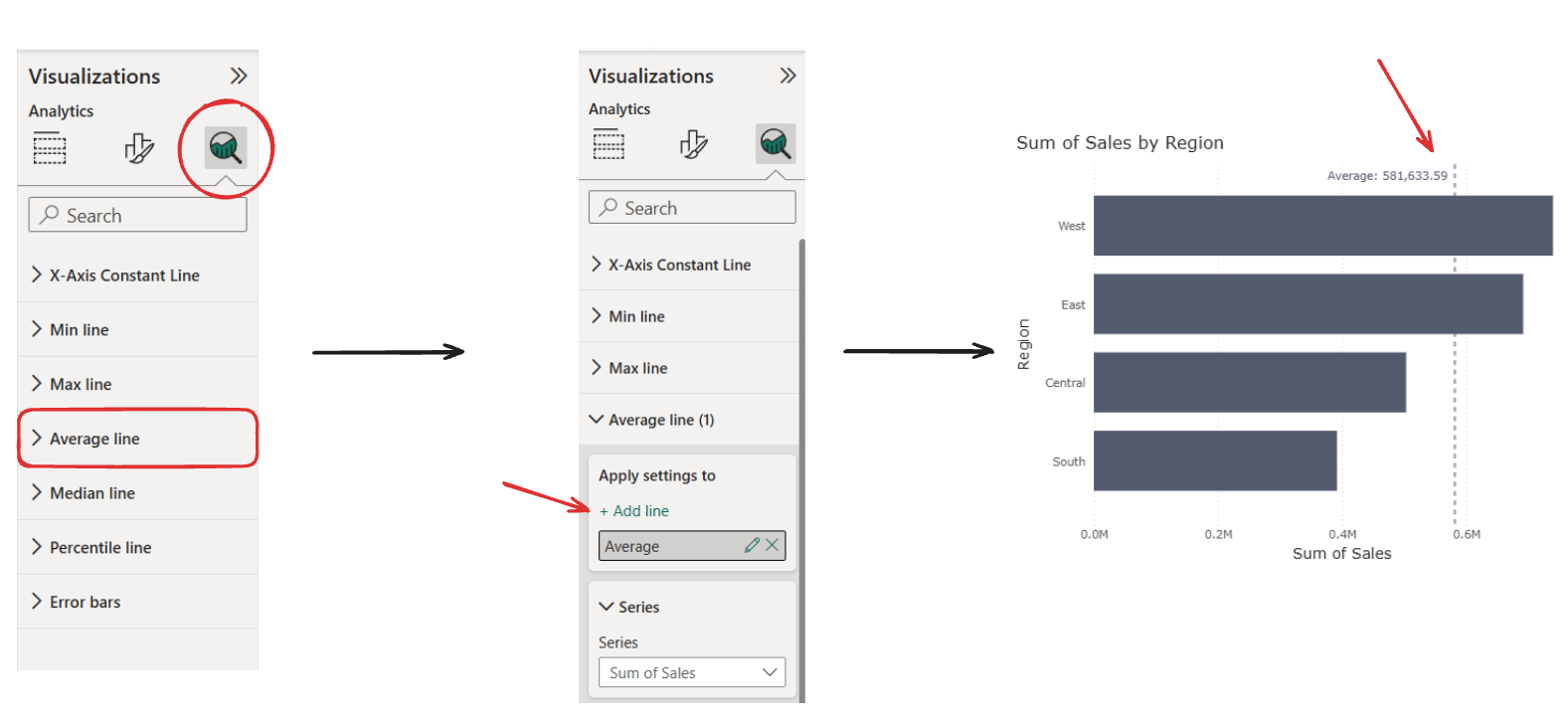
In the analytics pane you can add an average line (and rename & format).
3 - Create Average Region Sales Measure
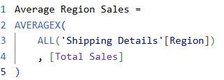
Why AVERAGEX instead of just AVERAGE?
The X is saying to calculate something row by row. So in this case it will go through the rows and calculate the Total Sales for each Region, and then average the results. This should actually give the same number as the average line from the previous step but we need this to be able to do another measure that will help us format the colours. It can also go on tooltips.
4 - Create the Colour Measure
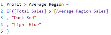
This measure is saying if the sales is greater than the average line then it should be dark red, else it should be light blue. The difference in the way you write the IF statements in Power BI took some getting used to.
5 - Add to Colour
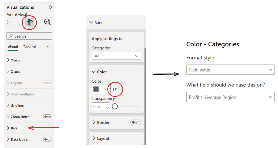
This time we'll go to the format visual pane, find "Bars", click the fx button (for conditional formatting), and then change the format style to "Field Value" (always needed when using colours in your measure) and then select the measure you made in the previous step.
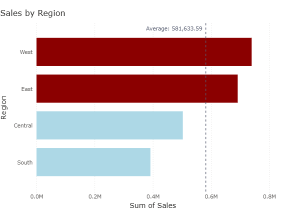
Now the first chart is done and should look like this:
Scatterplot
1 - Create the scatterplot
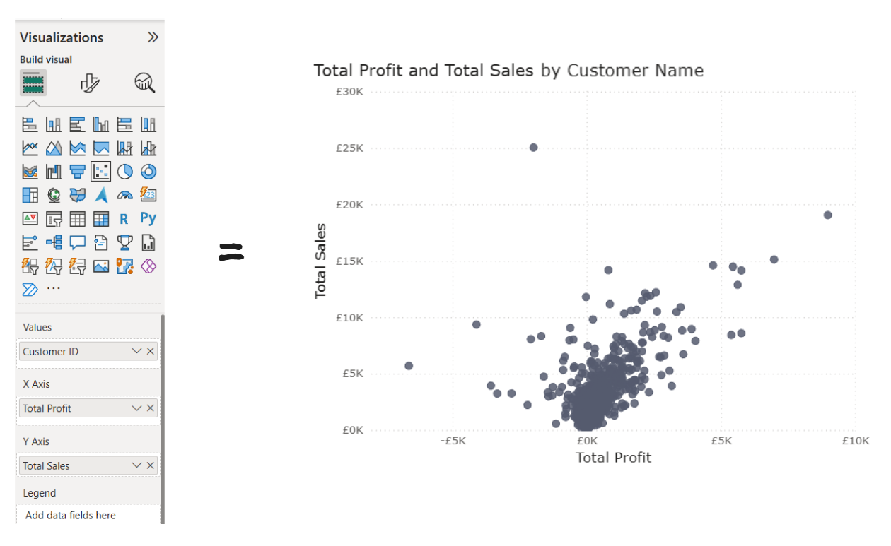
Build the scatterplot with Total Profit on the X axis, Total Sales on the Y axis, and Customer ID in the values.
2 - Add the average lines
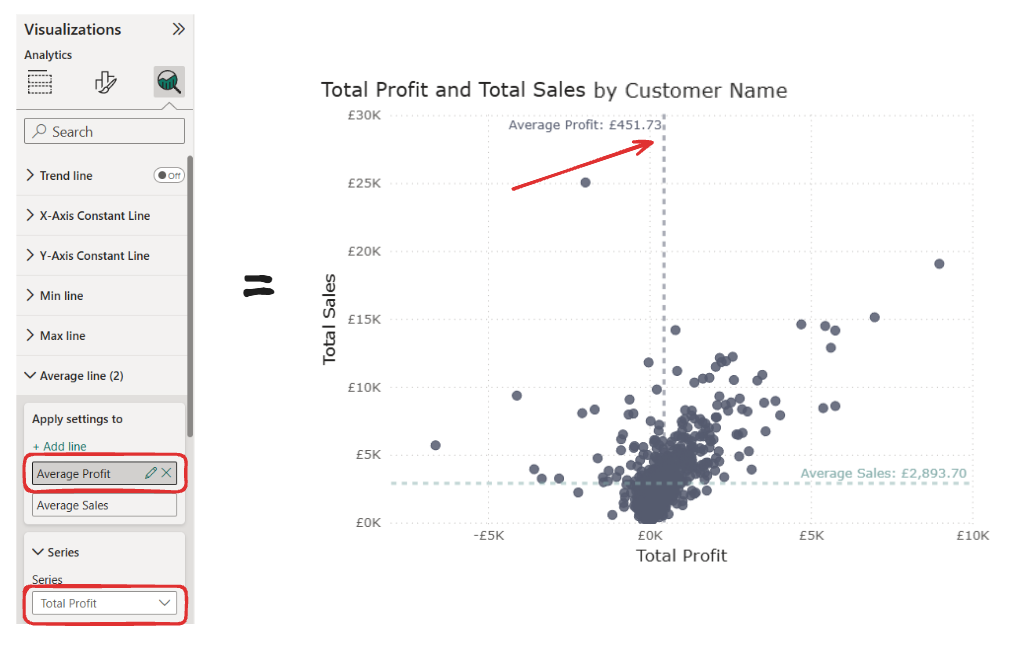
Just like before, add the average lines. You can change the axis under "Series" and create an average line for both Total Profit and Total Sales.
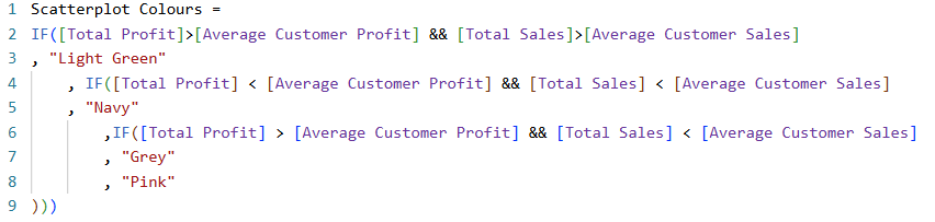
3 - Create the colour measure and add it to colour
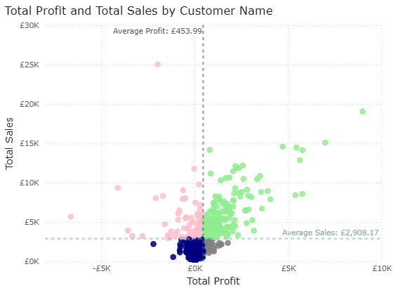
Now it should look like this:
Interactivity
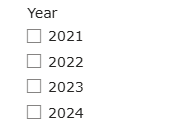
Add in a slicer with the Year from Order Date
And everything is connected automatically!