


Another day, another "fun" brief
The brief
- Day 3 of Dashboard week has us using data from the MyAnimeList website. The brief was to build an infographic on a series/genre/ users or a cool story you can find in the data.
My Plan
Originally, I thought it might be quite interesting to look at what the effect of a change in studio had on ratings and viewership. However in the dataset, there was only one studio listed per anime and so this was not possible.
In keeping inline with the infographic theme, I decided to look into Studio Ghibli movies as I watched a lot of them growing up.
I wanted to explore users who watched Studio Ghibli movies first and how their watchlists were.
Data preparation
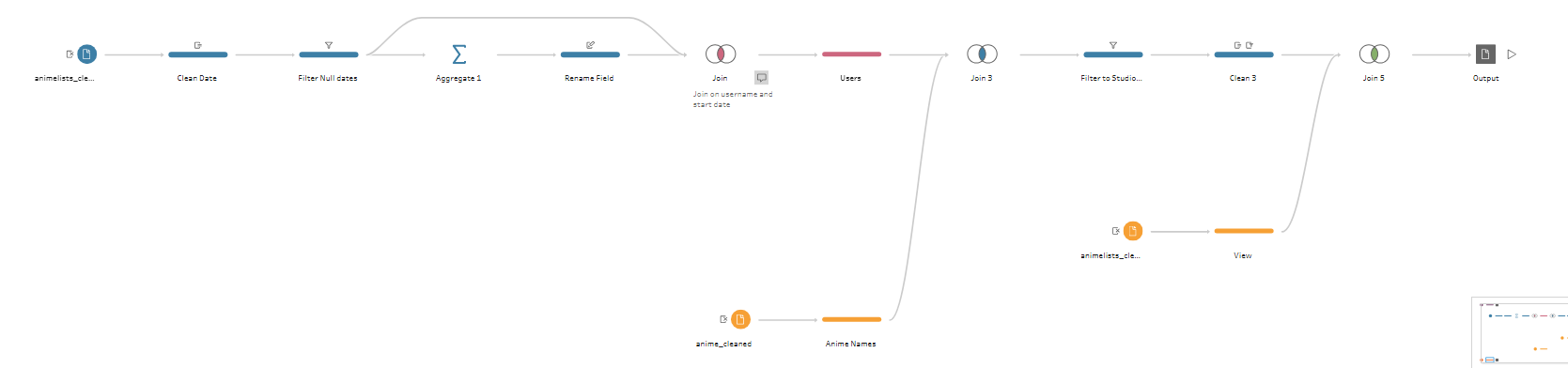
I was only interested in looking at users whose first record was a Studio Ghibli movie so I filtered for these users and then joined back to the original data.
I found a total of 1,165 users who's first input was Studio Ghibli.
Challenges
- The longest part was the data preparation, however, this was mainly due to how slow Tableau Prep was being rather than any technical difficulties.
Sketch
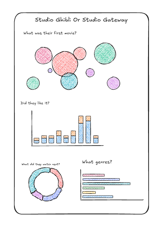
- Since it was an designed to be an infographic, I had wanted to incorporate different Ghibli icons into the charts.
Final Dashboard
The link to my dashboard is here.
