The final day of dashboard week and our final challenge was to create a C-level (chief executive level) dashboard using data on Kickstarter projects from Kaggle. This dashboard had to be compatible for both mobile and desktop use.
Like all the days previously, I spent a long time planning this dashboard, and thinking my design out to a T, so that when I came to build it, I would have a clear direction on what I was doing.
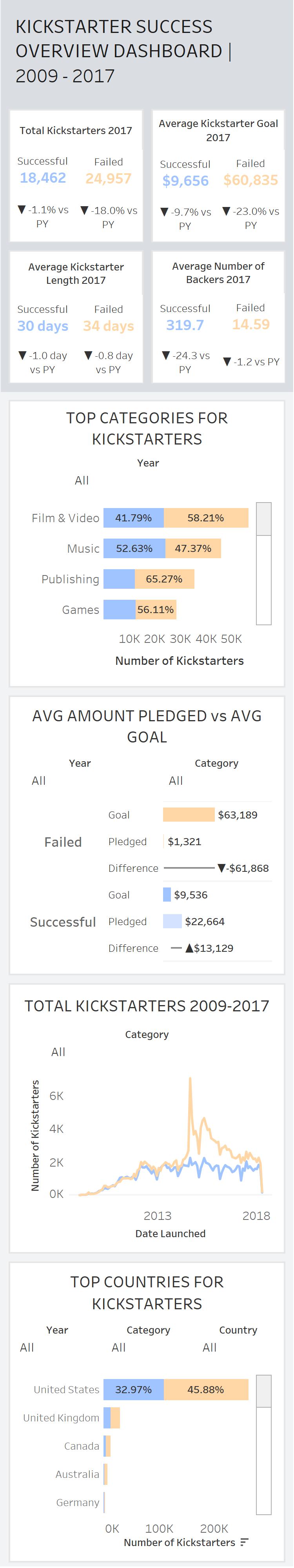
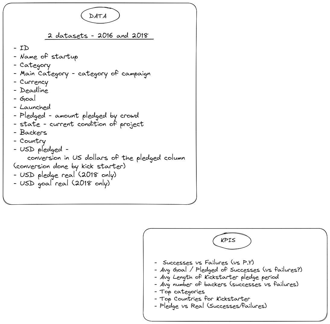
I started by having a brief look at the data, to get an idea of what was in it, and what sort of story I could tell with it. I wrote out all the fields and them came up with a user story based on what was there:
As a C-level executive in charge of a that makes investments in Kickstarter projects, when thinking about what Kickstarter projects to invest in, I want to know what factors lead to successful Kickstarter projects, so I can make better judgments on what projects to invest in.
From there, I started planning out the KPIs and fields that I wanted to incorporate in my dashboard.
After this initial planning was done, I had a look at some inspiration of other dashboards, and then spent a while looking through different color palettes to get an idea of what I wanted to use in my design. I then moved on to planning my dashboard. I sketched up a plan for both my mobile and desktop view.
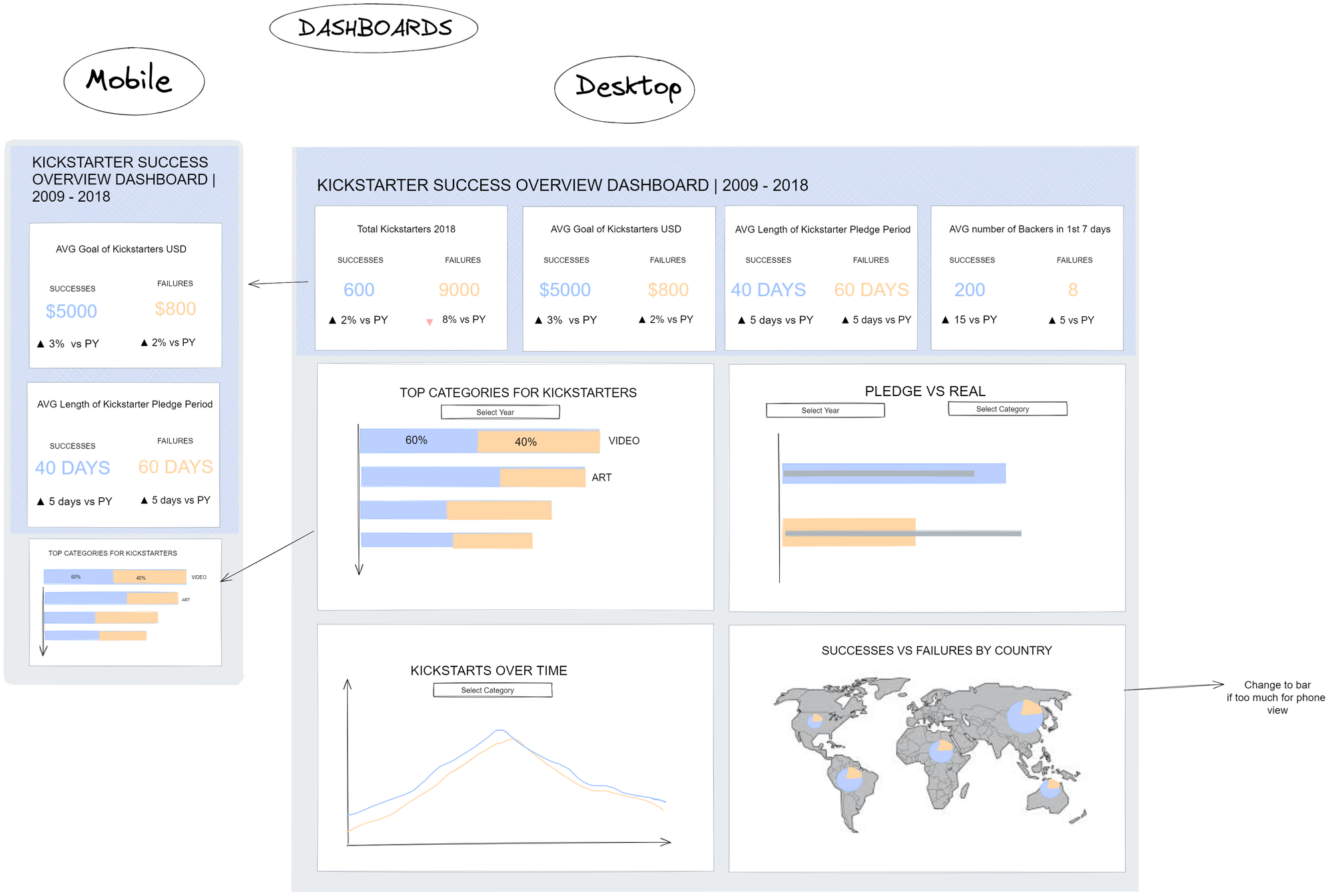
Once I had this all sketched up, I moved onto building the dashboard in Tableau. There were a few things that initially I had thought of doing, that then didn't transfer well because of the data structure, and sizing of the mobile dashboard view. I scrapped the bar-in-bar chart in favor of a much snazzier chart which I had built in a Workout Wednesday challenge, which I felt better represented the data. I also scrapped the map as it didn't work well with mobile view, and opted for a bar chart. I spent a long time creating all my KPIs as for each KPI box, I needed 4 different sheets.
Finally I moved onto putting all the bits of the puzzle together and creating the dashboard. I started with the desktop view only and got this looking as close to my plan as possible. I then tested it out in mobile view, and started making edits to customize the mobile view. The trick with this is to wait to make any mobile edits until you are 100% sure with the design in desktop, as once you start customizing the mobile view, the edits won't transfer to the desktop layout.
Today went surprisingly smoothly which I was relieved about as I don't have much energy after how intense this week has been! I feel like dashboard week has really given me the freedom to be creative with the design of my work, try out new things, and push myself further than I have done so far. I'm really pleased with my designs and feel like they are testament to how much I've learnt whilst being at the Data School.
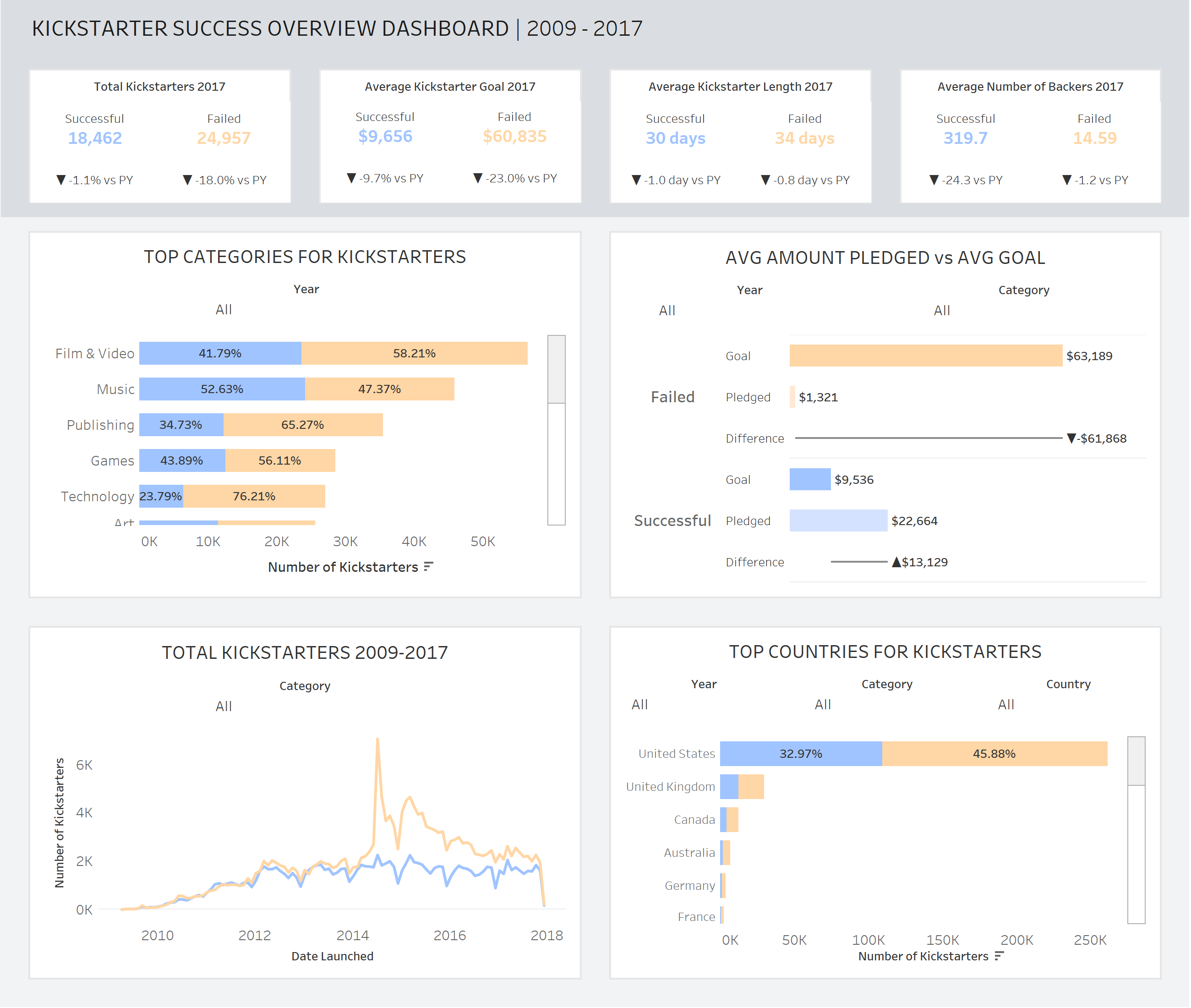
Here's my finished dashboard from today:
Desktop view
Mobile view