


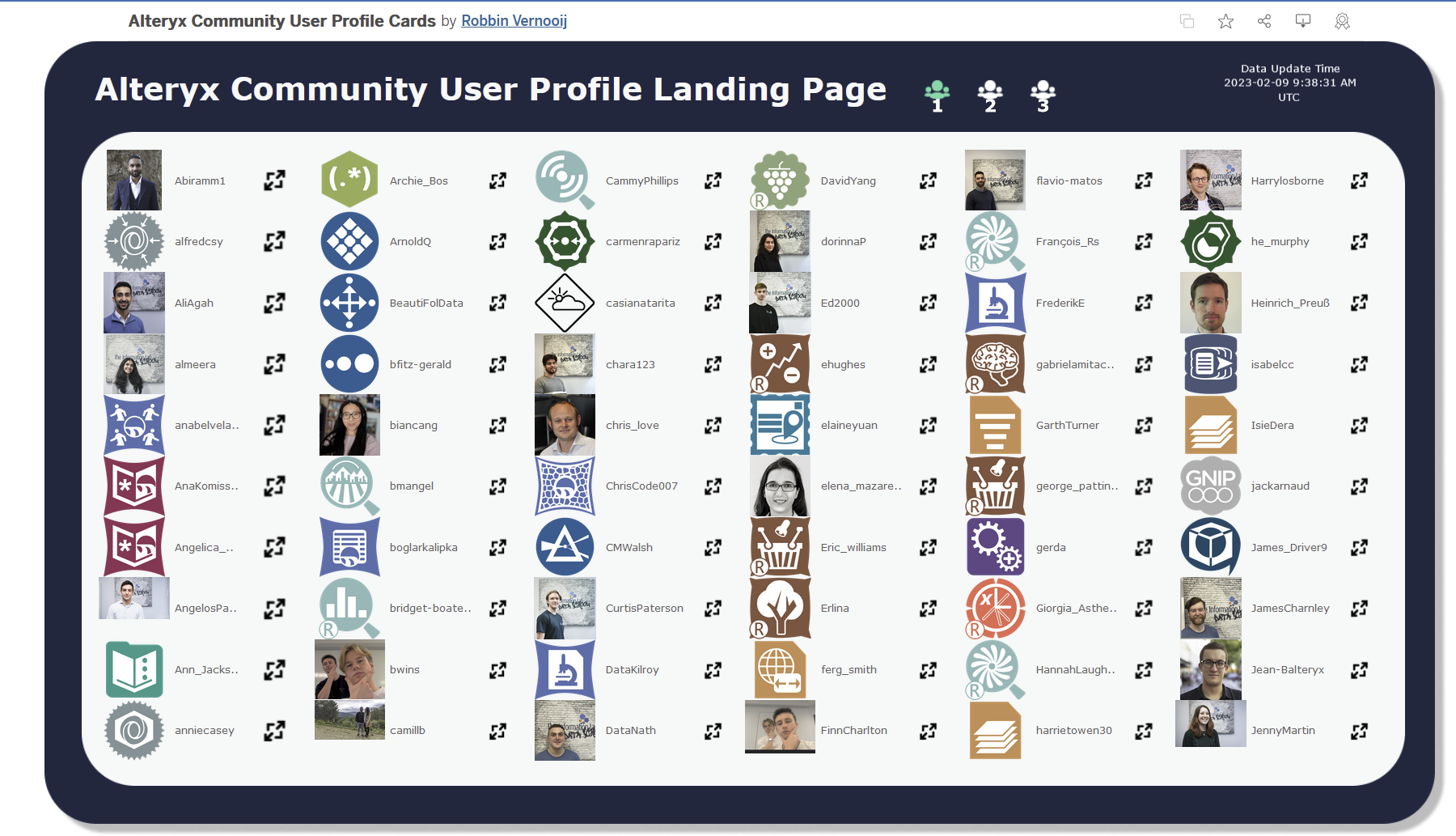
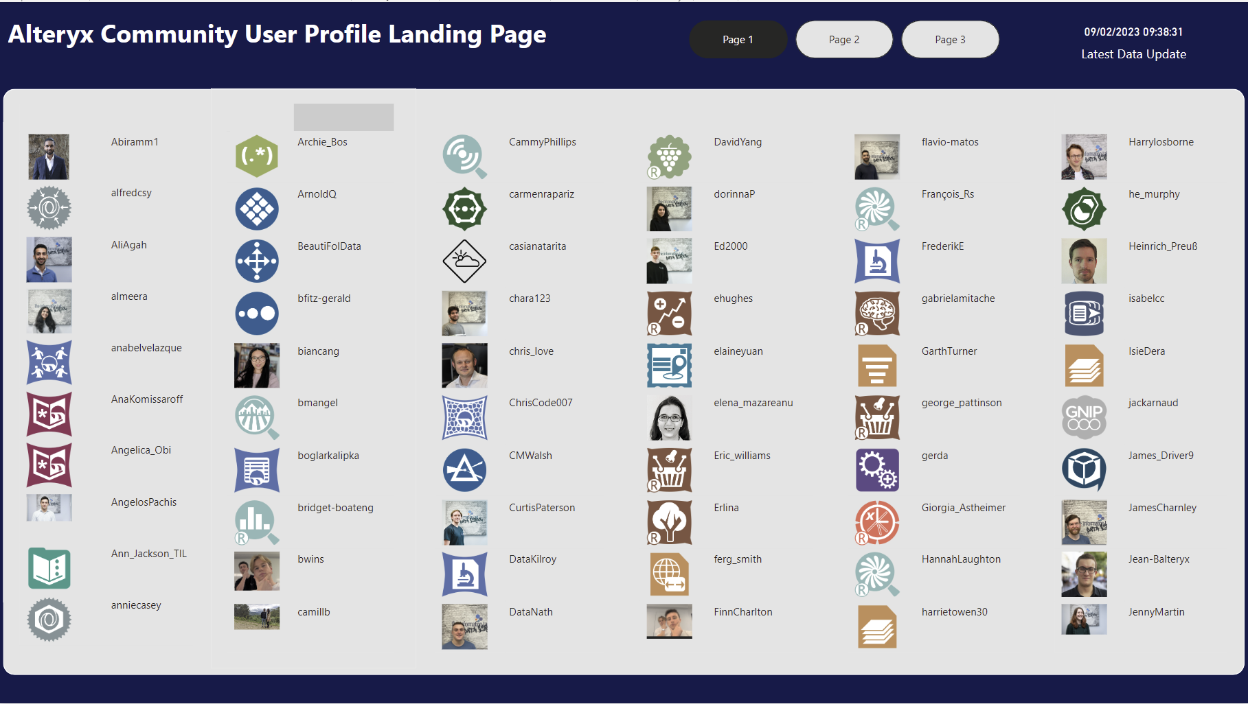
The task for today was to recreate a Tableau Dashboard in PowerBI. I opted for Robbin Vernooij's Alteryx Community Contribution Tracker. It consists of a landing page and a profile deep dive which can be accessed by selecting a person on the landing page.
My plan for the recreation was as follows:

In terms of replicating the landing page, splitting the table into columns was difficult so I ended up using Alteryx to create a column number I could filter on. I tried in DAX for about 10 minutes before deciding in the time it was more reasonable to prepare it with a tool I was more familiar with.
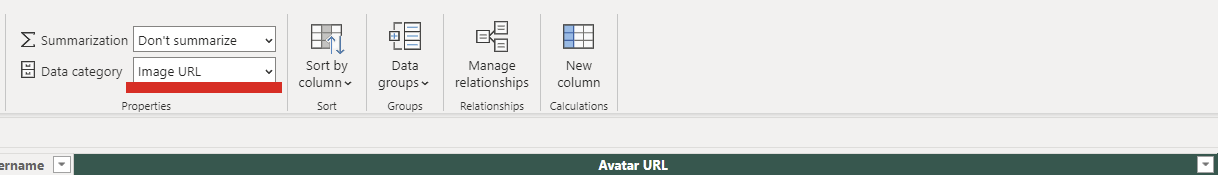
Changing the datatype of the image URLs in the tables from the data view was straightforward and went a long way to aiding the recreation with regard to profile avatars and badges.
The landing page was honestly straightforward. The icon to follow the link was not achieving much so I had two versions one with it included and one with it replaced so that I had more space for the full usernames without text wrapping.
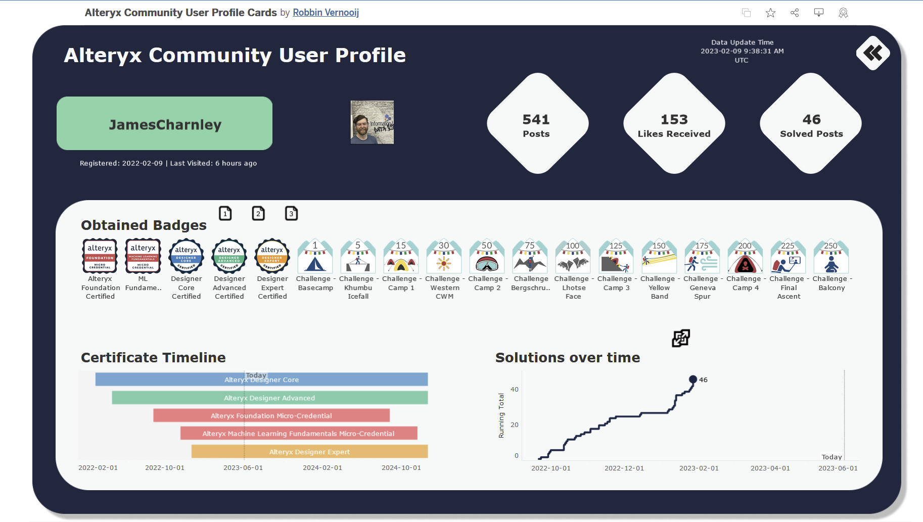
I then had to build out the relationships to other tables for the profile deep dive. They were 1 to manys when it came to the base table which was one row to each profile.
PowerBI automatically detected this and configured the relationships accordingly.
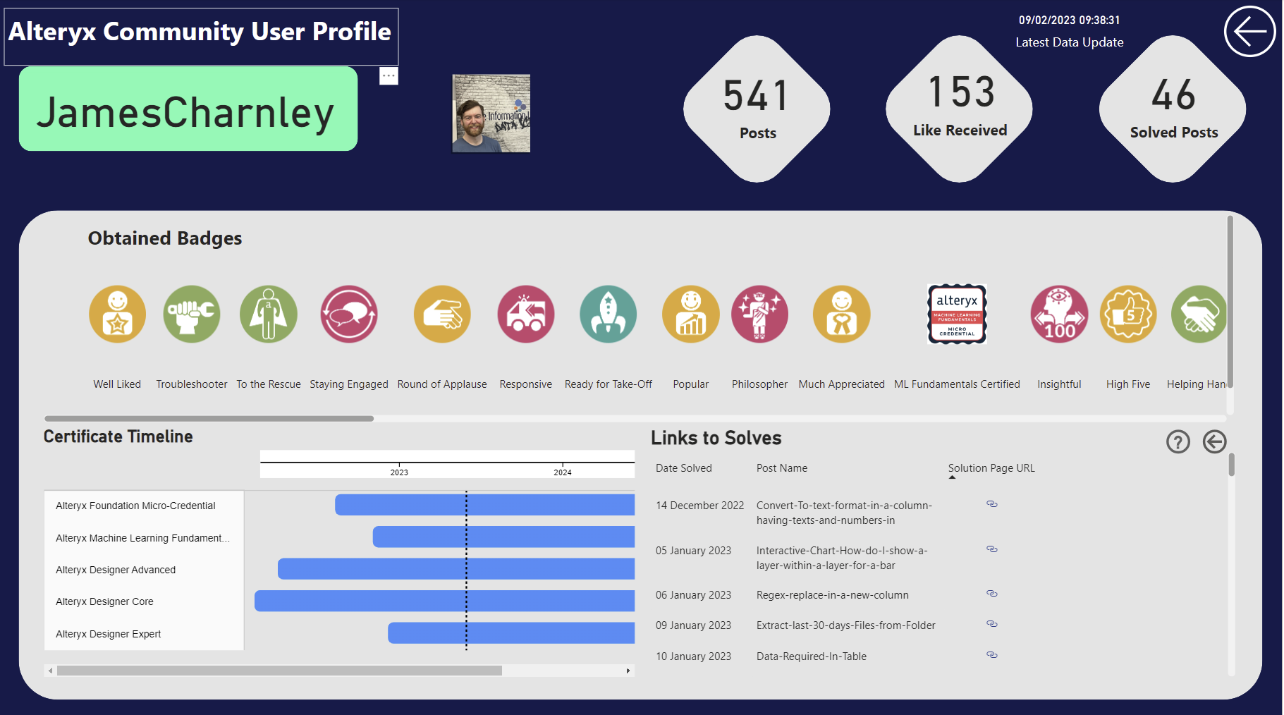
Running totals were easy to make with quick measures like Tableau table calculations so that was a positive when making the line chart. It is a slight drwaback that PowerBI does not have index calculations as part of the quick menu. This led me to ultimately conceed that I could not sort the badges as I had wanted to.
PowerBI does not have a gantt built in which is very frustrating to be honest - I think the axis at the top is ugly and it had limited formatting options hence the white backgrounds for sections. I was also unable to color the bars for the name of the certification as the legend was bugging out a bit. I did my best in the circumstance but gantts are ones to avoid in my opinion in PowerBI.
More positively, formatting was a cakewalk in PowerBI and making curved shapes was pretty simple as was arranging the items in roughly the right area.
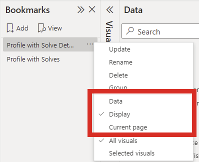
The final things were the dynamic zone visability of the solves detail table. The problem I had with this is that you are meant to use buttons to return the view to a bookmarked state. So I made two bookmarks one for the layout with 2 charts and the other with the detail table. But toggling between the buttons removed the chart but did not revert the formatting. I tried updating bookmarks and turning off current view options but none worked so I scoped it down to just replace the chart with the detail table with the toggling buttons. The other thing to note is to turn off the data box in the bookmark configuration to ensure that when a button is selected the profile selected filter does not reset to the profile that was active when the bookmark was set:
The last thing I attempted was the parameter that linked the two "reports". In Tableau this is completed with parameter actions. In PowerBI I was amazed at how straight forward it was. I simply dragged the username into the drill-through filter section of the profile report which automatically generated a back button, I then found out you can trigger the drill-through with a right-click on the landing page report.
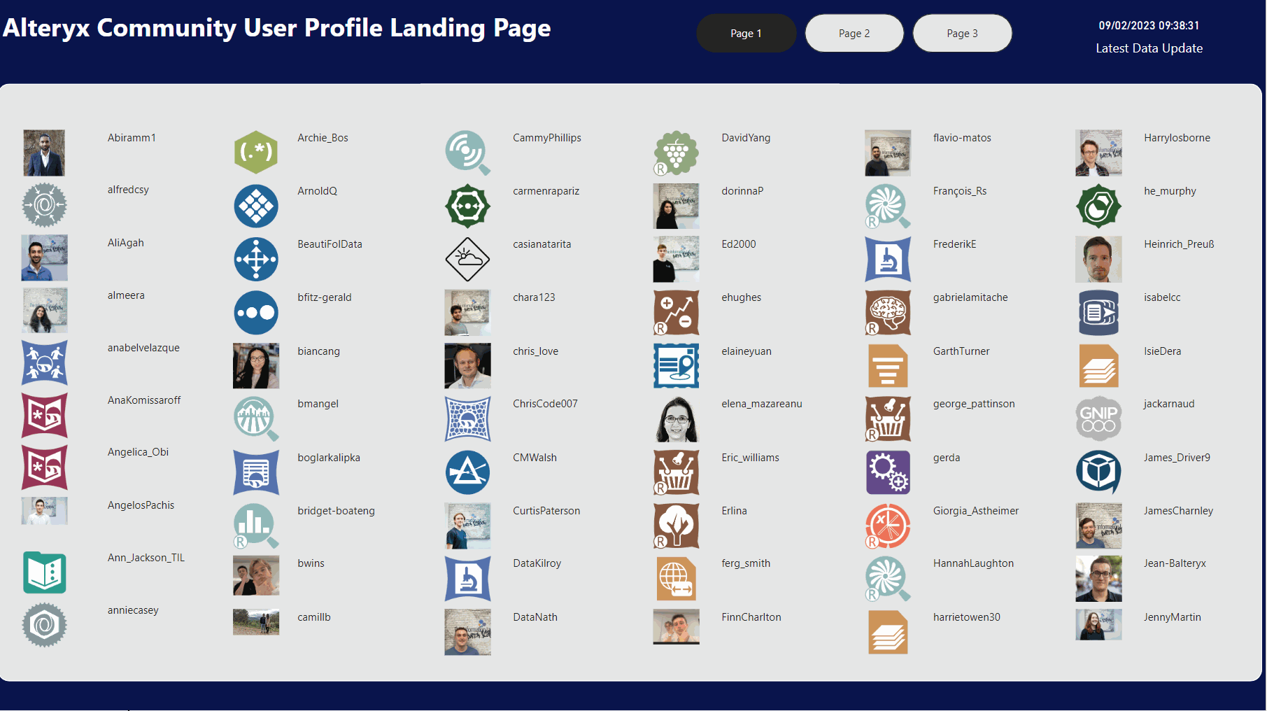
This is what motivated me to streamline the landing page by removing the icons.
Overall, I was really happy with what I produced today, bar a few aspects (index and gantts) I would say that the dashboard was probably easier to make in PowerBI than in Tableau.
The Recreation should be accessible here: