For Day 1 of Dashboard Week we were given some data and tasked with making an app, an accompanying high level dashboard and a blog reflecting on the work by 3:30pm (A busy start to the week!).
Preparing the Data
The first step in my analysis was to prepare the data. The data was split up into separate files for each month. I decided to union all the separate months of files into three tables with the same structure: street crimes, stop and search, and outcomes. I needed a directory tool to help me with this, so I made sure the files were stored locally, as I couldn't point the tool to an area in the shared drive. Then I used a dynamic input tool to bring in the data and save the fully unioned tables so they could be used in the app.
Creating the App
Once the data was prepared, I created an app to make it easy to analyze. However, I quickly realized that the stop and search data was separate and could not be joined to the other data. Instead, I focused on the street crimes data. I wanted to bring in the outcome data, but I noticed that some crimes had multiple outcomes, which made it more complicated. Therefore, I chose to keep it simple and used just the street crime table that had the latest outcome column.
While making the app, I encountered a problem getting the map input tool to work. Luckily, I found a solution on a community post (https://community.alteryx.com/t5/Alteryx-Designer-Desktop-Discussions/Error-When-Adding-Map-Input-Tool/m-p/1070231/highlight/true#M264669). After that, the app worked as I intended, except for a slight date parsing error, which I corrected by sending the dates as strings to Google Sheets and letting Tableau automatically detect and switch back to dates.
Creating a Dashboard
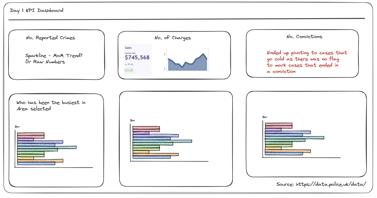
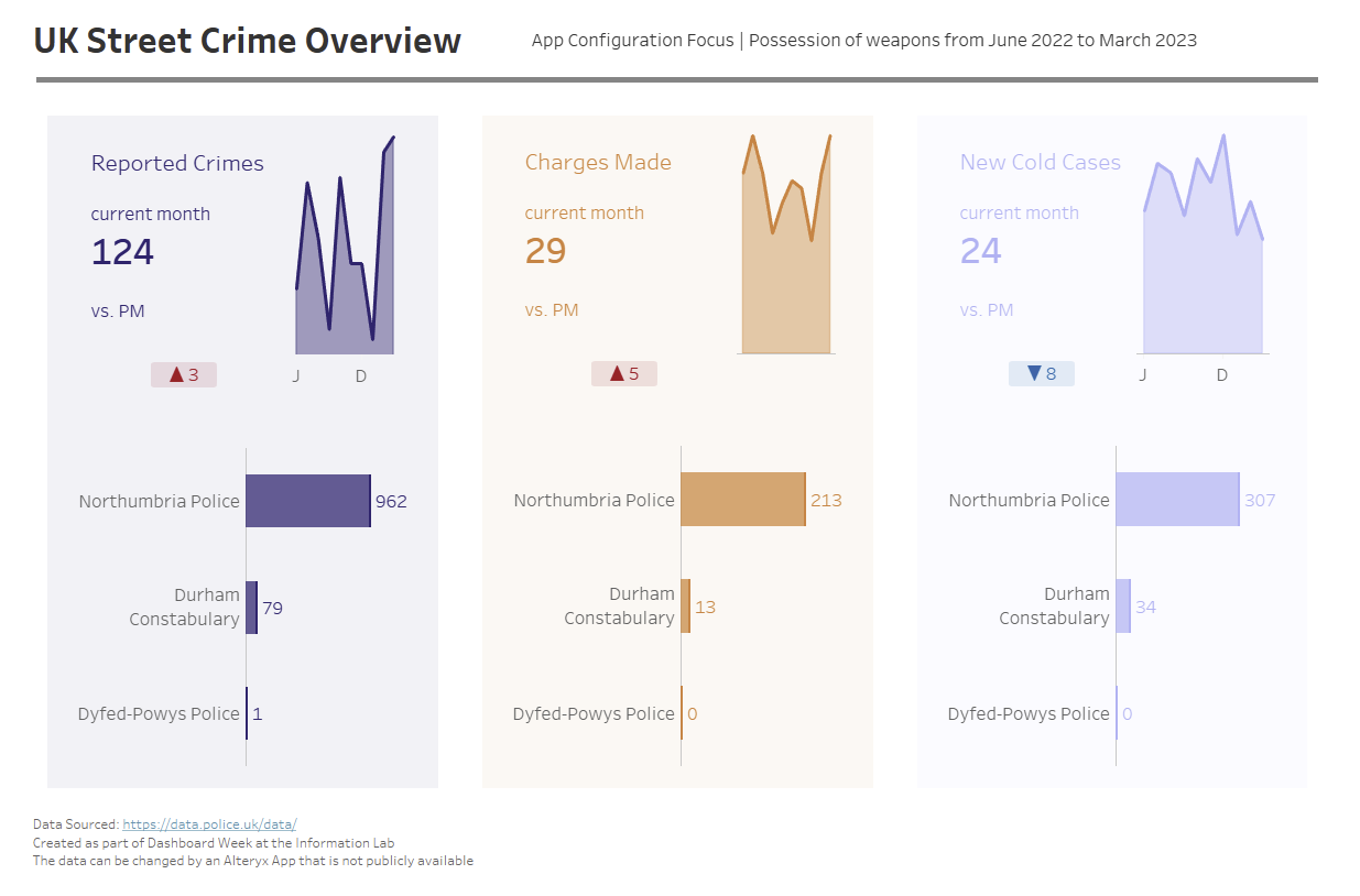
To visualize the data, I created a dashboard. I knew I wanted to keep it high-level, so I came up with three key metrics to track:
- Reported crime count
- Count of crimes that had charges that followed
- Count of crimes that were not pursued (I termed them "cases that went cold").

I wanted to create KPIs that would track performance. If I had more time, I might have made some of the KPIs proportional/percentages. I opted to create some of them with LODs for the most recent levels of the measures. Opting for parameters would have given a user more flexibility to explore, but I have made them this way in the past and wanted practice with LODs. Finally, given the dashboard was high level, I did not want a map or a complex chart. I wanted bar charts of some description, and splitting up the crimes by who was responsible for dealing with it made the most sense.

Although the dashboard might look barebones, I was quite satisfied with it live updating as I changed the app specification. Use-case wise, I could foresee the dashboard and its accompanying app being rolled out for a local politician to explore how crime has developed in the local area and what the “conversion rate” is from reporting a crime to charging someone for it. It also helps monitor how many crimes are not being pushed to conclusion for whatever reason.
Ultimately I am happy that I did not get caught over-scoping and delivering an incomplete dashboard. Having read a few blogs of peoples first efforts on Day 1 of Dashboard Week I am content with what I produced.
