


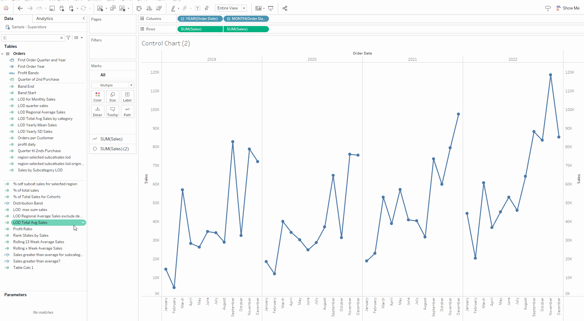
Today's blog is a breakdown of how I created a control chart with Level Of Detail (LOD) calculations. Below is a copy of the finished chart:
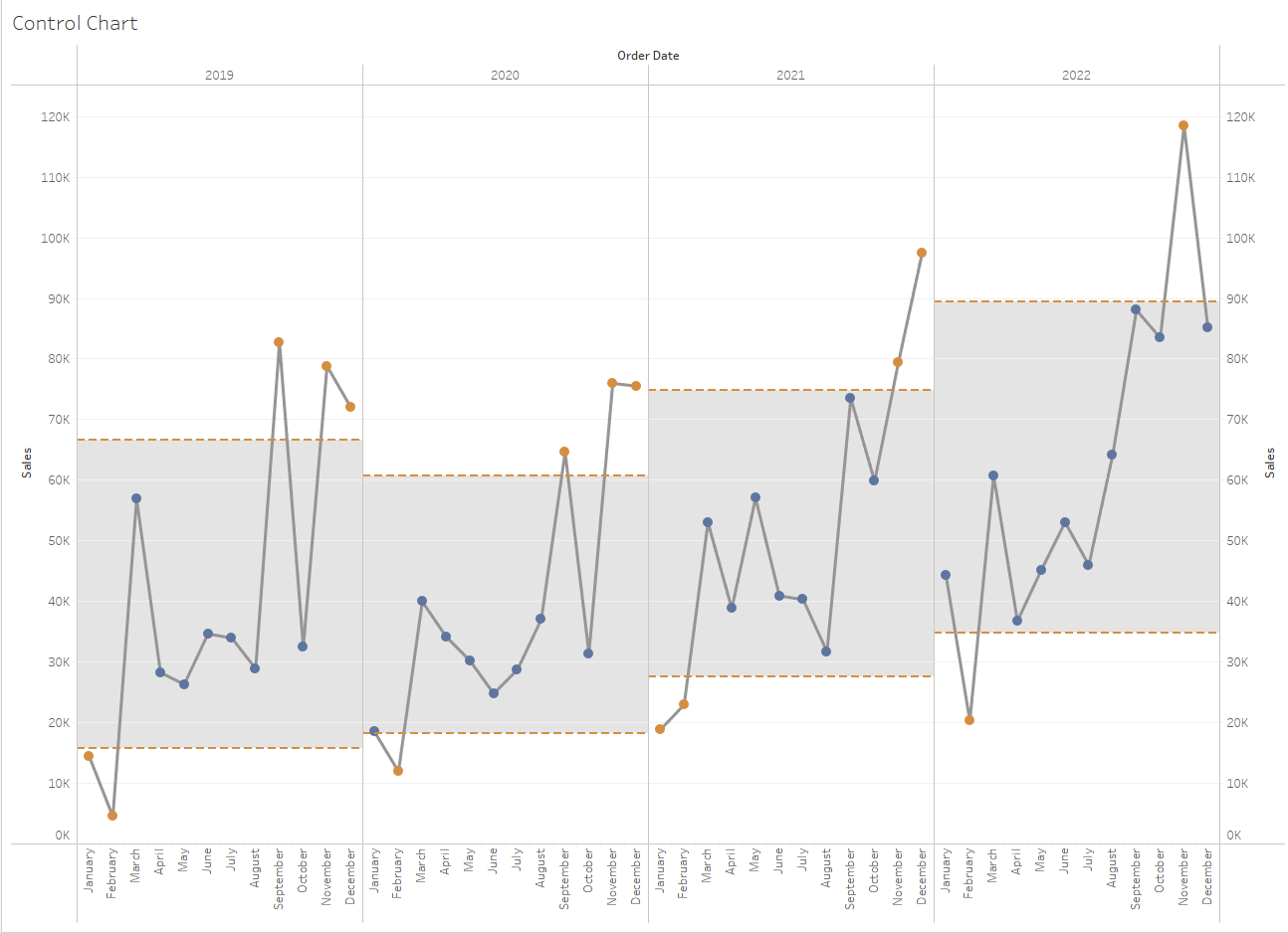
The chart is useful because it identifies outlier data points. What we have on the bottom of the chart is a dimension for order date. Note year at the top subsequently broken down into month. This is achieved with the following set up:

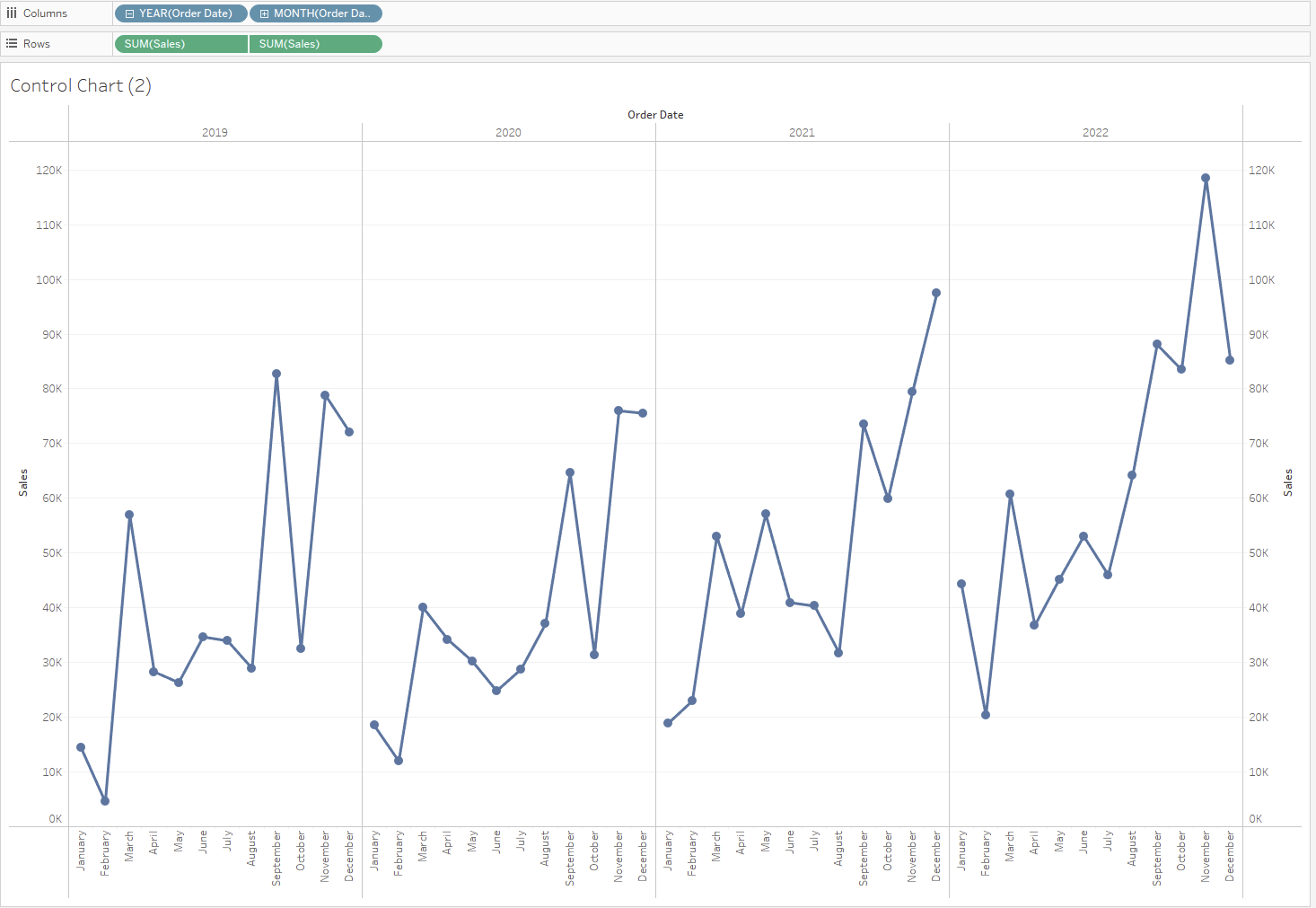
Right click drag is useful in this instance to specify how you want Tableau to handle the date. The two axis up each side is an indication of the need for a dual axis - both are sales so that is straightforward and the aggregation we are interested in is the sum(sales). For the amount of sales done each month of a year. One of the marks should be line and the other circle for the desired mark pattern. Giving us:
Now we are going to have to start using LODs to add the flagging elements.
Because we are looking at both month and year we are going to need to nest the LODs. First thinking about our desired outputs our bands are centred at the mean so we will need a calculation for the mean sales in a year.
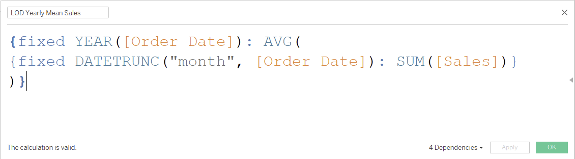
This reads as "For each year, give me the average of the sum of sales for each month of the year."
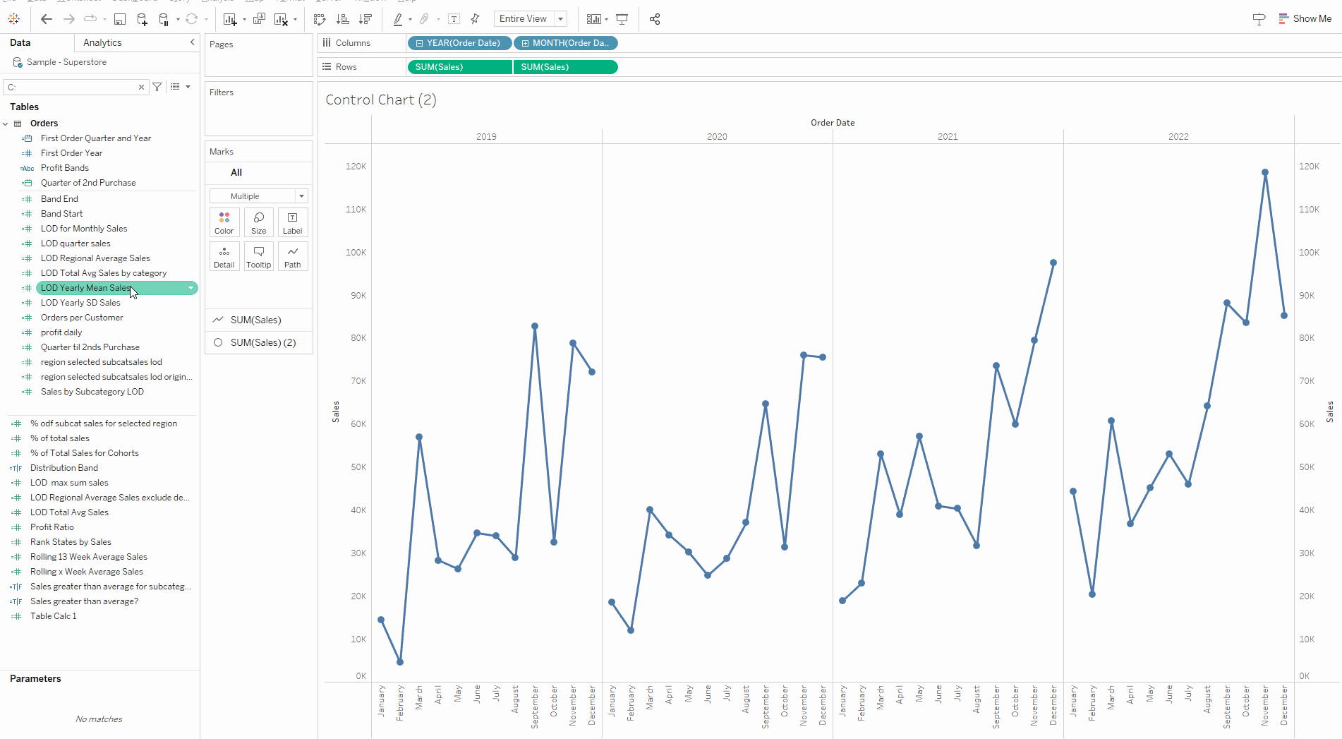
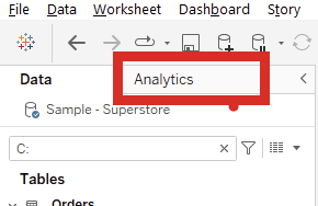
We can check whether the calculation is correct using reference lines:
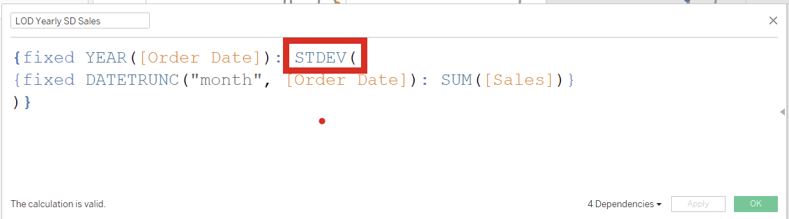
Now we have checked that the LOD is calculating correctly we need to get the figures for the reference band. It's size is +- 1 standard deviation. So we can duplicate the previous LOD with 1 ammendment:
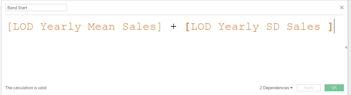
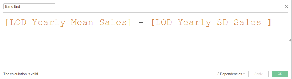
Now we have all the figures we need we just need some conditional calculated fields. First calculating the start and end point of the bands:
Now we can use those points to create a boolean statement to color the points that fall out of the band:
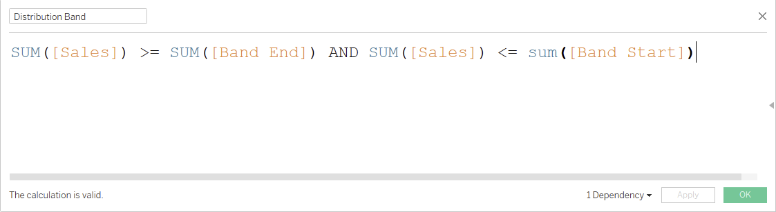
We drag this boolean onto the colors card for the circle marks. Returning:
Finally we can make the bands with the analysis tab. First make sure your start and end points for the band are added to the detail section of the all marks card as we are going to need to use them to specify band size.
Select Reference Band towards the bottom and drag it onto pane (i.e. compute for each year seperately. This brings up the reference band menu:
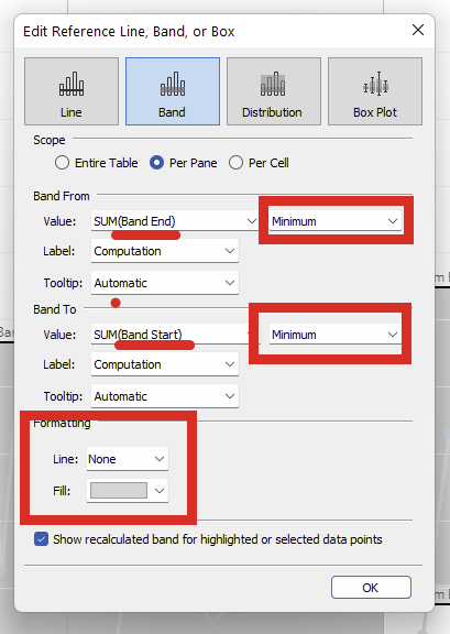
We use the values from the Band start and end as our value. I specify minimum here to stop the values aggregating over multiple rows. Effectively; for each year take the minimum band start (the for each year part is satisfied by the scope per pane option).
Formatting options at the bottom give an opportunity to customise and return the final product:
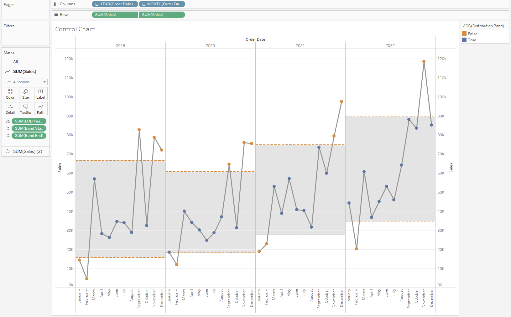
That brings to an end the guide for creating a control chart that highlights outliers.