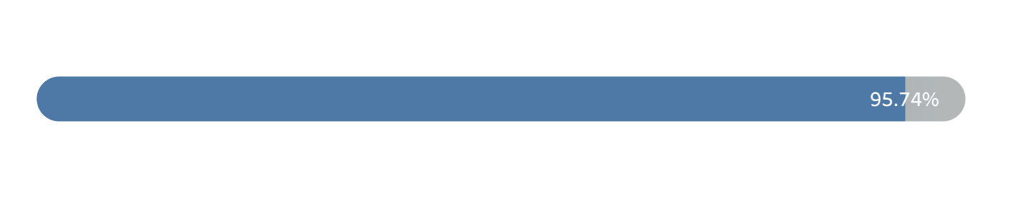
If you're looking to build a progress bar like the one below, you're in the right place! Let's walk through the steps for creating a rounded bar that shows the progress in 2023 Sales relative to 2024 Sales (using the Superstore dataset).
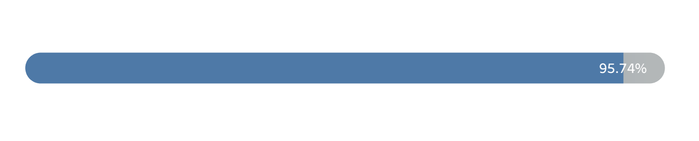
If you're wondering why we're comparing 2023 vs 2024 rather than more recent years, this is because you need the standard to be a higher value than the value of that which you are tracking. Otherwise, you exceed 100%, which becomes meaningless for the purposes of this visualization.
Starting off, we need to create the necessary calculations to get the sales for each year that we are comparing. Create the following two Calculated Fields, which give us the sales for 2023 and 2024, respectively.
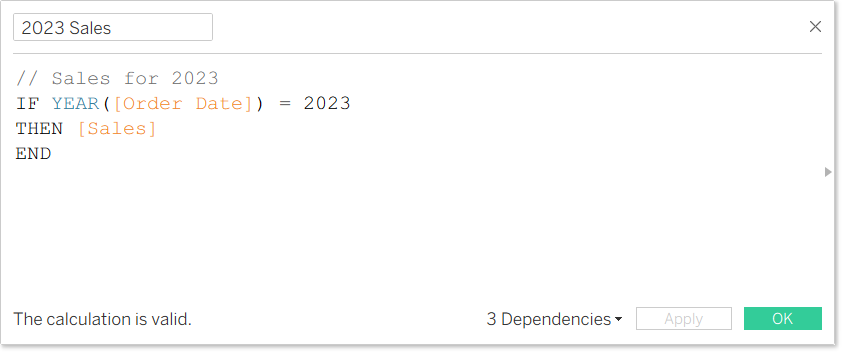
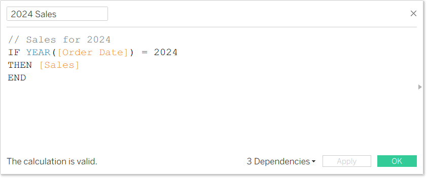
Once you have those, change the Mark type to Line.
Next, drag Measure Values from the Data Pane to Columns.
Before you drag anything off the Measure Values card, double click within it and type 'MIN(0)', then click enter. This will give us the starting point for the bar, with the end point being 2023 Sales (think 0% and 100%).
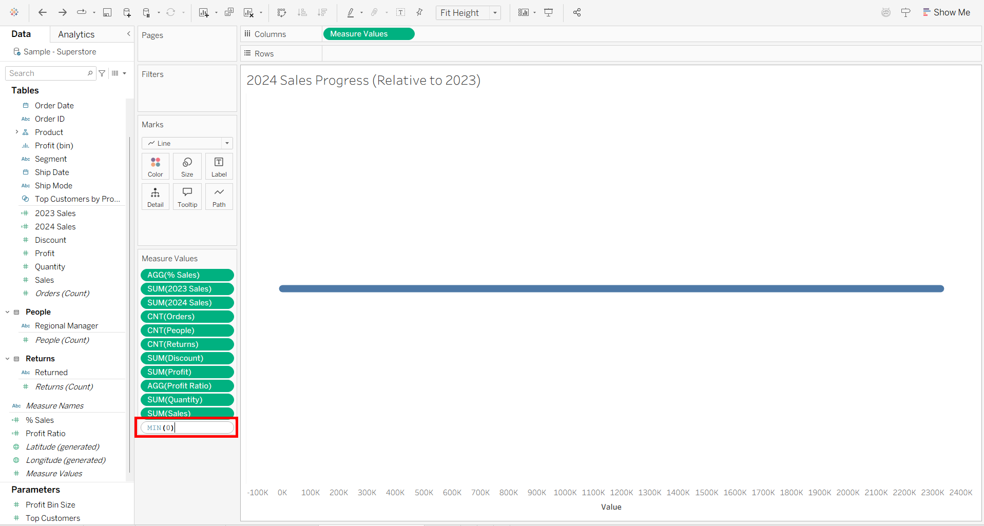
Now, drag everything out of the Measure Values box except your Min calculation, SUM(2023 Sales) and SUM(2024 Sales), which will be representing the actual progress percent.
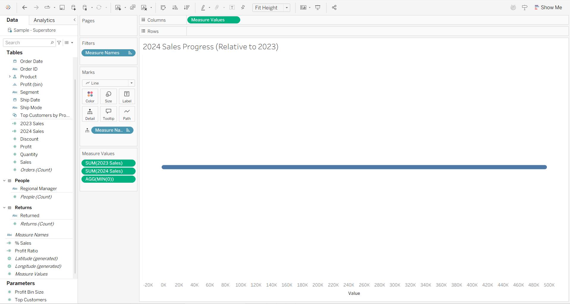
And while holding down Ctrl, choose and drag AGG(MIN(0)) from the Measure Values card to Size. (Holding down the Control key allows the mark to be duplicated rather than just moved). This is so that the bar is sized more appropriately. Still, feel free to enlarge the bar using the Size field.
Now, move Measure Names to colors (it is currently on Detail).
To get the bar look we're expecting, rearrange the pills on the Measure Values card to have SUM(2023 Sales) followed by AGG(MIN(0)) and SUM(2024 Sales). You should now see this:
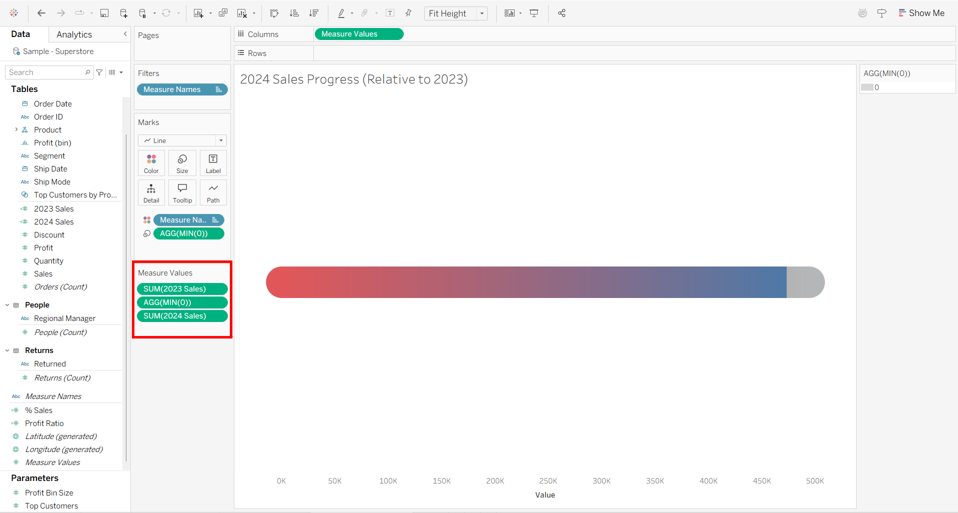
Next, edit the colors so that MIN(0) is blue and matches 2024 Sales, and pick a gray/neutral color for 2023.
We're almost done, now we just need to format the label to indicate the progress. To do this, create the following Calculated Field:
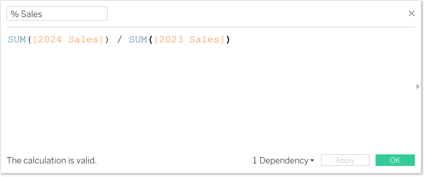
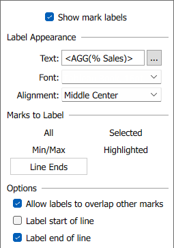
You might also need to format the values to get your desired number of decimals. Drag it to Label and edit so that it is Middle Center aligned and only 'Label end of line' is checked. Like so:
And done! You should have a bar that looks like this: