


If you've built a Donut Chart in Tableau before, you know that it is essentially a Pie Chart covered by a centered circle. (If you're wondering how to make a Donut Chart in Tableau you should check out this blog). While they may look great on your dashboard, when you click on any of its segments, the underlying pie chart is exposed.
There are different ways to bypass this behavior, some of which you can learn about here. This blog (inspired by Kyle Yetter's Workout Wednesday) will walk you through how to achieve this by creating what is essentially a fake filter.
For this example (following the WOW), I've set it up so that clicking on a Category donut chart filters a Subcategory donut chart--all with Superstore data. Let's get started!
Step 1: Build the Donut Charts
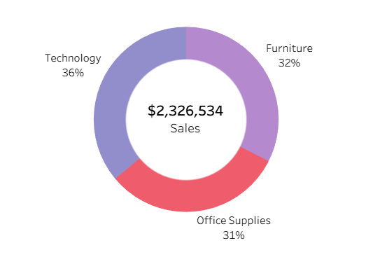
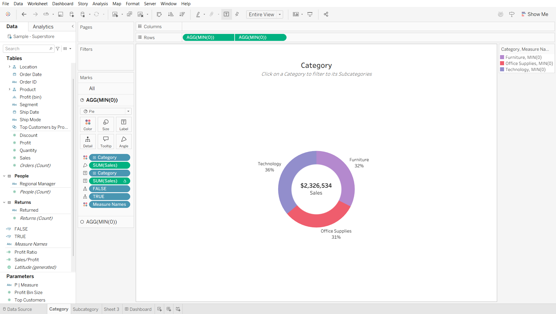
Start by building the Category and Subcategory donut charts. For the Category outer donut chart, you need to set the Mark type to Pie Chart, set Category on Color and Sales on Angle. For the inner circle, set the Mark type to Circle and add Sales to Text. Adjust and format the label as necessary.
For the Subcategory outer donut chart, you need to set the Mark type to Pie Chart, add Category to Color, and Subcategory to Detail. Then click on the icon to the left of the Subcategory pill and change it to also add it to Color. Then create the inner circle.
Edit the colors for the subcategories so that they go with the broader categories.
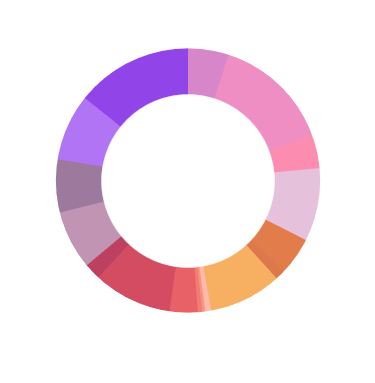
I later added Sales and Category to Text to indicate the total sales for the filtered category.
Step 2: Create a "Blank" Sheet and Dummy Fields
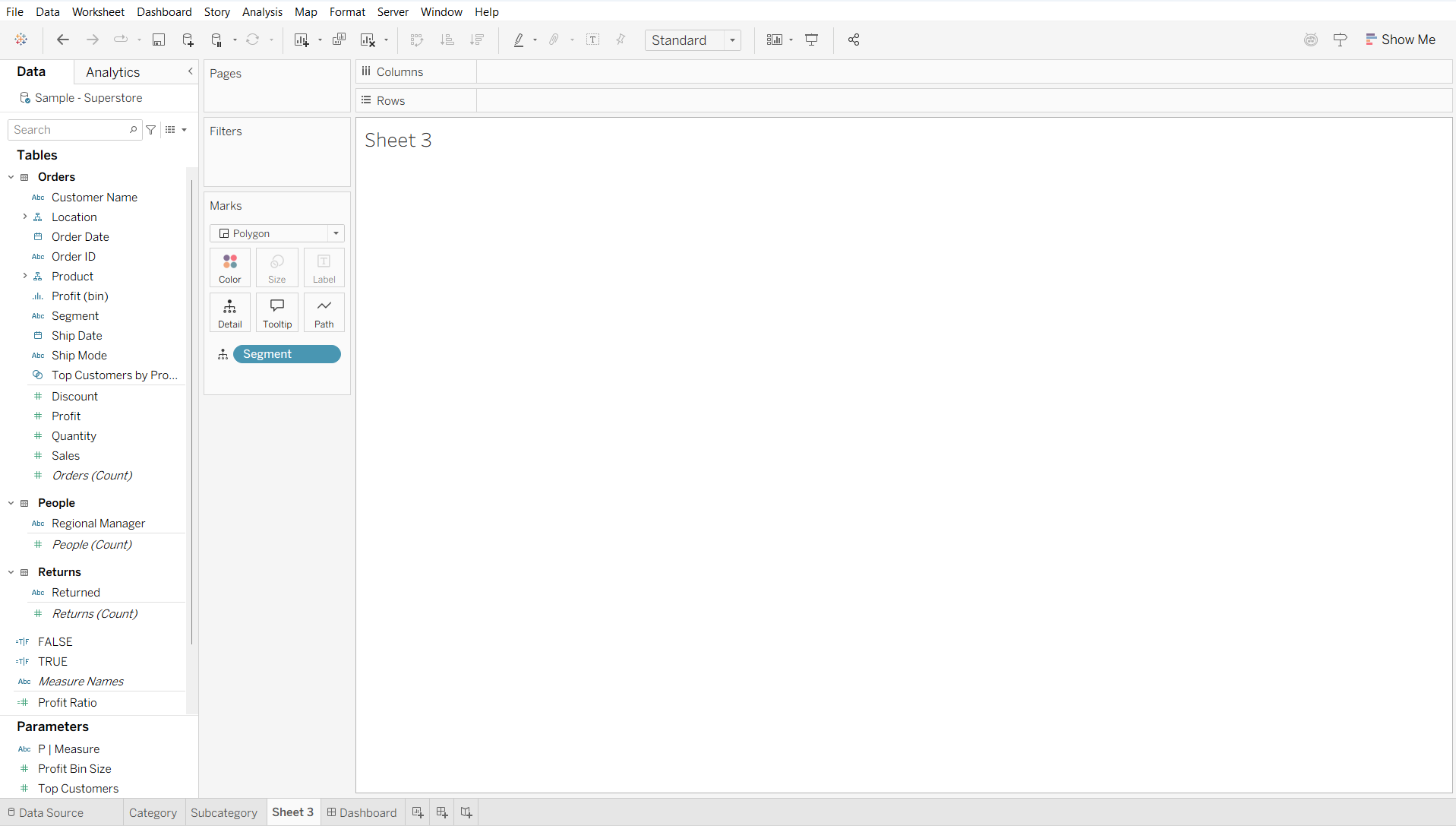
Before adding the Category and Subcategory donut chart sheets to a dashboard, create a third sheet. Add Segment to Detail and change the Mark type to Polygon. This will allow us to have a (seemingly) blank sheet to target with our filter.
Additionally, create two calculated fields to prevent the highlighting of the pie chart:
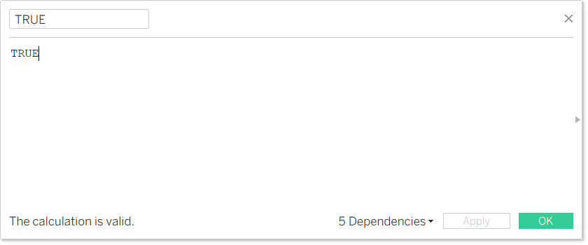
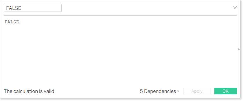
Add both of these to the Detail card of the Category pie chart.
Step 3: Create the Dashboard
Now go ahead and create your dashboard, incorporating both donut chart sheets and your "blank" sheet (Sheet 3). (Adding it is necessary because you aren't able to reference sheets that aren't on your dashboard when creating Filter Actions).
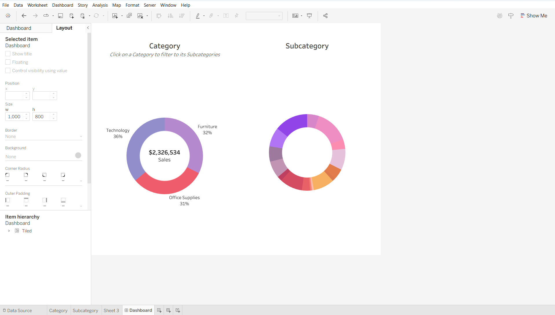
If you want to avoid being able to see Sheet 3 as much as possible, you can float it and adjust the dimensions to make it tiny.
Step 4: Set Up the Filter Actions
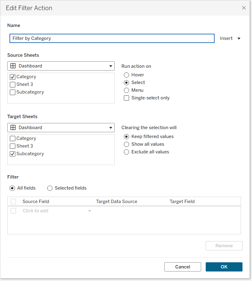
To get to the desired Category-to-Subcategory filtering behavior, go to Dashboard > Actions and create a Filter Action. It should be set up like this:
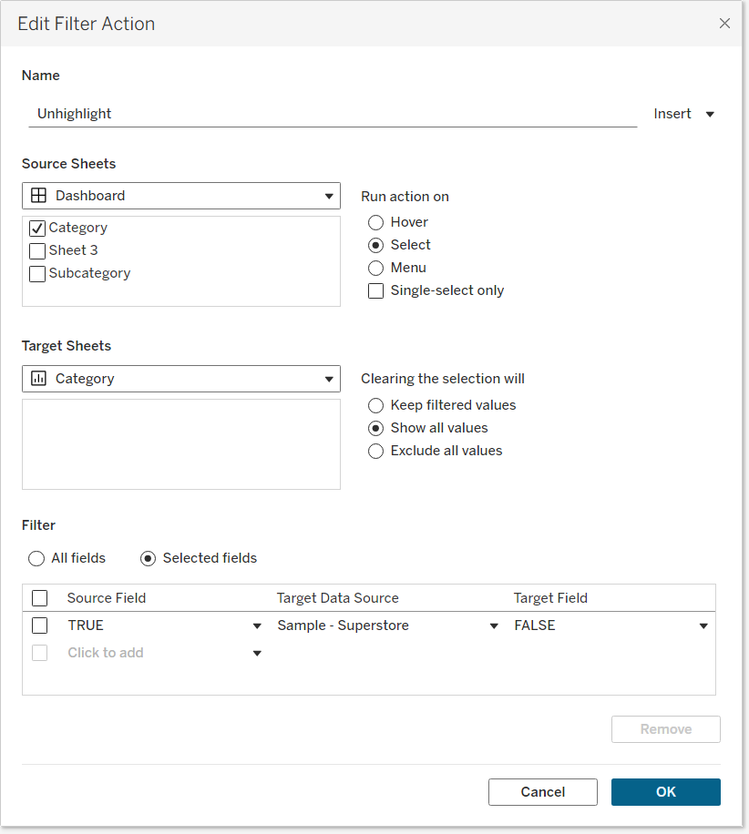
Now it's time to set up the action to remove the pie chart filtering. For this, create a new Unhighlight Filter Action configured like so:
And done! Click on a piece of the Category donut chart and you will see the Subcategory donut chart filtered but the pie chart underneath the Category donut chart won't show. Try it below!