


Brief:
Use the FooDB website to build a visual aid to educate the public about food and their:
- Nutrients
- Taste
- Content
- Enzymes
- Health effects
Brief Requirements:
- Use the FooDB CSV file as your base information
- Design a single page visualization that fits on a 1920 x 1080 screen
- Modern Interactivity is encouraged
- Click actions & image button slicers, DZV & Bookmarks
- NO DROP DOWN OR LIST FILTERS/SLICERS
- Tableau or Power BI
Data:
29 tables of data available. Of these 29 tables, 5 were empty.
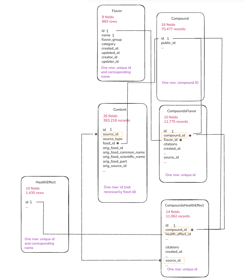
After investigating the data, this is the schema that I created.
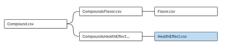
I used relationships in Tableau Desktop.
My approach:
I wanted to provide the user with an interactive experience to allow them to find out about the flavours, compounds and health effects of different foods.
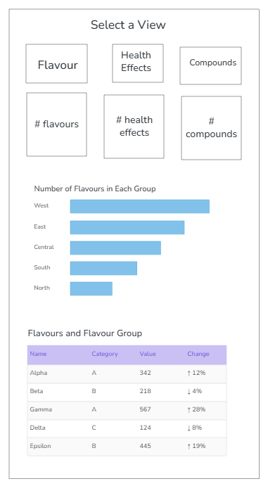
Dashboard:
See below to view my final dashboard!
