


For our last day of dashboard week and final day of training, we were tasked with creating a dashboard inspired by (source….) based on boy band data (source…).
I wanted to do something fun and since much of the data described the appearance of the members of each boy band, I set out to explore the fashion of different boy bands. Since it was a short project (only 3 hours long) there are certainly more details and formatting I would like to add, but I managed to try out some new techniques such as using a background image – not necessarily best practice, but fun for today’s purposes. Since the data I was focusing on described physical objects (clothing types, colours) I set out to solely use shapes and colours to represent the data. I successfully did this via the attire of the mannequin - the KPIs at the bottom only describe what is shown in the image, so all the information can be interpreted without words or charts which I though was quite cool. Here is what I came up with:
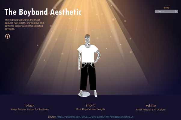
I used LODs amongst other calculated fields to find the most popular shirt colour, bottoms colour and hair length for each band. I then assigned colours and shapes to these fields.
When the user selects a band, the clothing colours and the hair updates to reflect the most popular styles within that band.