


How to use separate colour legend for each separate value.
This blog is inspired by another Workout Wednesday and this time I will show you how to format a table so that each meausre has a separate color legend. As always, I use the old favourite Sample superstore. Let’s begin!
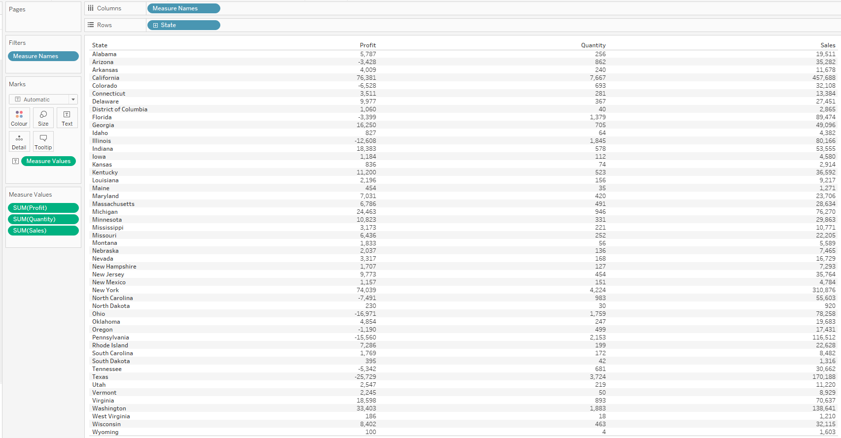
Step 1: I quickly build a table showing all the states and the sales, profit and quantity values for each state. If you need to find out how to do this, I have written a separate blog: How to get the measure names and measure values in view.
Now we have a table that looks like this:
Step 2: Next, I will drag the Measure Value pill to the color shelf. I do this while holding on the control key so I don’t loose the text.
Step 3: Change the chart type to square
Now we have a table looking like this:
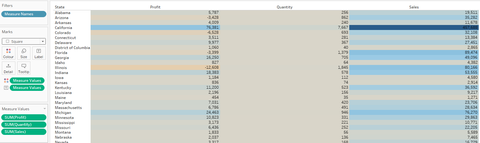
As we can see, there is only one color palette in use. The big difference in the range of each of the measures results in pretty much the same colour for quantity. Lets fix that!
The secret is hidden in the Measure Values pill that lies on the color shelf. I click on it and I click on ‘Use separate legends’.
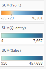
On the side these color palettes appear. Now we can select different colours for each Measure. This is my result:
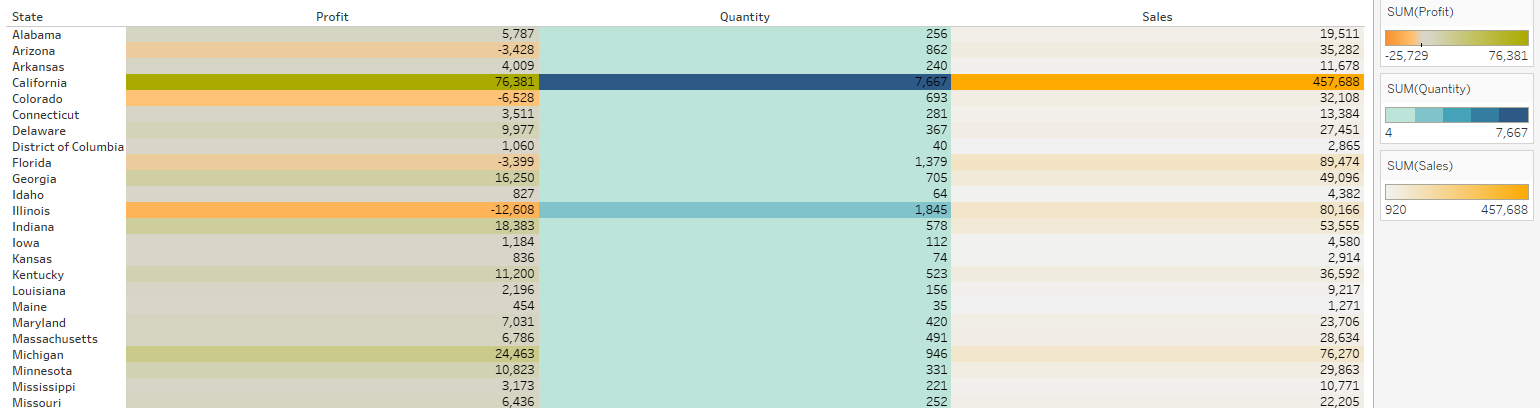
And Voila! Now you know how to enable yourself to use different colours for each measure.