


This week’s client project was a fun one: I partnered with Infotopics (Apps for Tableau), the team behind several powerful Tableau extensions, to showcase their Power KPI in a production-ready dashboard. The brief was simple but exciting—use the extension’s wide feature set to turn a standard KPI header into an interactive insight engine.
What is Power KPI?
Power KPI is a Tableau extension that lets you go beyond static numbers. Instead of a single figure and a sparkline, you can:
- Drill into a KPI to explore the drivers behind it
- Compare periods and targets with flexible thresholds
- Trigger actions that filter or highlight other views
In short, it turns KPIs into entry points for analysis, not just scorecards.
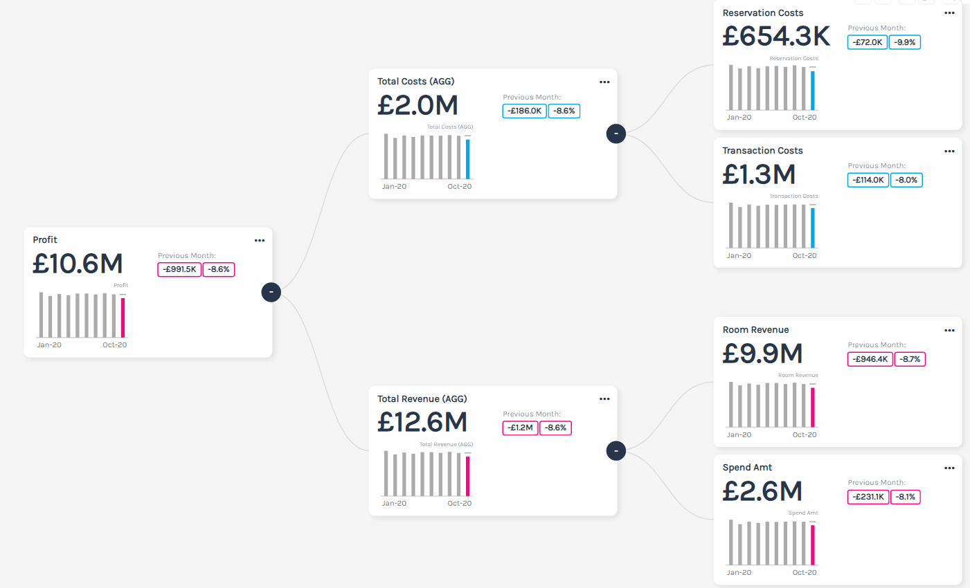
The Challenge
My task: embed Power KPI into a hotel performance dashboard and highlight profit as the hero metric. The dashboard needed to:
- Surface total profit at the portfolio and hotel levels
- Let users drill into profit to see what pushed it up or down
- Cascade that selection to filter all charts below
Why Drilldown Matters
One of Power KPI’s strongest features is driver analysis. With a click, users can examine:
- Positive drivers (e.g., Customer Spending, Room Revenue)
- Negative drivers (e.g., channel costs, discounting, labor spikes)
This flips the experience from “What happened?” to “Why did it happen?” and it does so without leaving the dashboard.
How the Dashboard Works
- Top KPIs show total profit per hotel and an overall Profit Breakdown.
- Click a Hotel KPI to filter the Profit Breakdown (and all charts below) to that hotel.
- Click again to remove the filter.
- Click on Departments, Booking Channels, and Room Type to dynamically update the KPIs for deeper insights.
Where Power KPI Shines
- Executive summaries that need fast drilldown
- Multi-hotel or multi-outlet portfolios with like-for-like comparisons
- Revenue and cost centers where drivers (price, mix, volume, rate, cost) explain variance
Final Thoughts
Working with Infotopics’ Power KPI let me turn KPIs into clickable stories. Instead of shipping a static header row, we delivered an interactive analysis flow: headline → driver breakdown → focused deep dive. For teams chasing quick, defensible explanations, that’s a big win.