


During Dashboard Week, one of our projects involved using Anime Viewer Data, which included a score for each anime title.
For my dashboard, I wanted to feature a gauge chart to display the score of the highest-rated anime title — serving as a simple, eye-catching KPI element.
Here is the link to my Anime Dashboard:
In this blog, I’ll walk you through how to build a gauge chart in Tableau step by step , a chart type that can be used in a wide variety of KPI or performance-based visualisations.
Step 1: Create the Metric
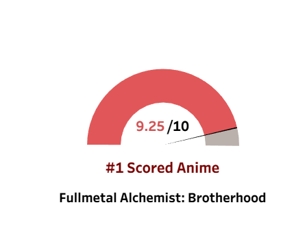
The dataset includes a Score field, which I’ll use as the main metric.
To standardise it, I created the following calculated field:
% Max Score = [Score] / 10
This converts the score into a decimal value (e.g., 9.5 → 0.95), making it easier to work with in the gauge chart calculations.
Step 2: Create the Calculations
To construct the gauge, we’ll create several calculated fields that define the different segments of the chart.
Here’s the full list:
Calc 1 = MIN(1)
Calc 2 = IF [% Max Score] < 0.5 THEN [% Max Score] ELSE 0.5 END
Calc 3 = IF [% Max Score] < 0.5 THEN 0.5 - [% Max Score] END
Calc 4 = IF [% Max Score] > 0.5 THEN [% Max Score] - 0.5 END
Calc 5 = IF [% Max Score] > 0.5 THEN 1 - [% Max Score] ELSE 0.5 END
Calc 6 = IF [% Max Score] <= 0.5 THEN 0.005 END
Calc 7 = IF [% Max Score] > 0.5 THEN 0.005 END
These fields control the proportions and segments that make up the gauge visualiation.
Step 3: Build the Donut Chart Base
To build the gauge shape, we’ll first create a donut chart.
- Type
0in the Rows shelf and press Enter to create a dummy field. - Repeat to create a second one.
- Change the Marks type to Pie under the All Marks section.
- Right-click either of the two pills and select Dual Axis.
- Change the colour of the second pie (in the second Marks card) and reduce its size slightly.
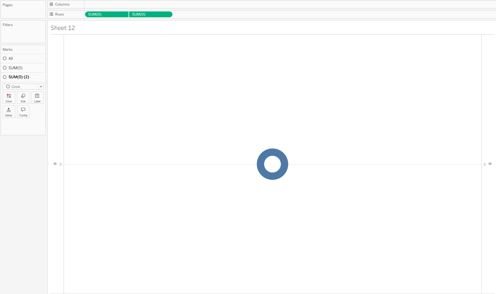
This creates a dual pie setup — the foundation for the gauge effect.
Step 4: Build the Gauge KPI
Now we’ll bring the calculations together.
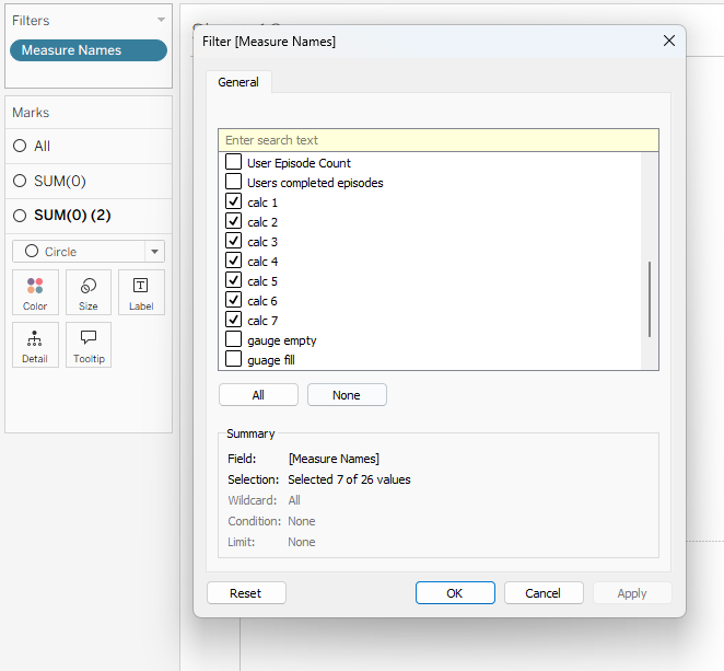
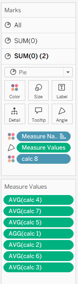
- Drag Measure Names to Filters and select only the calculations created in Step 2.
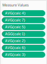
- Drag Measure Names to Colour and Measure Values to Angle in the All Marks section.
- Rearrange the calculations in the desired order to create the gauge layout.
- Adjust the colours to fill the gauge chart correctly (red representing segment filled and grey being unfilled).


Next, create one more field:
Calc 8 = "Calc 88"
Make sure this is enclosed in quotation marks — this makes it a discrete field.
- Drag Calc 8 to Detail on the second Marks card.
- Change its mark type to Color to display an arrow or pointer on your gauge.

Step 5: Format and Finalise
Polish your gauge by:
- Aligning it with your dashboard colour scheme
- Adding labels for context (e.g., “#1 Scored Anime”)
- Adjusting the inner circle size to balance the doughnut
Once complete, you’ll have a gauge chart that visually highlights your KPI — perfect for summarizing performance or key metrics in any Tableau dashboard.
Use Cases
While this example uses anime scores, you can easily adapt this technique for:
- Customer satisfaction scores
- Sales performance targets
- Employee engagement ratings
- Any metric that benefits from a clear KPI visualization