


Containers in Tableau: Horizontal vs Vertical
When designing dashboards in Tableau, layout is everything. Whether you're creating a slick executive summary or an interactive story for your users, containers are your best friend.
So, what exactly are they?
What are Containers?
In Tableau, containers help you organise and align your dashboard components such as charts, filters, text boxes, and images in a clean and responsive way. Think of them like invisible boxes that hold your content in place.
There are two main types:
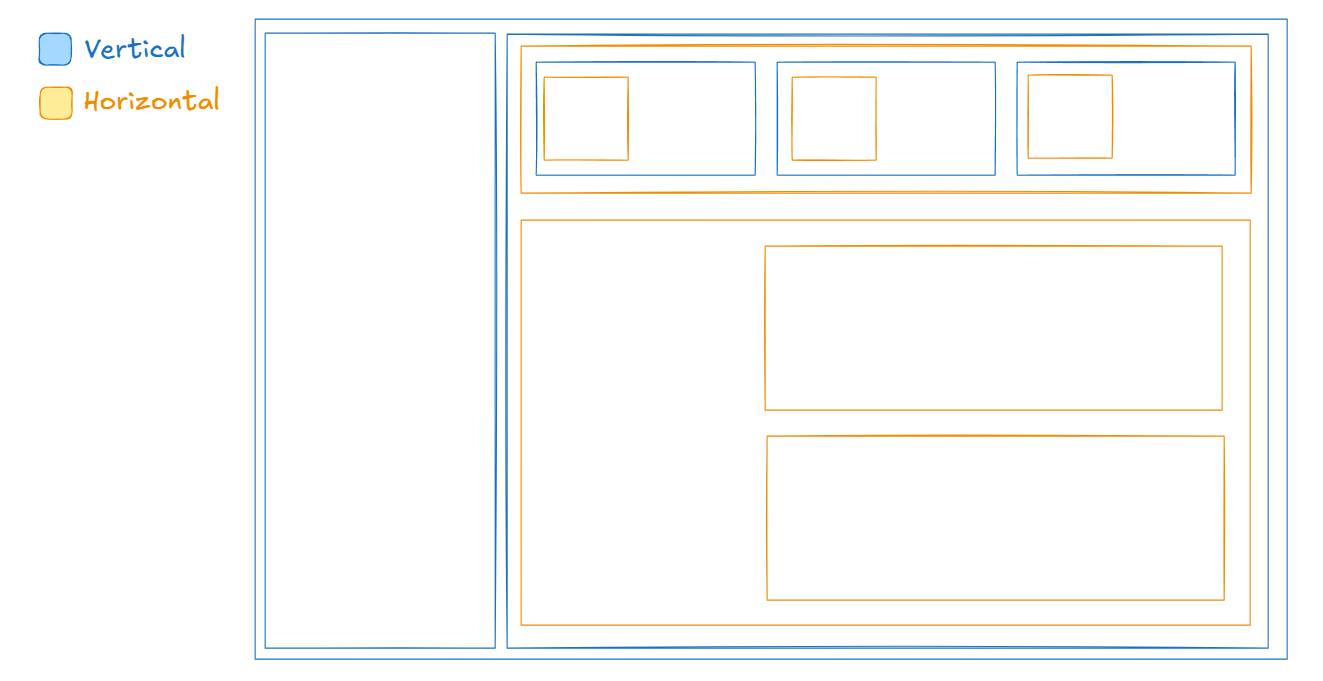
Horizontal Containers
As the name suggests, horizontal containers arrange items left to right. They’re great for:
- Placing filters side by side
- Lining up KPIs in a row
- Creating consistent spacing between charts
Each new object you drag into a horizontal container snaps next to the previous one.
Vertical Containers
Vertical containers arrange items top to bottom. They're great for:
- Stacking charts vertically
- Keeping a title above a chart
- Adding text descriptions under visuals
These are especially useful if you're building a mobile-friendly dashboard or guiding your viewer down a data story.
Pro Tips:
- Nested Containers: You can combine horizontal and vertical containers for more advanced layouts.
- Even Spacing: Right-click inside a container to distribute space evenly or fix widths/heights.
- Click on an object inside a container and use the Layout tab to add inner padding. This adds space around your charts or text; making your dashboard cleaner, easier to read, and more visually appealing.
I’ve included a quick sketch to illustrate how containers can be used in a dashboard layout. It should help you visualise where horizontal and vertical containers fit best.
A well-structured dashboard helps your audience focus on the insights, not just the layout. So don’t be afraid to drag in a few containers and start experimenting!