


DSNY4 just started training, and that got me thinking back to my application viz on HIPAA breaches, which I’ve been meaning to go back to, so that I can implement some things I learned during my own training.
Something I hadn’t really understood until starting at DSNY was containers, which is what this blog post is about. Containers in Tableau hold objects, just like real life. When I first started learning how to use Tableau, I would always make everything floating because I didn’t understand why you wouldn’t–everything looked so much nicer when they were floating, and everything was easier to rearrange that way, too.
Unfortunately, the flexibility of having everything in your dashboard be floating comes at a cost–because nothing is fixed in place, you run the risk of your dashboard looking different/wonky on differently sized screens.
Nowadays, I love containers because I love organizing. They were also a major part of why I began to like Tableau, as my Tableau dashboards always looked horrible before I learned about them (this was also before I learned about Tableau Public and saw just what people could do with Tableau).
Below are some tips I’ve picked up with regards to using containers:
1. Add blanks to your containers before putting other containers inside the first container. As you bring in the actual objects that need to be in the container, then you can remove the blanks.
Let’s say you have a container on a dashboard, and that container holds a text box for the title and another container that holds two charts. If you put a container inside the first container, it’s difficult finding the right place to drop in the text box, so that the title is in the big initial container and not in the little one. (This, in particular, gave me a lot of heartache when I was working on my application viz.) (Hence the blanks.)

See how close together the two containers are in the sketch above? They’re actually right on top of each other in Tableau. The only way you can tell apart the two containers is by highlighting the respective container in the Item Hierarchy–and trying to actually insert something between the two containers when they’re right on top of each other is impossible.
I personally like adding two blanks to each container; adding an object to the container is easier this way because you can aim to place the object in between the two blanks, rather than hoping you’ve dragged your object to the correct spot when there’s only one blank present (oftentimes, you’ll have just barely missed where that container ended, or at least that was the case for me). Compare:

2. Add a background color or border to your blanks and containers as you bring them in. Remove the colors and borders (or change them to match the other colors of your dashboard) after you’ve brought in all of your other dashboard objects (charts, buttons, images, etc.).
Without the color or border, it’s difficult to easily tell what’s a container and what’s a blank. I used to leave my containers uncolored/without a border and change only the color of the blank when I bring it into the dashboard, but now I prefer to give the container a border and a blank a background color because then I can easily tell from a glance what is what / what holds what.
Here’s an example of how I color my blanks and containers:
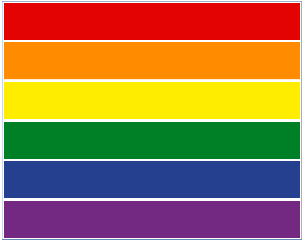
There’s a thin blue border outlining the dashboard, showing that there’s a container surrounding the blanks, and each of the blanks is a different color, just because I love rainbows. You can keep all your blanks the same color if you wish, but I generally color the blanks randomly. I also gave the container a blue border because that’s how I show that it’s a vertical container.
3. Check your Item Hierarchy regularly. You want only that first container to be Tiled; things start looking wonky when there are more.
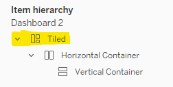
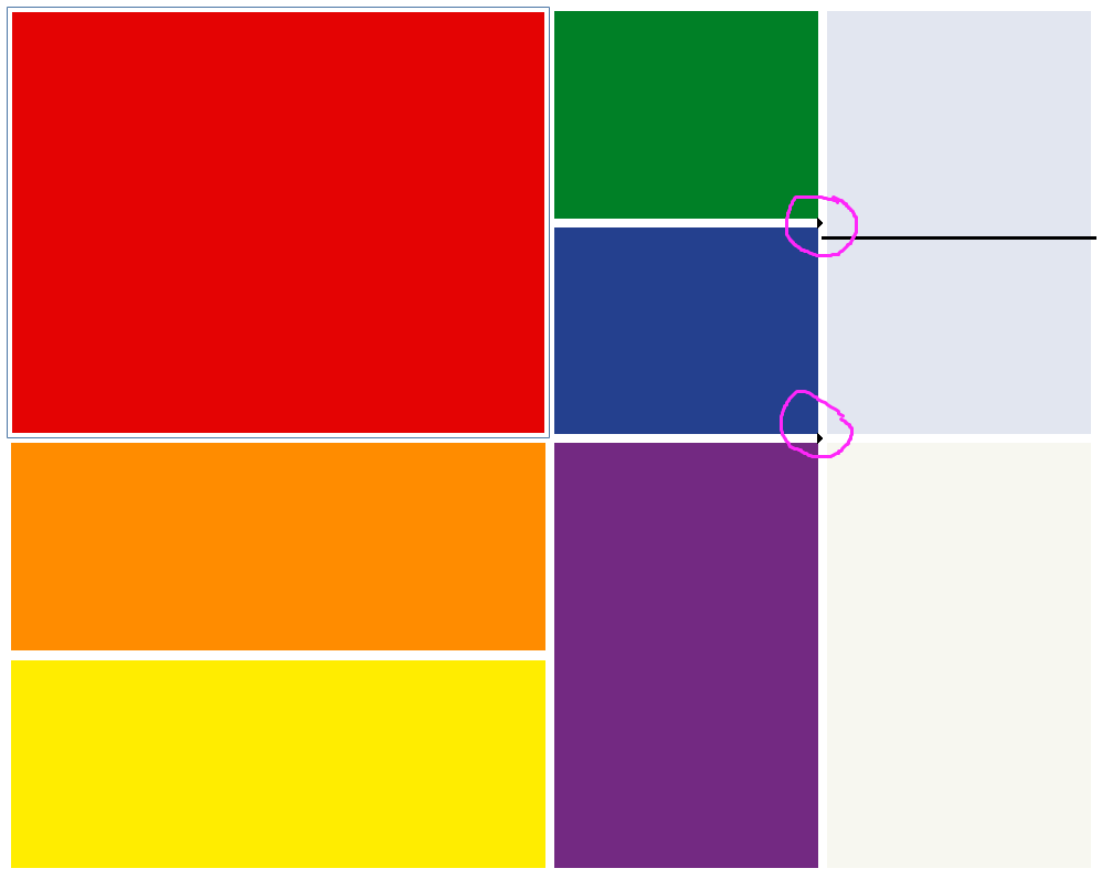
Tableau will sometimes automatically convert a horizontal/vertical container to a tiled one when you’re trying to make your charts align by dragging the boxes’ lengths/widths themselves. It’s likeliest to happen to me most often when these little black triangles appear (circled in purple below):
Below is what it looks like in GIF form; take note of the triangles appearing as I adjust the width of the blank:

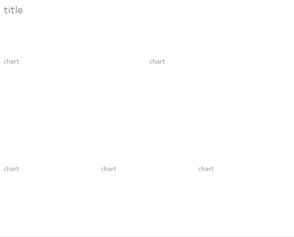
4. Use text boxes as placeholders for titles, logos, charts, and other objects, if the other objects aren’t ready to be inserted yet (like if you’re making a template, for instance). Then, once you’re ready to dashboard, you can replace or format the text boxes. My placeholder dashboard often looks horrendous at the beginning:
5. Plan, plan, plan. It’s a lot easier to keep track of your dashboard if you sketch it out first. Plan out the layout of your dashboard, of course, but plan out the containers, too! This was probably my favorite thing we learned during training, haha!
Here’s what my dashboard looks like sketched out (different from my initial sketch–the initial one showed what I was going to put into the dashboard originally; I redid it in Excalidraw for this blog):
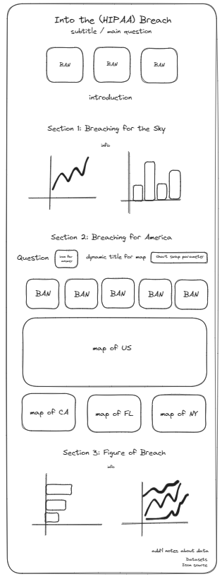
When I tried putting in some containers, I had difficulties deciding whether to use a horizontal or vertical container, so I went back to my original sketch and drew black rectangles around all the objects that didn’t already have a black outline:
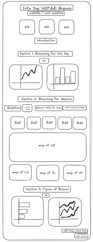
Finally, I got to my favorite part–drawing out the containers! I use the same colors as when our head coach Michael McFadden taught us how to plan out our dashboard/containers: black for dashboard objects, blue for vertical containers, and red for horizontal containers.
Another thing–planning out the containers on top of the layout tends to make the sketch a little busy/confusing, so make sure to space out your original dashboard sketch (the initial one, without all the containers), as my final sketch looks a little cramped:

Zoomed out, the Excalidraw looks unwieldy, but having a sketch like this to be able to reference allows me to track which parts I’ve already done and see the underlying layout. If there are extra things I’d like to add to the dashboard (which can happen, as things don’t always go according to plan), I can look back at my sketch to see the type of container holding the other objects in the area I want to add things.
I like to keep my sketch updated, as you never know when you may need to reference it again, even if you’re almost done with your dashboard, but you could also just start bringing in the new additions directly to the dashboard.
Anyway, I love containers, and you should, too! I hope these tips make containers easier to use for your next dashboard :)