


Welcome back! Today, I’m going to talk about section 3 of my HIPAA breaches dashboard, specifically how to make it so that when you click on a bar on the left, both that bar and the corresponding line on the right turn blue.
While I didn’t find the set action as difficult to understand (or do) as the chart swap, I still broke up the process into a few parts, starting with figuring out how to best represent my third talking point. After figuring that out, that’s when I realized I needed to do two things: create a set and then the set action itself.
The Process
Figuring It Out
To begin, I asked myself: What do I need to visually represent the talking point most effectively?
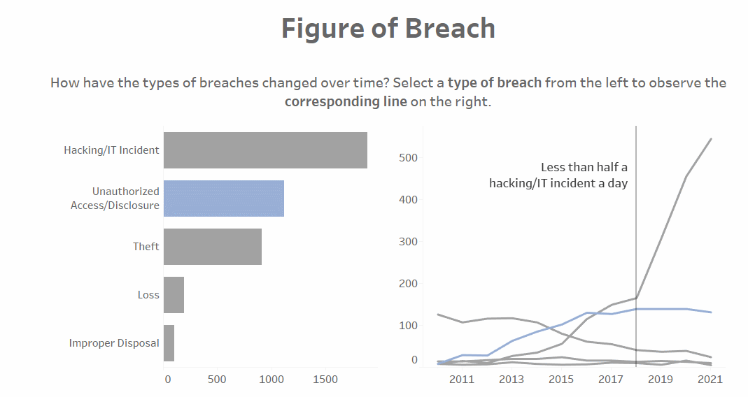
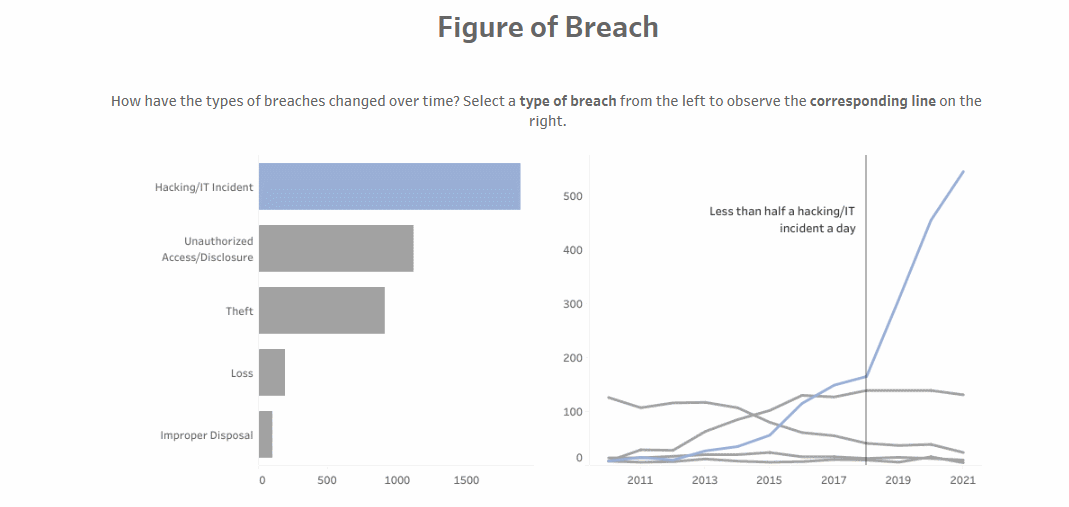
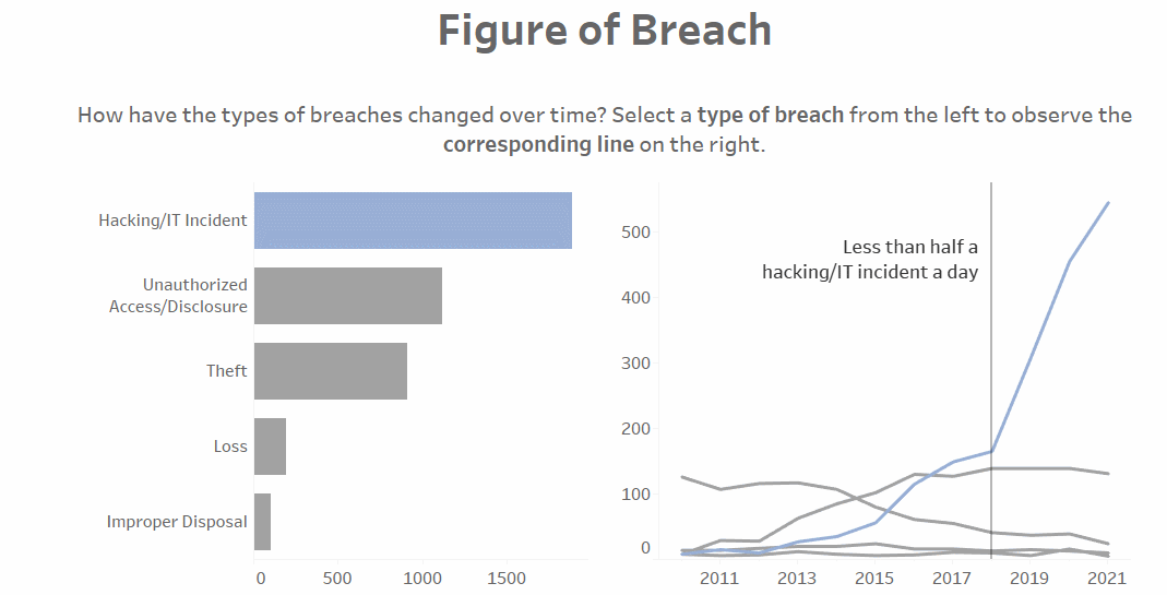
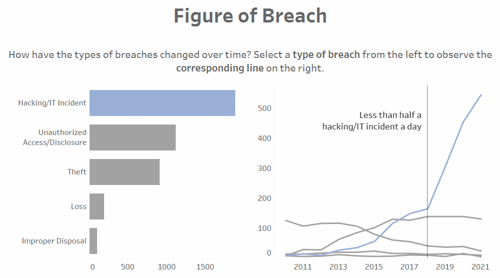
My third talking point was about the most common type of HIPAA breach over time. I’d already planned to have (and made) a bar chart and a line chart, but after putting them on the dashboard, I had an idea to add some user interactivity. (Also, the dashboard came full circle in a way because the first section shows the impact of breaches over time, and the third section shows the breakdown of the different types over time – one of my favorite things about this dashboard is how the layout worked out so that the dashboard began with a line chart and a bar chart and then ended with a bar chart and a line chart. Symmetry!)
1. Problem #1
I wasn’t initially thinking about interactivity, though. After arranging the two charts on the dashboard, I realized that the breach types could not all be the same color, whether for the bar or line charts, because I wanted to draw attention to Hacking/IT Incidents as the most common type of breach. The breach types could not each be a different color, either; I’d run the risk of overwhelming my audience. It would also be hard to pick out a particular breach type to focus on and hinder audience comprehension.
Solution #1
How could I somehow differentiate the types with a little color, then? That’s when I realized – sets! They’re made for this! All I would need to do was have what was “in” the set be colored blue (to match the rest of my dashboard) and have what was “out” of the set be gray, allowing the blue to stand out.
2. Problem #2
I could have easily left it at that, but I also added the daily rate of breaches calculated field to the tooltip for the chart on the right.
Solution #2
If you were curious about a breach type other than Hacking/IT Incidents, it’d be hard to find it with all the lines being gray. That’s when inspiration hit – I wanted the user to be able to click one of the breach types on the left and then see how those particular breaches have changed over time on the right.
One approach would be select the chart in question on your dashboard and click the Use as Filter icon in the top right corner.
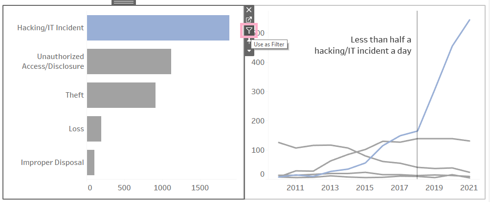
Observe how the filter works:
3. Problem #3
Looks pretty nice, right? The thing is, this filters all the charts on the dashboard. If I selected Theft from the bar chart, all of the visualizations – not just the line chart next to it – would change to show only data pertaining to that breach type. However, that information isn’t particularly useful because the first section is supposed to be a general overview of the impact of all breaches on the U.S., while the second section is supposed to be about the impact of all breaches on individual states.
I don’t want to muddle the story by getting so granular with the data before I have to be, especially since the filter is so inconveniently placed for that (you’d have to scroll all the way to the end, select a breach type, and then scroll back up to see how the visualizations change – no thank you). On top of all that, it would make the whole dashboard lag.
Solution #3
That’s where the set action (i.e., filtering with a set) comes in, which will allow me to choose only the charts I want to be affected.
I know this was long, but I wanted to show that I didn’t immediately think to execute the third section this way. I started with a basic problem – the issue of not wanting to introduce a lot of colors to the dashboard – and went from there to find a solution, before thinking of other potential issues and solutions.
I hadn’t actually noticed what I was doing when I was making the dashboard; it was only when I was retracing my steps with this blog entry that I realized that I chose to do it the way I did it as direct responses to anticipated issues. In retrospect, this was a good way to go about it – coming up with ways to resolve specific issues steered my thinking in a particular direction (i.e., a solution-oriented one), so that every choice I made was with intention; I didn’t do anything just because it looked cool (granted, things like the chart swap and the daily rate of breaches calculated field are cool, but I have reasons for using them!). Start simple, then get complicated.
The Set
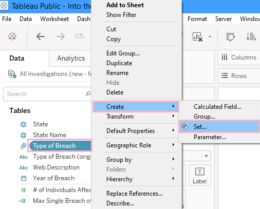
1. To create a set, which is what allows just the one specific breach type to turn blue for this third section, right-click on the field and select Create, then Set…
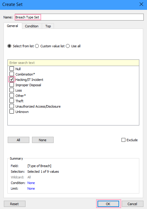
2. When the Create Set window pops up, name the set accordingly and check off a value from the list before hitting OK. It doesn’t matter which value you select because the set action we’re adding in after this will change it; we just need the set to exist as setup for the action (i.e., the user’s click) that’ll actually change the set later.
3. Drag the set to Color on the Marks Card.
All the bars were originally blue, but once we placed the set on Color, only the selected value from when we were creating the set is still blue; everything else became gray because they aren’t part of the set.
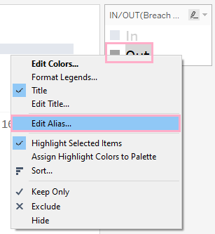
4. Don’t forget to format! Right-click “In” and “Out” on the legend, and select Edit Alias to change the labels.
To change the colors, click on the colored square next to one of the labels on the legend. A window will pop up to let you edit the colors.
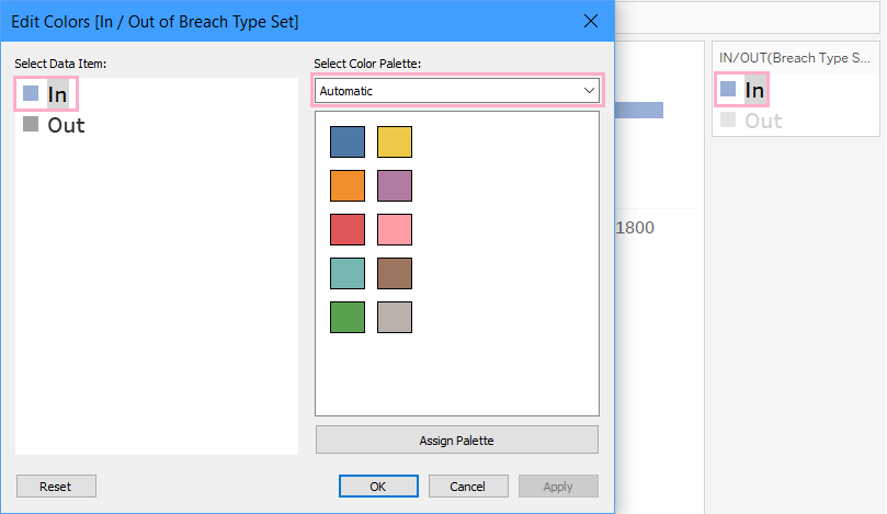
You can look through the color palettes to pick your colors (Tableau’s default color for “Out” is gray, which I left unchanged), or if you know the hex code of the specific shade you want, you can double-click the colored square in this window to enter it into the next window that pops up.
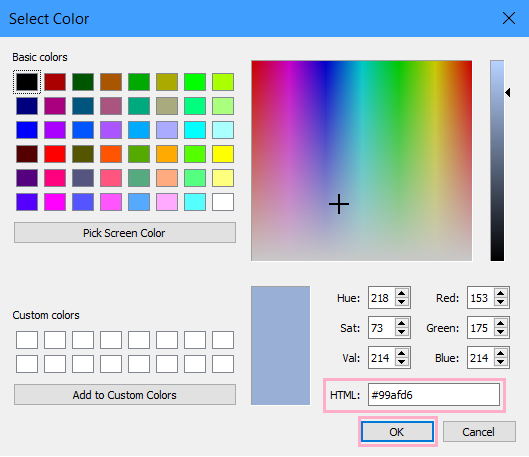
Finally, hit OK for these two windows to finalize your choices.
5. Drag the set to Color on the Marks Card for all worksheets that the set pertains to.
The Set Action
Now, it’s time to set up the set action. Make sure that your charts are already in place on the dashboard before you begin and that you’ve dragged the set to Color on the Marks Card for the relevant visualizations.
1. On the dashboard tab, select Dashboard from the ribbon at the top, then Actions.
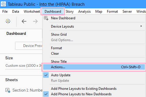
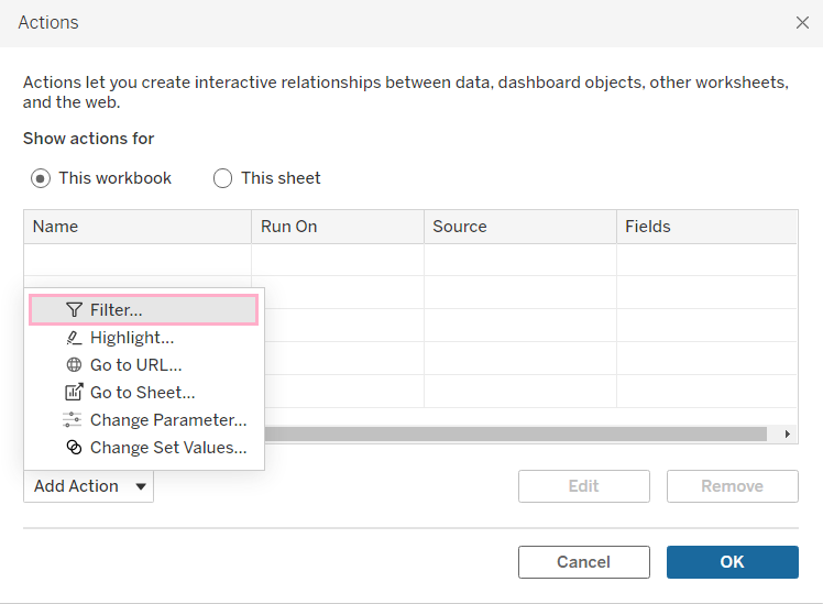
Then, select Add Action and Filter…
2. A new window will pop up. Name the action at the top accordingly.
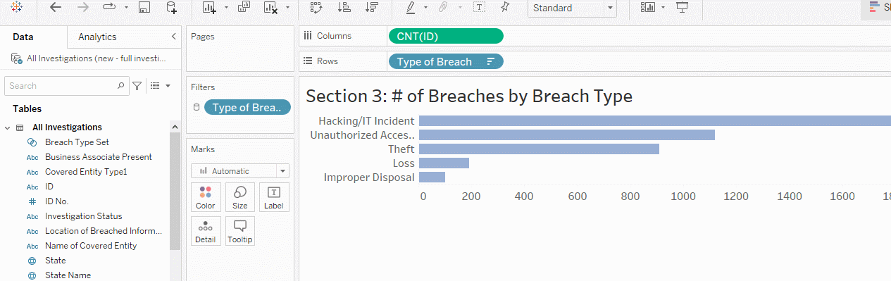
Then, it’s time to select the source sheet (what the action will be performed on/where the user will be clicking), which is the bar chart showing the number of breaches by breach type.
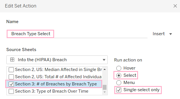
I want the effect (the color change) to happen when the user clicks on a bar, which is why I choose Select for the Run action on next to it. I also want the user to be able to select only one bar at a time (to avoid muddling the information I want to convey), which is why I also checked off Single-select only.
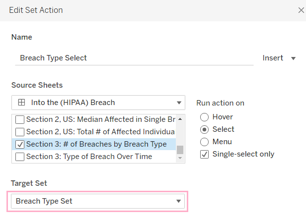
3. I only have one set in this workbook, so I just need to select that for my Target Set.
The target set being used in some way on the relevant worksheets is the connection between the two charts that allows the user to click on something on one chart that will then turn that thing blue, as well as the corresponding thing on the other chart.
4. I want the user’s click to change the color of the selected bar to blue. Thus, at the bottom, Running the action will Assign values to set, which means that the user’s click will change which value is “in” the set, and change the bar that’s “in” to blue. (Because I selected Single-select only earlier, only one value can be blue at a time; as soon as the user clicks another one, the previous one will turn gray like the rest of the unselected bars.)
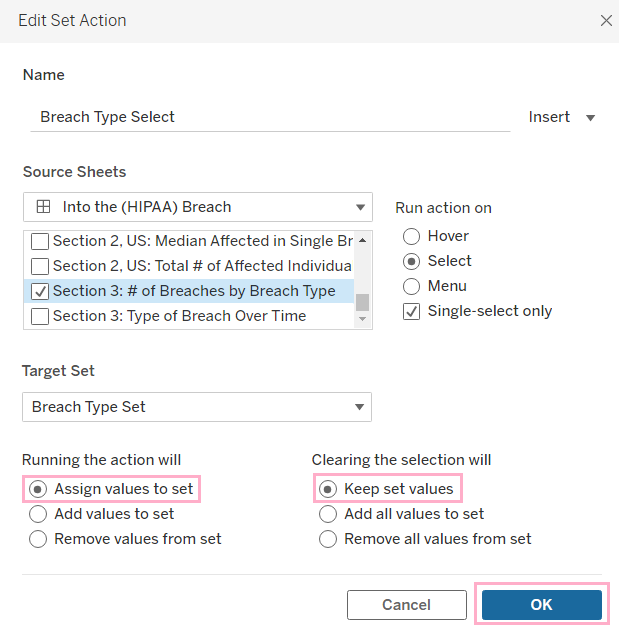
The next part, Clearing the selection will, is asking what you’d like to happen when the user clicks out of the visualization with the set action. Keep set values will show what the user had most recently selected as blue.
For example, if the user had selected Theft and then clicked out of that visualization, the bar and line for Theft on the two charts would remain blue instead of resetting or doing something else.
5. When you’re satisfied with what you’ve chosen, click OK to close out of the window, so that you can test out your newly minted set action.
I think the most difficult parts of this process were figuring out what I needed to do to most effectively convey the information I wanted to convey and understanding what was connecting the two worksheets, which was the target set.
Again, in order for the desired charts to change together based on the user’s action, the set in question must be used in some way (e.g., the set does not have to be dragged to Color on the Marks Card for every worksheet) on all relevant worksheets.
Hope this was helpful! See you next time!