


With the end of my 4 month training at the Data School coming, it is time to start renowned Dashboard Week (all be it, 1 week before we actually start dashboard week). Our challenge today, analysing Chelsea’s Performance Insights data that was part of the CFC Performance Insights Vizathon held earlier this year in PowerBI. Bearing in mind it has been a couple of weeks since I last touched PowerBI (and I would not call it one of my sharpest tool) this has definitely been an adventure.
Dashboard Rules
· They must work independently, unless otherwise specified.
· If data prep is required, they can use Alteryx, Prep, SQL or Power Query, unless otherwise specified.
· They must create a sketch of their plan for their dashboard and show this during their presentation.
· The dashboard they create must be uploaded to Tableau Public or Power BI Service (and embed it into their blog). If no visualisation tool is specified in the challenge, they can choose themselves.
· At 3:30 pm, they will present their data prep, sketch, viz, and anything else they would like to present.
So how did I do it?
The data
‘CFC GPS Data’
o Looking at the training data & match data for an Individual
o 20 columns
o 862 rows
Use Case Scenario
Based on the data provided, I came up with the following story guide to approach my dashboard on:
Analyse the impact of training vs match
o Does training data match similar to the matches?
o Are there any key areas that differ between the match and training
Look at this on a match by match basis with the trainings sessions before and after the match reported

Data Prep
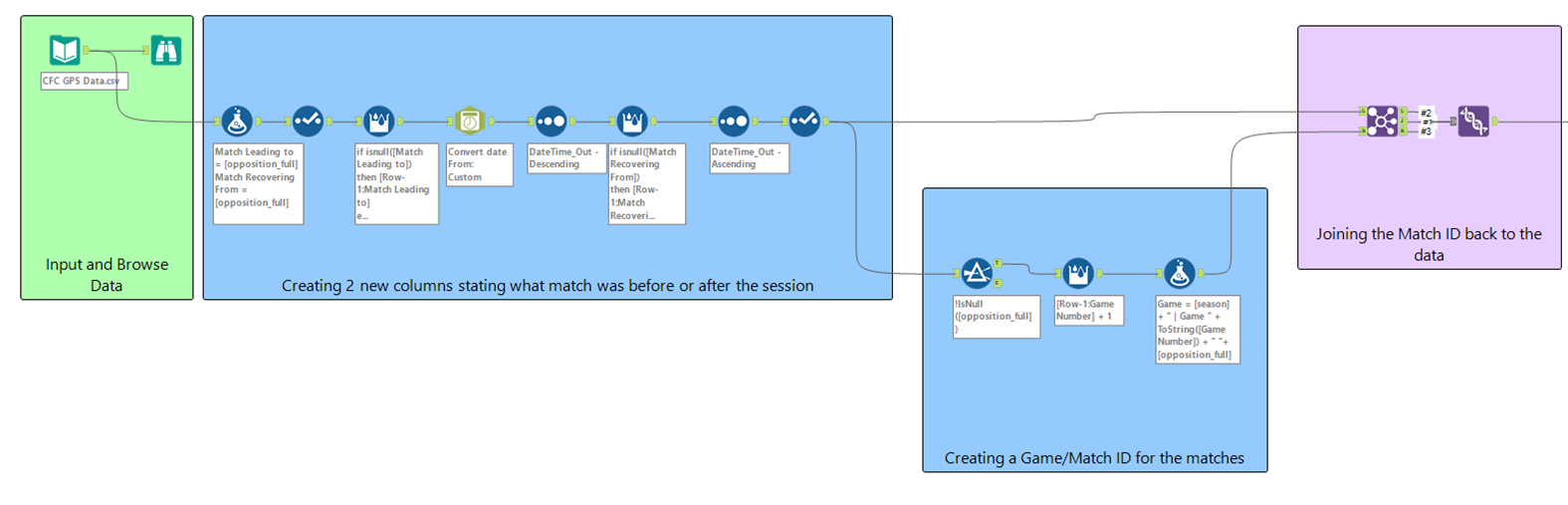
Now we have the plan, the next step was getting the data ready. As mentioned, PowerBI isn’t my strong suit so I opted to try and do as much cleaning (within reason) in Alteryx first before loading into PowerBI.
While the data was fairly clean, there were 2 main things I wanted to accomplish in Alteryx to prepare the data
· Create a game identifier that relates the training sessions and matches to a game
· Expand the data so that each row represents a training session per identifier based on a selected match
This was pretty straight forwards in Alteryx to do, mainly using multi-row formulas to fill up/down columns to assign them to a match, before creating an match identifier and then expanding the data using a pivot.
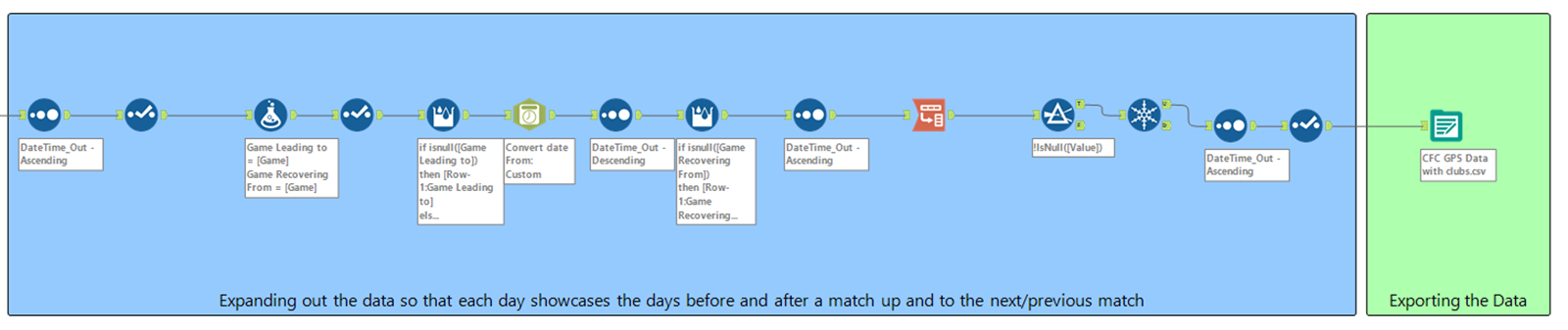
The next stages was getting the data ready in PowerBI for analysis. The main jobs here was to pivot grouped fields that were in separated columns (e.g. the 5 Heart Rate Zones, 3 High Speed Running fields, etc.). To do this, I recreated new tables that references the main dataset in Power Query, where I then did the pivots (see the below schema).

Building the Dashboard
Following the plan I created earlier, I opted to slightly alter the design to ensure that the graphs were more readable – this also included creating a long dashboard instead of screens sized. This dashboard still contained the main graphs as outlined in the sketch as well as some supplementary information that I thought would be insightful and relevant to my user story.
You can see the presentation that quickly ran through here outlining the main steps as well as the final dashboard here (you might need to zoom out to see the dashboard):
And that was it. Whilst a very challenging first project, I definitely feel quite proud of what I managed to create in such a short time (even while trying to relearn PowerBI again).
On to the next one!