


Today DS30 was tasked to create an "exceptionally" designed KPI dashboard based on rent prices in San Francisco:
https://public.tableau.com/app/profile/valerie.madojemu/viz/DashboardWeekThursday/Dashboard1
Audience
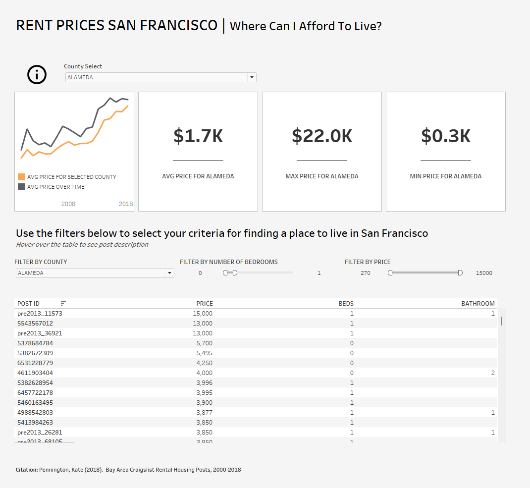
My audience was to those who are not data literate. I wanted the user to be able to quickly decipher which area of San Francisco they could afford to live in
Plan Process
Before starting my project, I did some research into KPIs, and what the user should take away once they have looked at the dashboard.
When planning my dashboard I wanted the user to be able to:
- Quickly read the dashboard and form conclusions
- Easily track metrics
- Not be overloaded with information
Main Features of My Dashboards
- Kept things simple - 4 KPIs at the top
- Line graph to compare overall average price with the average price in each county
- Table at the bottom to show listings available based on user's criteria
Main Techniques Used
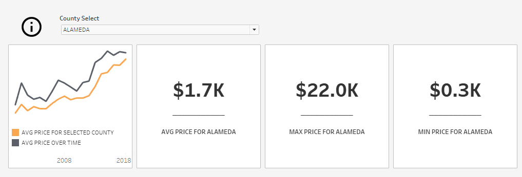
I used a parameter so I can select the county of interest to compare to the average price over time.
With the same parameter I can change the KPIs to the county of interest to show the; average price, max price and min price
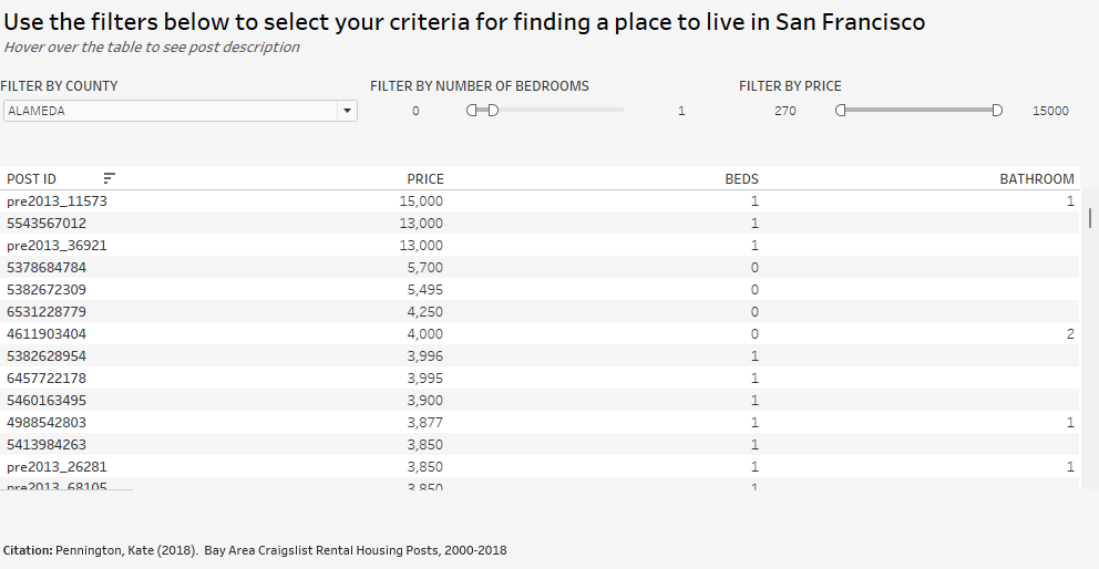
In the 2nd half of the dashboard I created a table were the user could filter the listings to their criteria
Feedback
Looking back on the challenge today, I should have just looked at summarising more metrics, making the dashboard more simple to use and allowing the user to form quicker conclusions.
Inserting a table was moving toward a direction for creating a dashboard for functionality
Important lessons were learnt today about just KPI dashboards, with a focus just being kept on summarising the metrics