


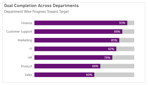
Progress bar charts aren’t a built-in feature in Power BI, but you can recreate the effect with a simple workaround. We are also going to make them rounded to add more to our learning.
Here’s how to do it step by step.
- Creating the baseline visual
- Add a Clustered Bar Chart visual
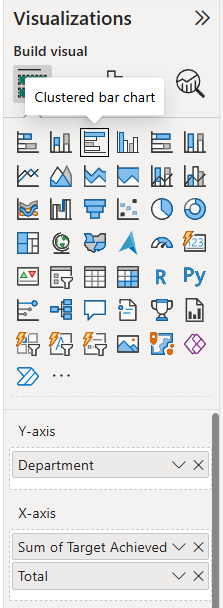
- Drag your categories into the Y-axis (in my example the field name is Department)
- Add:
- Sum of Target Achieved (this is your filled/progress portion)
- Total (this is what the progress is measured against)
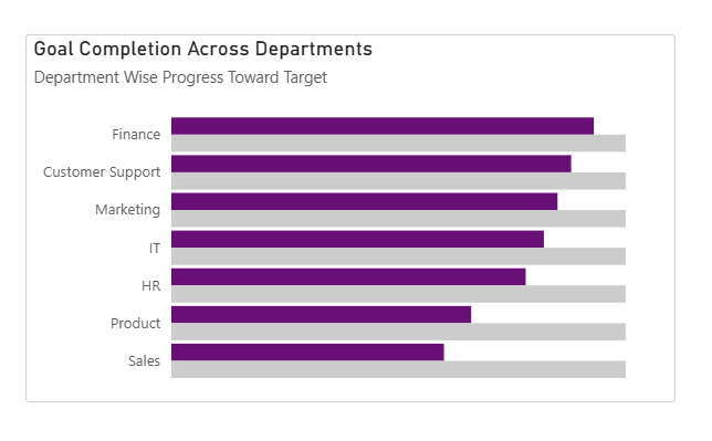
This creates a standard clustered bar chart showing progress vs total.
2. Adjust the Bar Layout
Go to:
Format visual → Visual → Bars → Layout
Turn on:
- Overlap
- Flip overlap
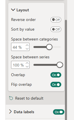
Now tweak spacing:
- Space between categories Controls the gap between each horizontal bar group. → Lower value = tighter layout → Higher value = more vertical spacing.
- Space between series (set to 100%) Pushes the bars in each category fully on top of each other. → This is key to making the bars look like a single progress bar instead of side-by-side bars.
At this point, your chart should resemble a progress-style bar.
3. Create the Rounded Effect
Now for the trick that creates rounded edges:
Go to:
Add further analysis → Error bars
- Apply to: Sum of Target Achieved
- Under Options:
- Set Upper bound = Sum of Target Achieved
- Leave Lower bound empty
Do the exact same for the Total
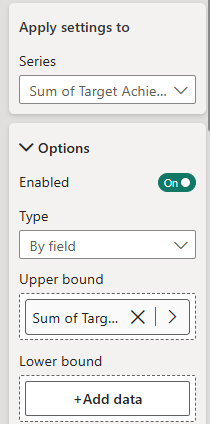
Why this works:
- The upper bound gives us something to attach the rounded cap to
- Leaving the lower bound empty keeps the left side flat (so it aligns with the bar)
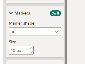
4. Add Rounded Caps
Still in Error Bars:
Go to: Markers
- Set Marker shape = Circle
- Increase Marker size until it matches the bar thickness
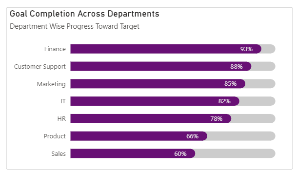
5. Final Result
Some tips:
- Match marker and bar colours: To make the rounded edge blend properly, set the marker colour to match the bar colour exactly and ensure there’s no visible outline mismatch. This creates the illusion of a fully rounded bar.
- Marker size maxes out at 10: If it doesn’t fully match the bar height, reduce your bar thickness in formatting.
As you can see, progress bars are a clean, effective way to visualise progress against targets and budgets. Hopefully this has helped you to build them in your dashboards soon!