


This project began as a data preparation challenge, where the final visualisation was provided as the end goal. After reshaping the data in Tableau Prep to meet the required structure, the next step was to recreate and enhance the visualisation in Tableau Desktop. The result is an interactive ranking tracker that tracks each team's league position after every game, allowing users to follow the story of a season as it unfolds.
This example uses data from the 2018/19 NBA season, but the approach can be applied to virtually any sport, league, or competition where team rankings evolve throughout a season.

Preparing the Data
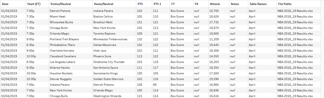
To track team rankings after each game, we first need a table that maps league positions to each fixture result.
The source data looked like this:
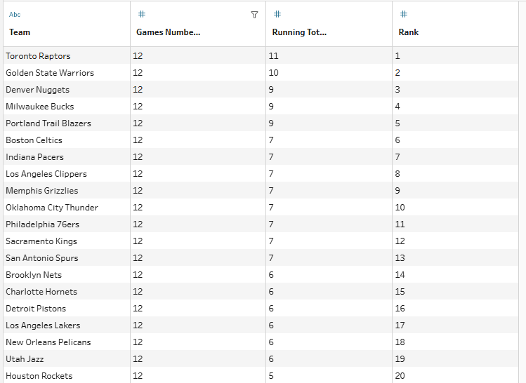
To build the viz, the data needed to be reshaped into the following structure:
In a future blog post, I'll walk through the full process of transforming the original fixture data into this rankings table, including additional enhancements and automation options.
Building the Base Visual
Once the rankings table is prepared, connect it to Tableau Desktop.
Create the view by:
- Dragging Game Number to Rows.
- Dragging Rank to Columns.
- Swapping the axes if required.
- Adding Team to the Marks card.
- Changing the mark type to Shape.
This produces a chart showing every team's position throughout the season.
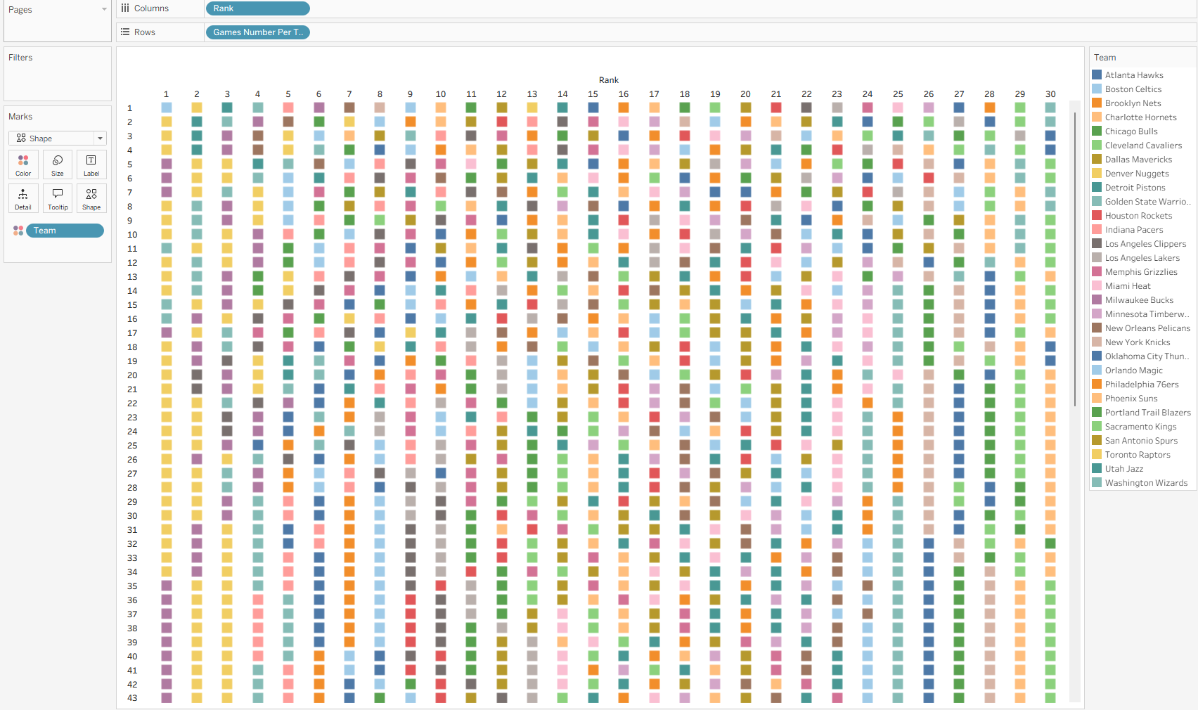
While the visual contains all the information we need, it's difficult to follow individual teams or identify the strongest performers.
To improve readability, we'll highlight the top-performing teams while allowing users to select any team for comparison.
Creating the Team Selection Parameter
First, create a parameter that allows users to select a team.
Configure the parameter as follows:
A few tips:
- Set the data type to String.
- Select Add Values From → Team to automatically populate all team names.
- Display the parameter control on the dashboard for user interaction.
The calculation also checks that teams have completed the full season (82 games in this NBA example) before using the final rankings.
Identifying the Top Teams
Next, create a calculated field called Colour Team.
The purpose of this calculation is to:
- Identify the final Top 5 teams based on league position.
- Highlight whichever team the user selects.
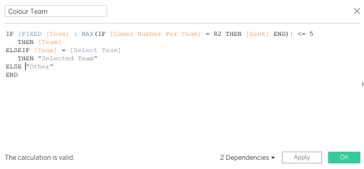
Group all remaining teams into a single category.The logic works as follows:
- Top 5 teams retain their own colour category.
- The team selected through the parameter is assigned a separate category called Selected Team.
- All remaining teams are classified as Other Teams.
The final category (Other) is important because it prevents the chart from becoming visually cluttered and keeps the focus on the teams that matter most.
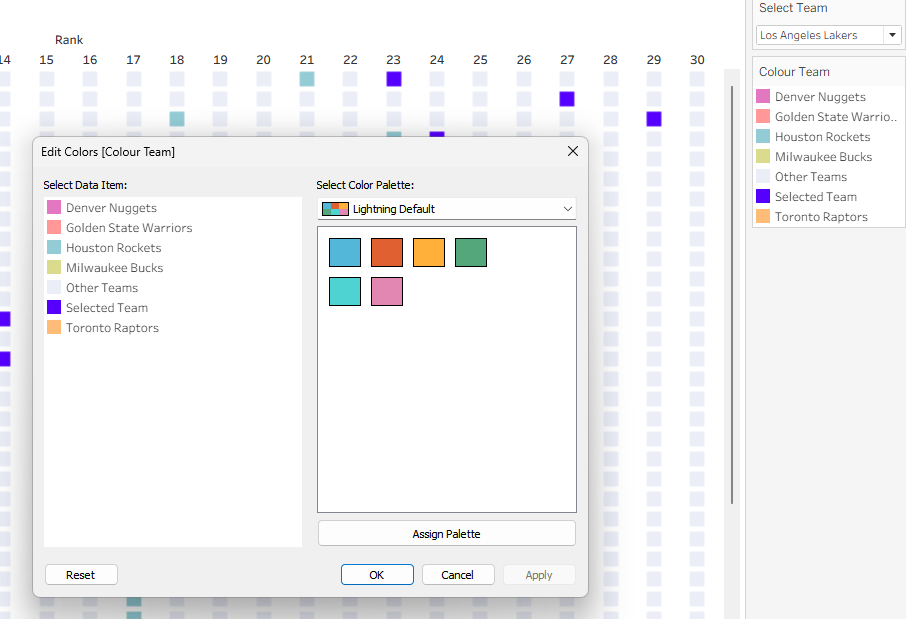
Applying Colours
Add Colour Team to the Colour Marks card.
I recommend:
- Using distinct colours for each of the Top 5 teams.
- Assigning a bold, attention-grabbing colour to Selected Team.
- Using a light neutral colour for Other Teams.
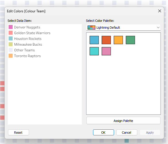
You may notice that Selected Team doesn't initially appear in the colour legend. This happens when the parameter is set to one of the current Top 5 teams.
Simply change the parameter to a team outside the Top 5 and Tableau will generate the additional category.
I used a bright blue for the selected team, making it easy to follow their movement through the rankings across the season.
Bringing It All Together
With the highlighting in place, you can build a dashboard that includes:
- The ranking tracker visual.
- The team selection parameter.
- A colour legend.
The result is an interactive visual that allows users to explore how teams moved up and down the standings throughout the season while quickly comparing their chosen team against the league's top performers.
Because the methodology is based on rankings over time, it can easily be adapted for other sports, leagues and competitions.