


In Tableau, standard mapping is easy. You drag "City" or "State" onto the canvas, and a dot appears. It works perfectly for showing where things are. But real-world analysis often requires understanding the relationship between locations.
Analysts are frequently asked questions that go beyond simple plotting: "How many customers live within a 5-mile radius of this store?" "Which supply chain route is the most efficient?" "How many incidents occurred within this specific danger zone?"
This is where Spatial Functions come in. They allow you to create geometries from raw numbers and, more importantly, interact with them mathematically to answer questions about proximity and overlap.
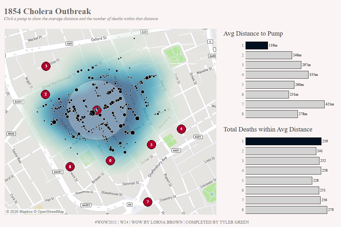
To demonstrate this, we’ll look at Workout Wednesday 2021 Week 24, a recreation of the famous John Snow Cholera Map. This visualisation requires us to identify which water pumps were responsible for deaths by analysing the distance and intersection between pumps and victims.
The Syntax: Core Vocabulary
Spatial functions turn flat data (numbers/text) into geometric shapes Tableau can understand.
1. MAKEPOINT (The Creator)
This function converts numeric latitude and longitude coordinates into a spatial object. Without this, your lat/longs are just numbers; with it, they become a location on a grid.
Syntax: MAKEPOINT([Latitude], [Longitude])
2. BUFFER (The Radius)
This draws a circle of a specific size around a spatial point. It is essential for "catchment area" analysis or creating exclusion zones.
Syntax: BUFFER([Spatial Point], [Distance], '[Unit]')
3. INTERSECTS (The Connector)
This is often used as a boolean (True/False) or a Join condition. It checks if two spatial objects overlap.
Syntax: INTERSECTS([Geometry A], [Geometry B])
Real-World Examples (The John Snow Case Study)
Below are three scenarios from the Cholera Map challenge that demonstrate how to move from simple points to complex spatial analysis.
Example 1: Creating Geometry from Numbers (MAKEPOINT)
Objective: In this challenge, you're given a CSV file with columns for Pump Lat and Pump Long. You need to plot these specific pumps on a map, not just generic cities. The Problem: Dragging numeric Lat/Long to rows and columns just creates a scatter plot, not a map layer. The Spatial Solution:
MAKEPOINT([Pump Lat], [Pump Long])
Result: Tableau creates a spatial field representing the exact location of the water pump. We do the same for the Death locations. This allows us to layer both datasets onto a single map.
Example 2: Analysing Proximity (BUFFER)
Objective: You want to visualise a "danger zone" or catchment area around the water pumps. In our dashboard, we want the user to be able to select a radius (e.g., 100 meters) and see which area that covers (NOTE - this actually isn't how the buffer functions in the Workout Wednesday, I have simplified it here for ease of learning buffers). The Problem: A point is infinitely small. You cannot see the "area" of influence with just a dot. The Spatial Solution:
BUFFER([Pump Location], [Radius Parameter], 'm')
Result: Instead of a dot, Tableau draws a physical circle around the pump. As the user changes the parameter (named [Radius Parameter]) from 50m to 100m, the circle expands dynamically on the map.
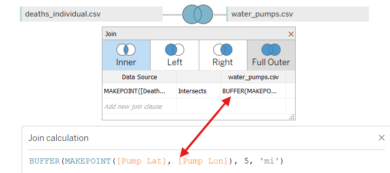
Example 3: Spatial Joins (INTERSECT)
Objective: You have two separate files: deaths.csv and pumps.csv. You want to join them so that every death is associated with nearby pumps, allowing you to filter and analyse them together. The Problem: There is no common ID (like "Pump ID") in the deaths file to join on. The only relationship between the two files is their physical location. The Spatial Solution: We perform a Spatial Join in the Data Source tab. Instead of joining on an ID with an = operator, we use the Intersects operator.
Crucially, you can create spatial calculations directly inside the join clause.
- Left Side:
MAKEPOINT([Death Lat], [Death Lon]) - Operator:
Intersects - Right Side:
BUFFER(MAKEPOINT([Pump Lat], [Pump Lon]), 5, 'mi')
Result: Tableau physically joins the rows where the death point falls inside the pump's buffer zone. This creates a unified dataset where spatial proximity acts as the "key," allowing for powerful analysis without needing complex data prep tools.
Top Tips & Common Pitfalls
1. The "Intersect" Logic The most powerful use of spatial functions isn't just drawing shapes - it's joining data.
- The Issue: You try to calculate "Deaths near Pump" using a calculated field, but the view gets messy.
- The Fix: Do the spatial heavy lifting in the Data Source Join layer using
INTERSECTS. This filters your data before you even start visualising, making your workbook much faster.
2. Units Matter When using BUFFER or DISTANCE, always double-check your units.
'm'= meters'km'= kilometers'mi'= miles- Tip: If your buffer covers the whole world, you probably used miles instead of meters!
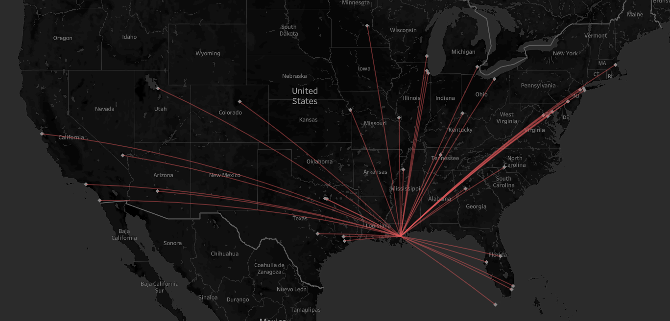
3. MAKELINE for Connection While not used in the final view of this challenge, MAKELINE is the best friend of MAKEPOINT.
- Syntax:
MAKELINE([Start Point], [End Point]) - Best For: Visualising flight paths, supply chain routes, or - in this case -drawing a line from a victim's home to their nearest water pump.
Conclusion
Spatial functions like MAKEPOINT and BUFFER transform Tableau from a simple mapping tool into a Geographic Information System (GIS) lite. They allow you to answer questions about "where" with the same precision that LODs allow you to answer questions about "how much."
Whether you are mapping 19th-century cholera outbreaks or modern-day retail delivery zones, mastering these three functions is your first step toward spatial analytics.
-- Tyler