


For the final stretch of Dashboard Week (Days 4 & 5), we were given data from the English Women’s Football (WSL) Database, covering 14 years of match results, standings, and player appearances.
The brief was open-ended: tell a story about the league. Rather than just showing a table of winners, I wanted to create a dual-layered experience consisting of two dashboards:
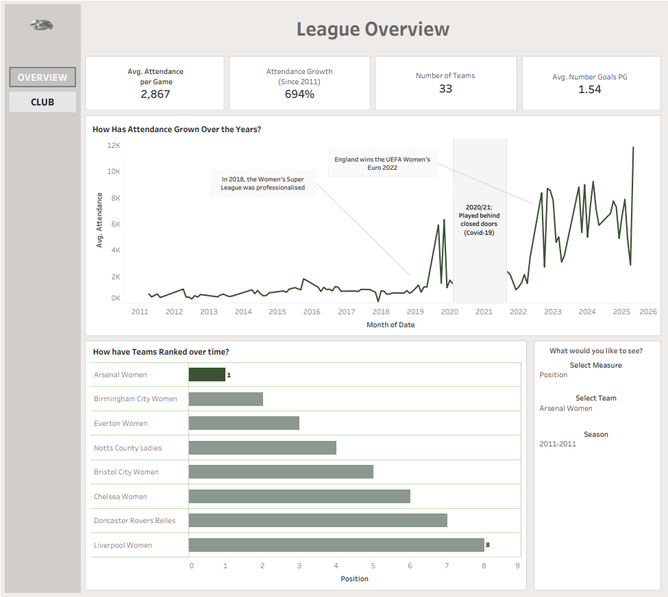
- The Overview: A high-level look at the explosive growth of the league.
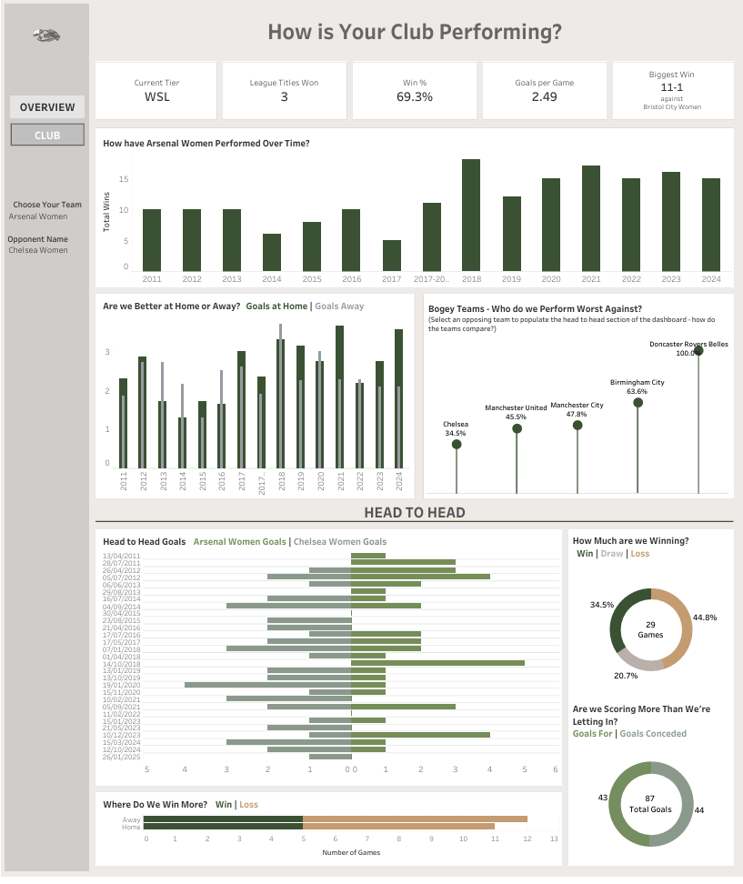
- The Deep Dive: A dedicated "Team Profile" tool that allows fans to analyse their club’s performance, specifically focusing on their "Bogey Teams" (rivals they struggle to beat) and head-to-head records.
My Approach
We were given Thursday and Friday to work on this project. I started Thursday morning drawing up a rough schedule for myself to follow, which looked like this for the Thursday:
- 9 - 10 Read Brief, Familiarise with dataset, create user stories
- 10 - 11 Meeting with Andy Pick, Break
- 11 - 12:30 Data Cleaning, begin sketching
LUNCH
- 13:30 - 14:45 Sketching
BREAK
- 15:00 - 17:00 Sketch and build
I mostly kept to this schedule for the day, though I also had to put in some time learning about football in order to understand the data.
Once I'd spent enough time learning the data, I went on to writing user stories to help guide the project. I wrote two user stories - one for each dashboard:
Dashboard 1 - Overview - User Story
AS A sports data journalist investigating the growth of Women’s football, I NEED TO explore the historical trajectory of the WSL and Championship - moving from league-wide context to individual team narratives. I CAN DISCOVER the pivotal moments where the league "levelled up" (e.g., attendance booms, competitive shifts) and pinpoint the specific performance traits of individual clubs BY ANALYSING 14 years of match results, attendance figures, goal differentials, and league table movements across the English Women's Football Database.
Dashboard 2 - Teams - User Story
AS A devoted club supporter, I NEED TO filter the data to see only my team’s journey, SO THAT I CAN DISCOVER my team's "bogey teams" (who we always lose to), our reliance on home advantage, and our best-ever performing seasons. BY ANALYSING specific teams appearances over time, looking at Home vs. Away splits and Win/Loss ratios.
Data Prep
The dataset was rich but fragmented across three csv files: Matches, Standings, and Appearances. While there wasn't heavy ETL required, two specific issues needed solving to ensure accuracy:
- Attendance Clean-up: The attendance column contained commas and non-numeric characters, and 47% of the data was null (common in early seasons). I cleaned this to allow for accurate "Average Attendance" calculations.
- Team Lineage: Most teams changed names over time, either due to rebranding and professionalisation, or relocating and changing name completely. "Arsenal Ladies" became "Arsenal Women." More complex were the relocations: "Lincoln Ladies" became "Notts County Ladies," and "Millwall" rebranded to "London City."
- The Fix: If I left these as is, the history would be split across two separate entities. I created a calculated field to standardise these names into their most recent identity manually, ensuring a team's history remained contiguous regardless of their name at the time.
The Final Dashboards
The dashboard is split into two distinct views:
- The "League Rise" (Overview): Focuses on the larger story - the 694% growth in average attendance since 2011, visualised with a line chart and annotations for key moments like the 2022 Euros that drove the surges in popularity of the sport.
- The "Team Profile" (Deep Dive): A dedicated analysis page. Users select their team via a sidebar, and their rival team via the lollipop chart displaying their teams toughest opponents. The bottom section features a dynamic Head-to-Head analysis section that updates based on the opponent selected.
Reflections:
- My initial User Story for Dashboard 1 was ambitious - I wanted to visualise the growth of the League to show how the WSL has evolved over time. However, I realised the dataset was mostly performance-based (goals, results, standings). Aside from a single column for attendance, there was no financial, broadcast, or commercial data to support a comprehensive "League Growth" narrative. I learned that a compelling User Story is useless if the data doesn't exist to back it up, and I should have thought this through more before beginning to build.
- Because of the issue above, I found myself on Friday morning with a dashboard concept I couldn't fully execute. I had to pivot late into the project. Instead of forcing a weak "League History" dashboard, I re-scoped it. I kept the Attendance chart (the one piece of "Growth" data I did have) and built a new section focused on Performance Metrics. By adding a parameter that lets users switch between Points, Goals, and League Position, I turned the dashboard into a useful tool for analysing team dominance and league standings over time.