As the prospect of a real client project week draws closer for myself and the rest of my cohort (DS55), it feels like a good time to reflect once again on a Friday project.
Last Friday, I was tasked with creating a design sketch based on previous handover documents, before then turning that sketch into a (hopefully) interactive dashboard.
Know your Input
Upon receiving the project brief, I first gathered all the datasets and handover documents I believed I would need to complete the task. I then looked through the handover documents to understand the client’s user stories and how the available data could be used to answer these.
I started by writing a shortened version of each user story, illustrating what each of them was trying to understand and why they wanted that question answered (e.g., Which departments are most important at each hotel → where should investments be increased or scaled back).
Next, I looked further into my datasets, noting how many rows they contained, their granularity, and the keys that could be used to combine them later on. Which I did later, joining my tables in Tableau Prep.
Next I moved into Tableau, not to start building charts but as a tool to understand and “visualise” the data. at a basic level.
For example:
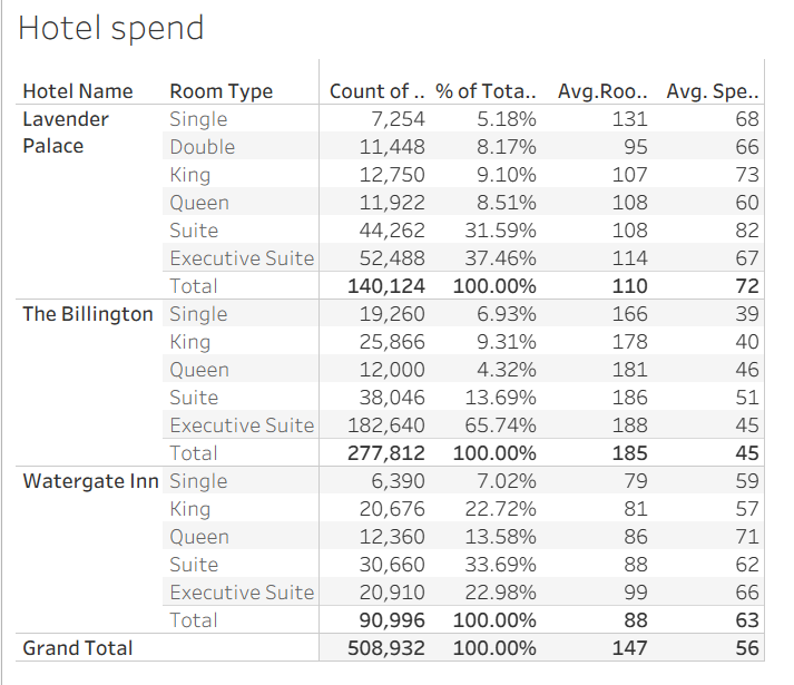
Simple tables like this helped me uncover eary insights and understand the story the data was beginning to tell. For example, I could see that most customers (79%) at The Billington were booking either Suites or Executive Suites. This aligned with the hotel having the highest mean room spend across all hotels. However, the same table also showed that it had the lowest additional spend per customer.
“Draft” some Charts
I’ve always struggled to visualise ideas in my head (we can thank aphantasia for that), so I tend to think things through by building charts directly in Tableau. This allows me to test whether my initial ideas work in practice, or if a different approach might be more effective.
Once I’m happy with a visualisation, I sketch out a very rough version of it in my notebook, alongside a note about which question or user story it answers. After producing these formative charts, I’m ready to start arranging them into a dashboard layout.
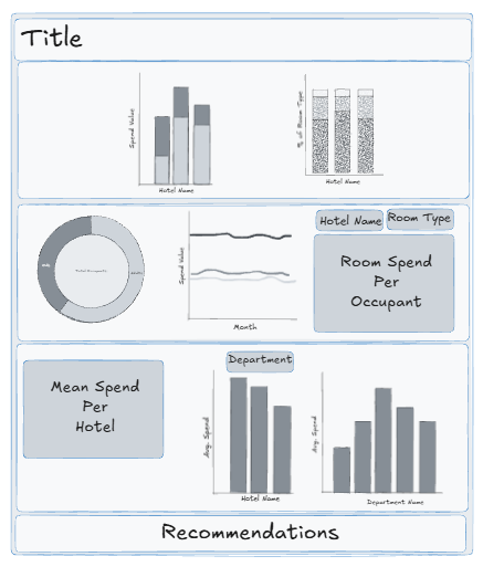
Dashboard Sketch
While I still find sketching on paper a quicker approach my artistic vision can’t always be understood by others. As such, if I ever need to share a sketch I choose to create it in Excalidraw. Firstly, I would decide whether I wanted my dashboard to be landscape or portrait. For this project I chose a portrait format. Following, I began to build my formative sketches in the software beforing placing them into my “dashboard.” I found that this helped me realise where the empty space within my dashboard sat, where KPIs or additional charts could be included to improve the quality of the dashboard both aesthetically and functionally.
This design sketch also helped act as a visual anchor when creating my final dashboard. Instead of thinking “where should I put this again” I had a framework to refer back to, especially when it came to working out where I needed to place my containers.
While sketching on paper is still the quickest approach for me, my artistic ability doesn’t always translate well to others. For that reason, if I need to share a sketch, I use Excalidraw.
I started by deciding whether the dashboard should be portrait or landscape, for this project, I chose a portrait layout. I then recreated my rough chart sketches in Excalidraw and began placing them into a dashboard structure. This process helped me identify empty space and think about where KPIs or additional charts could be added to improve both the aesthetics and functionality of the dashboard.
Having a design sketch also gave me a visual anchor when building the final dashboard. Instead of constantly asking myself “Where should this go again?”, I had a clear framework to refer back to. Useful especially when working with a bunch of containers
Here is my dashboard sketch:
Build your dashboard
When building the dashboard, I like to place everything in roughly the right position first, following my sketch, before worrying about detailed formatting. This helps me understand how much space each element needs, and where legends and filters should sit.
Once everything was in place, I turned my attention to colour. I used a website recommended to me called “Coolors”, which automatically generates colour palettes. This saved me a lot of time, as I tend to overthink colour choices far more than I should. While I did receive feedback about overlapping colour usage, largely due to time pressure, having a generated palette means I could easily iterate on this in future without starting from scratch.
Finally, after settling on a colour palette, I added filters to the dashboard, applied them to the relevant worksheets, and completed the final formatting across all views.
At that point, all that was left to do was practice… and present.
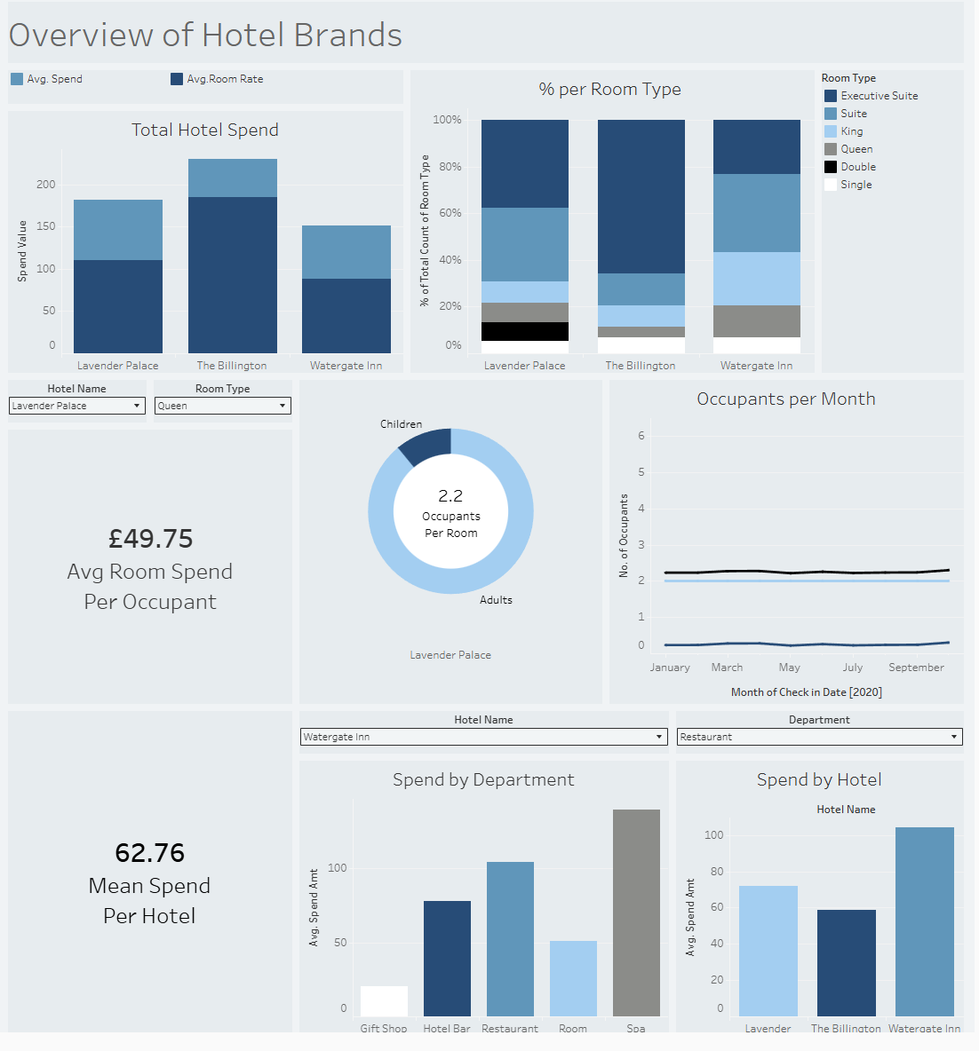
Here is my final dashboard from that Friday: