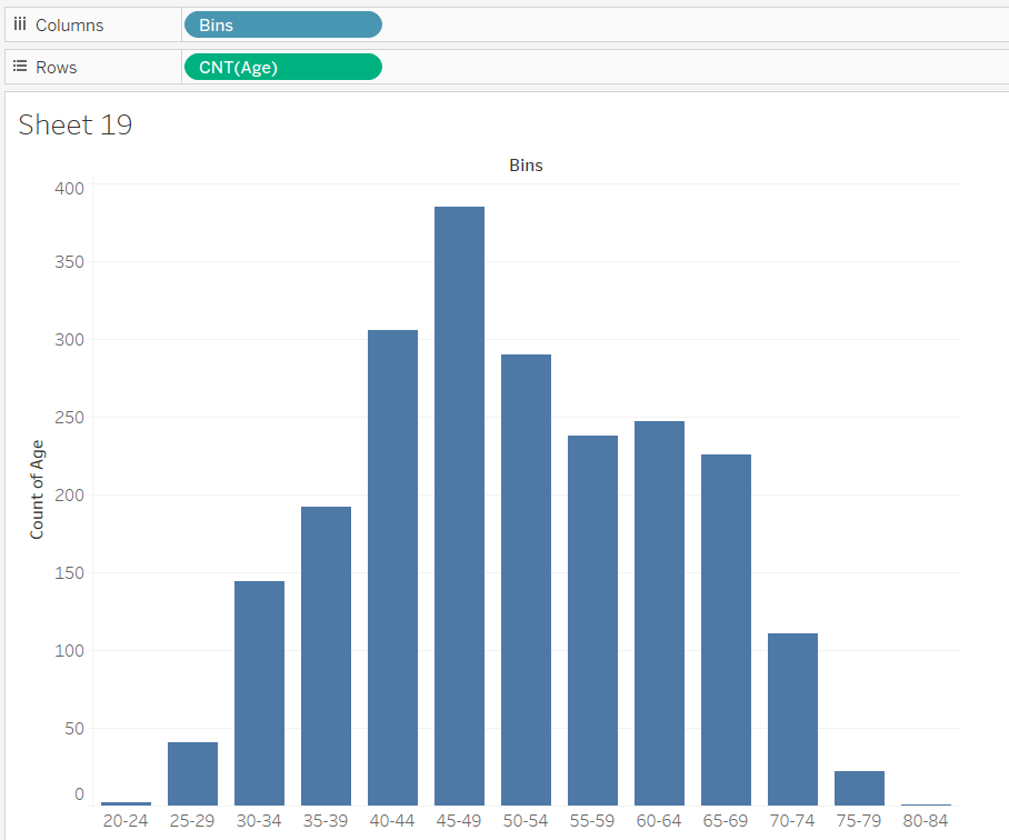
A histogram is a graph used to represent the frequency distribution of a few data points of one variable.
It is a chart type that I commonly think of using and I think is very useful to show the distribution of different demographics.
There are two ways I know of to create bins in Tableau.
The default way:
Right click a measure.
Click on create.
Click on Bins.
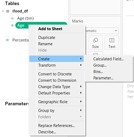
After following those steps you are lead to this menu.
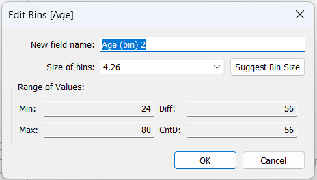
This automatically suggests a bin size that attempts to find a normal distribution of the data.
This is okay but could be better.
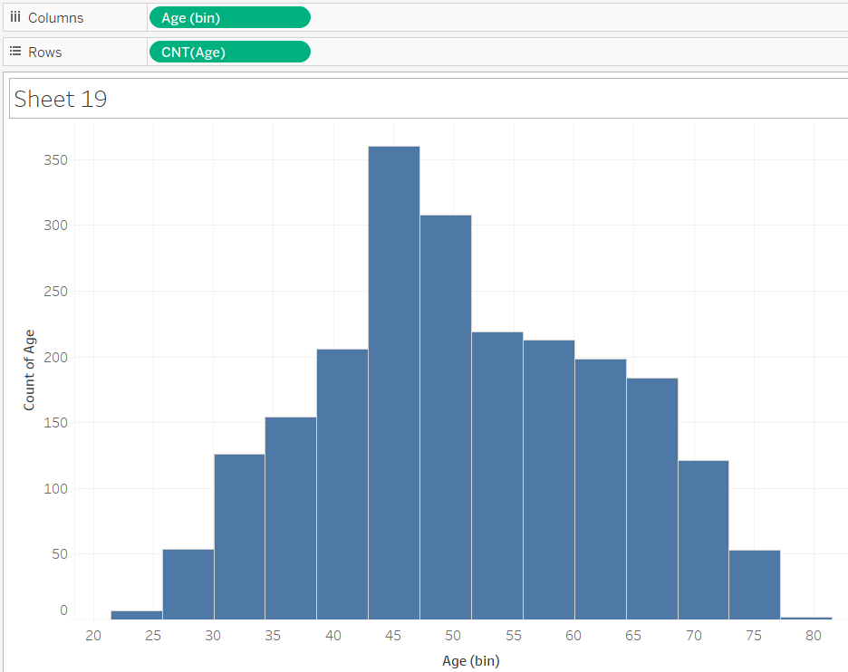
The way I have learned to create bins is with a calculated field.
This versions is much better in my opinion and clearly shows the range of numbers so the user doesn't have to think about it.