


During data preparation, we mostly try to reduce the size of the dataset, but for some visualizations, we have to extend it. Numerously!
Today, I will share an example where the visualization requires much larger data than originally anticipated. This technique can be useful for representing periodic data. That's why, for me as a woman, the most obvious example is period visualization. 💃
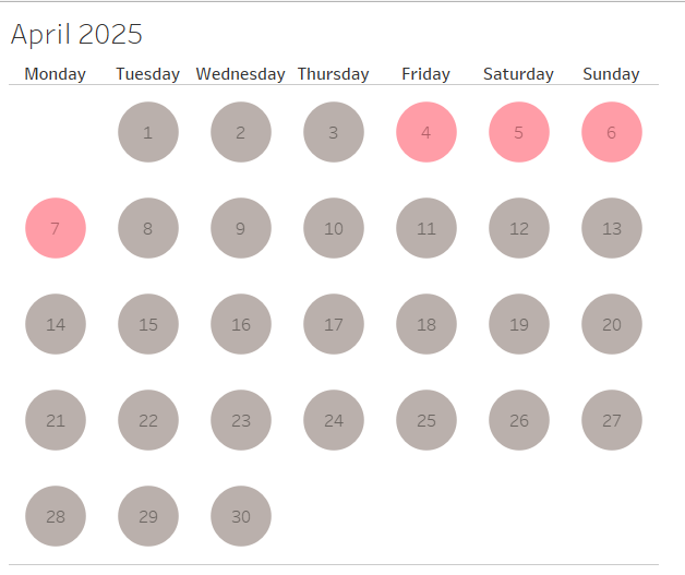
We will make a calendar with colored time intervals:
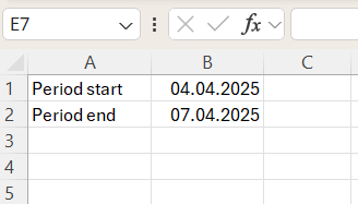
We don't have much to start with: only start and end dates.
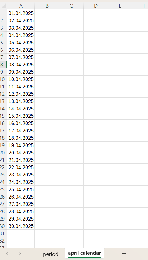
For this visualization, we will also need the dates of the month:
Data Preparation
I will use Tableau Prep to create the final dataset. First, let's pivot the period table so that the start and end dates are in separate columns.
Now, we should join the period data to the calendar and highlight the interval between the start and end dates. For that, we will use an unusual join.
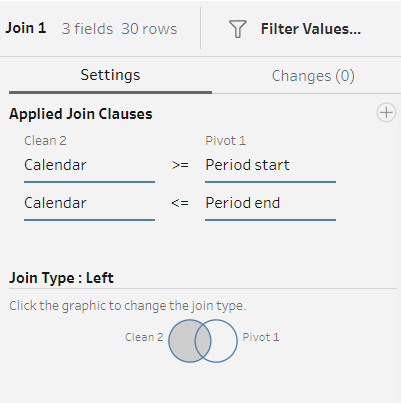
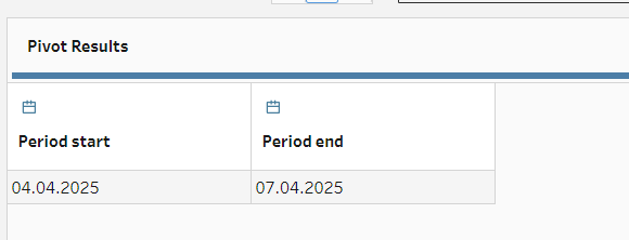
These join clauses will return calendar values, including start and end dates, as well as the days between them. This is the interval we're looking for, but we also need all the other calendar values for the visualization. That's why I'm using a left join. Here are the results of this join:
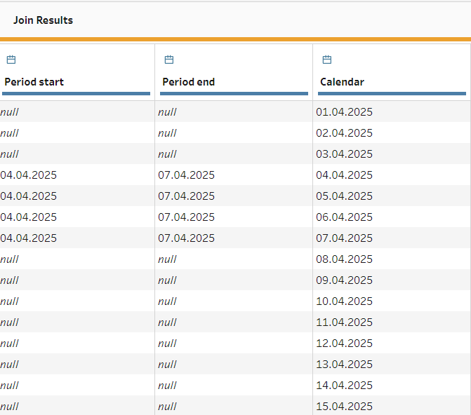
We kept the exact start and end dates and highlighted the period in the calendar without losing the calendar values. Now, we're moving to Tableau for visualization.
Visualisation
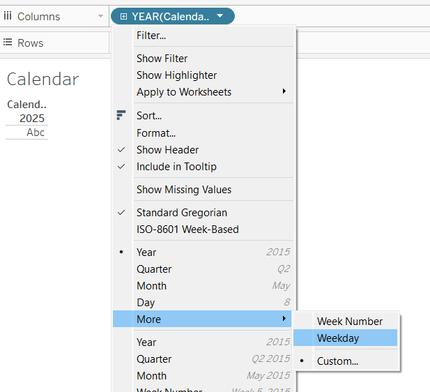
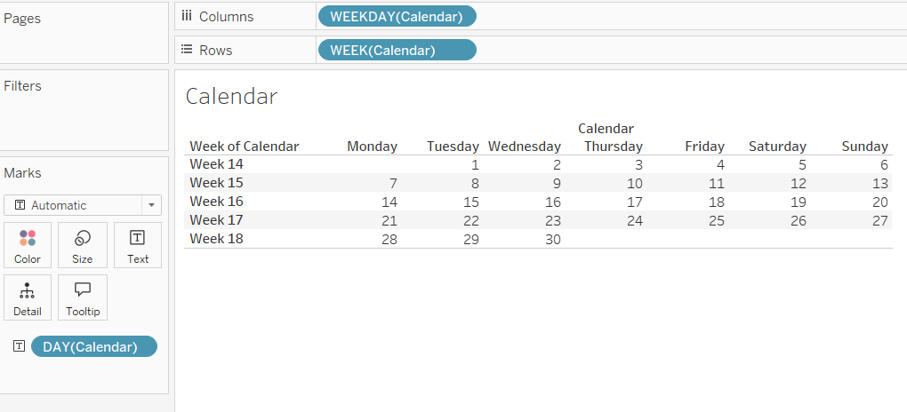
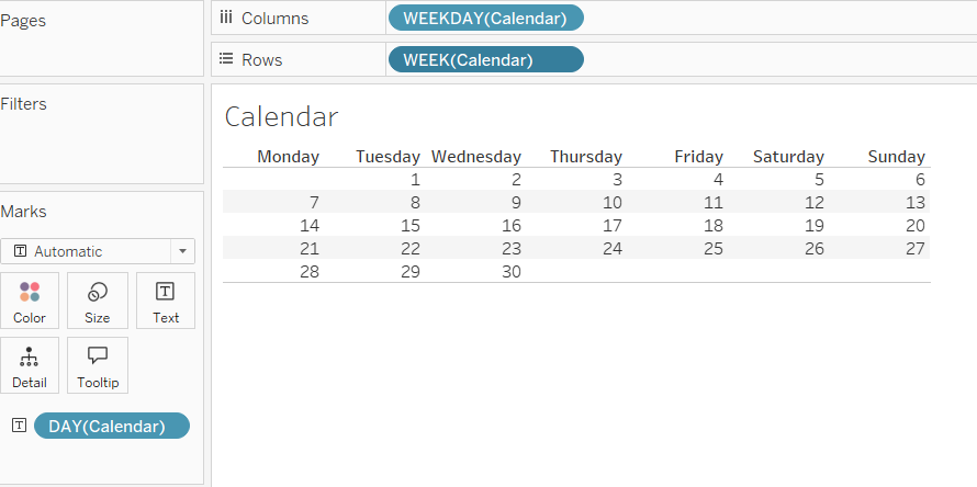
First, let's build a calendar. It's essentially a table with weekdays in the columns and week numbers in the rows.
We will also add days as a text field:
Let's hide the unnecessary labels and move forward.
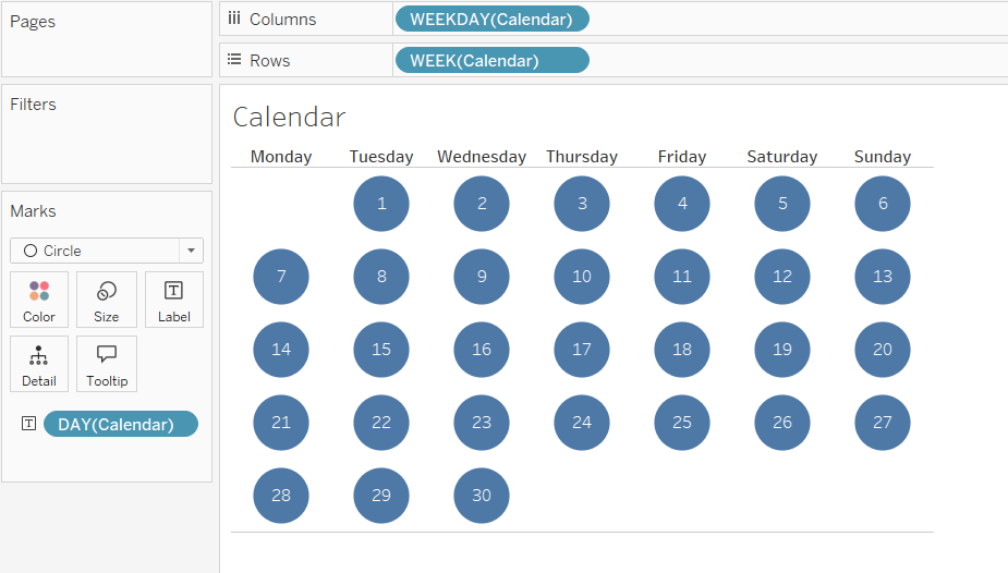
Much better! Now, we're changing the visualization to circles, increasing their size, and adding labels in the middle:
The last step is adding period data to the color field. It doesn't matter if we use the "Period End" or "Period Start" field because we only need non-null values.
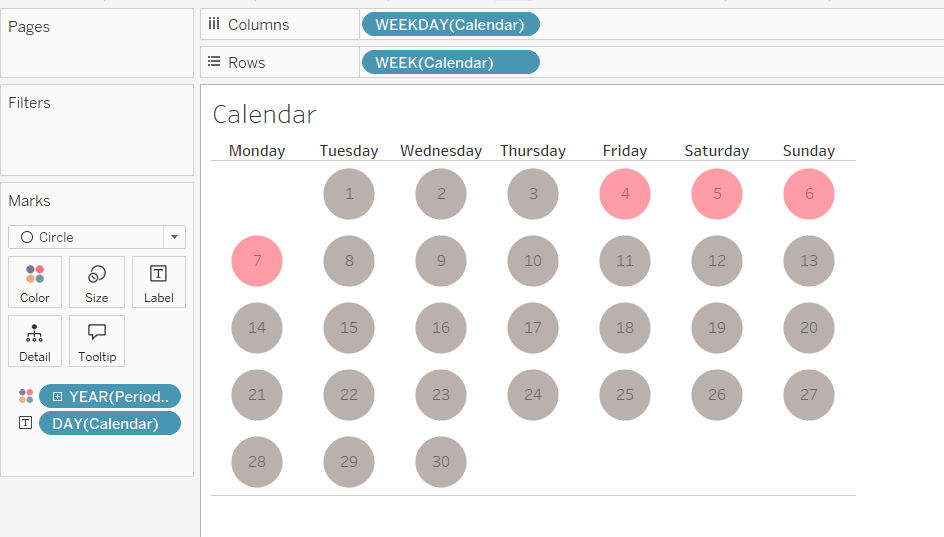
Done!
This technique can be useful for representing any cases, where we need to see when something happened (and when it didn't!). Hope it helped, see you in the next post!