


I am here to tell you about our "double" Makeover Monday 😁
Last week we had a task to makeover this nice vizz illustrating the article about Man’s best friend: global pet ownership and feeding trends.
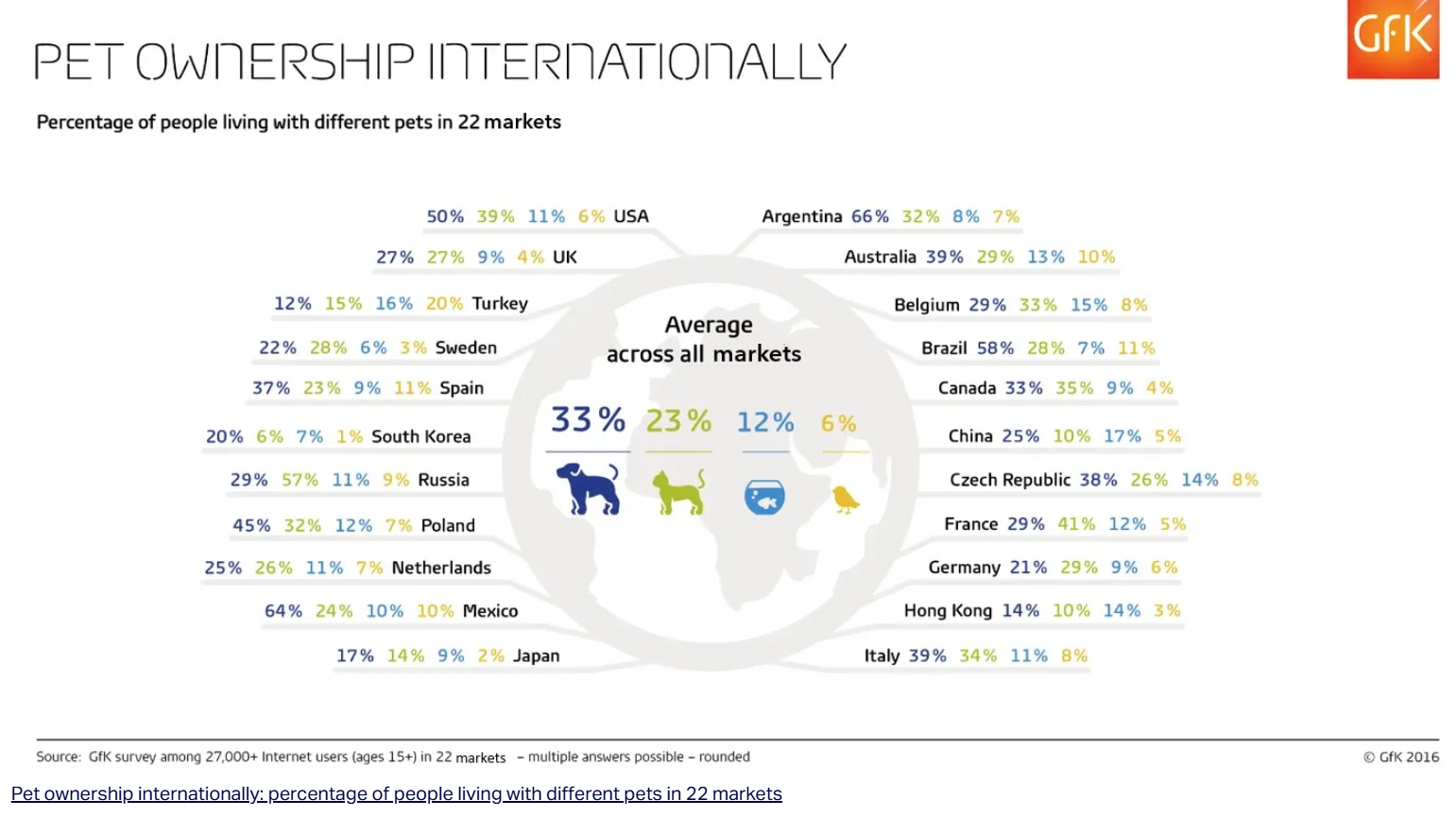
This is basically a table with an interesting alignment and overall numbers showing average pet ownership around the world. The visualisation is informative, but not really insighful. Therefore I decided to find a story in it.
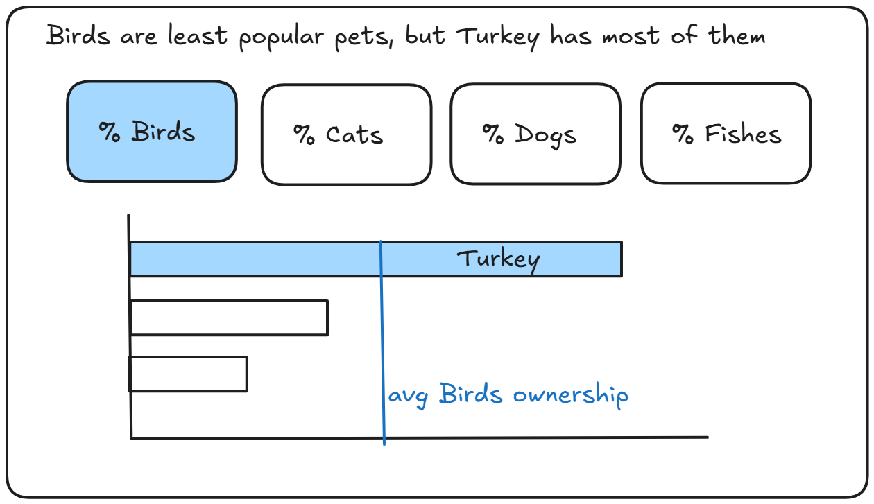
I did a quick emission analysis and found out that birds are least popular pets in the world. I found this fact interesting, dug deeper in bird ownership statistics and found out that Turkey has the highest percent of bird owners in the world. Sounds like a story to tell!
I created a quick sketch:
Based on that I made a dashboard, that looked similar, but something felt wrong...
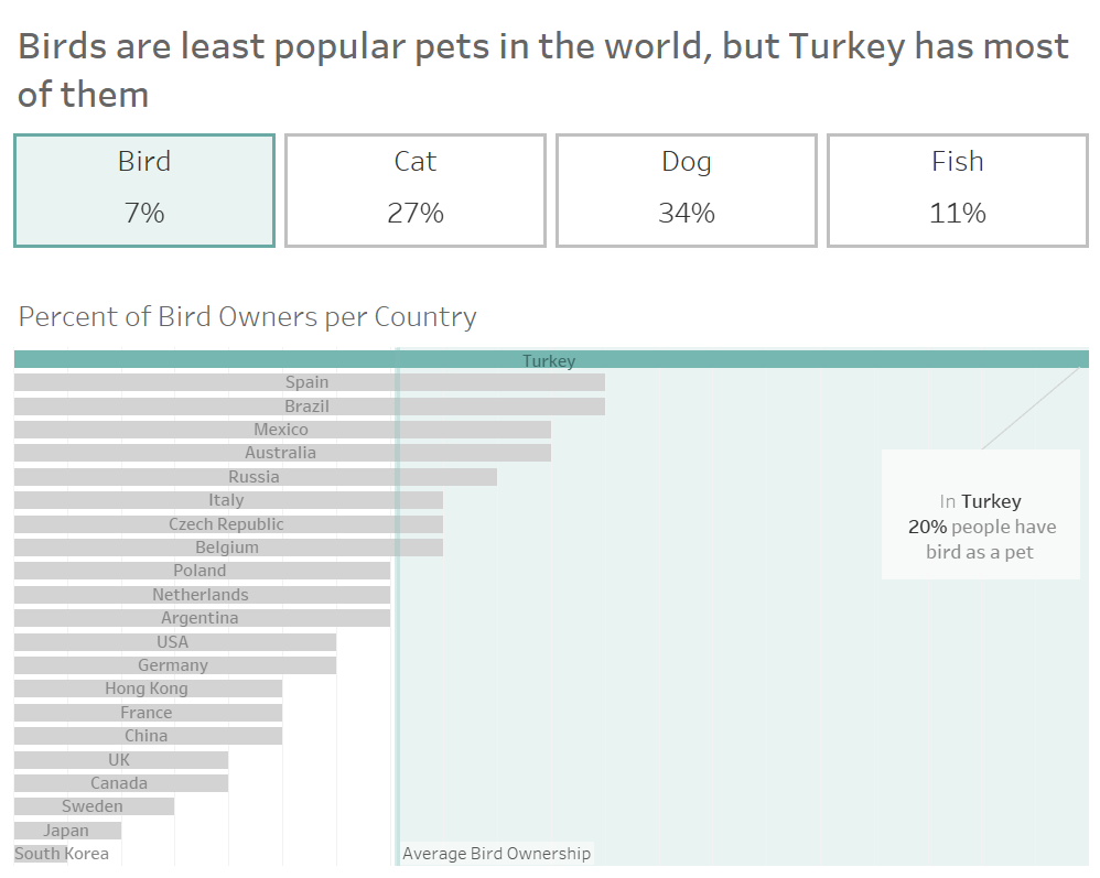
I've got really positive feedback from my colleague Ted. He mentioned that he could get the key takeaways from the dashboard very quick, through the title and KPIs. But he was confused by highlighted "Turkey" bar. He thounght it was the top of graph and being used as a divider for the graph because of the "above average" green shading accompanying this. Ted recommended me to avoid the unnessesery noise in the viz. And I am fully agree!
I found out other noisy things and tried to "calm them down". That's what I finally have:
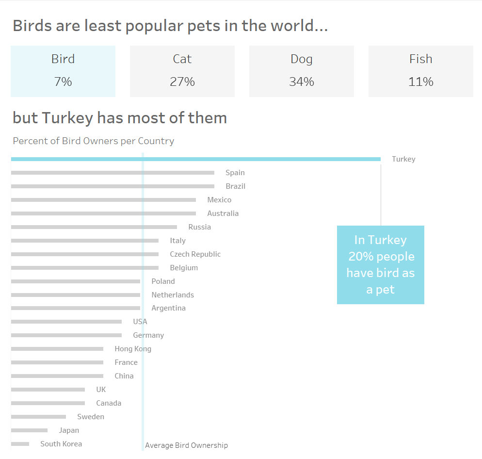
- Clearer Colors
- Separated title to explain each part of the viz
- Better alignment by using inner and outer paddings
- Less noisy bar chart with statistics across countries (made bars thinner, added space between bars and contry names, removed background lines)
I am much more satisfied with a new version! Maybe in a few weeks I will be able to make it even better 😅