


It is now day 3 of Dashboard week, our final day. Today, we were tasked with web-scraping the Ben & Jerry's website using Alteryx and create a clean visualization with the data in Tableau. With today's task being back with the tools we have most of our experience with, I was so excited to get started!
Despite using tools that I have a lot of proficiency in, this task definitely challenged me a bunch and forced me to make tough decisions on what ideas could be done within the allotted timeframe and what ideas had to be scrapped. In the end, I produced a dashboard containing information on where to find certain ice cream flavors at Ben & Jerry's locations in and around NYC.
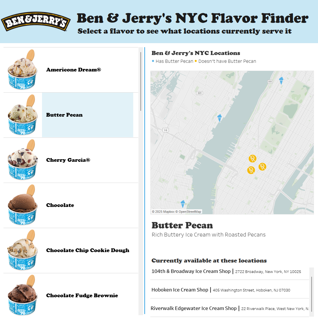
In this dashboard, the user can select a flavor of ice cream from the list on the left and see what locations currently serve that flavor on the map. Below the map is a short description of the flavor followed by a list of all stores that currently serve it, along with their addresses. Clicking on a location on the map will allow you to navigate to the store website, and clicking on a location on the list will allow you to navigate to the store's online menu. I am very proud of what I was able to put together. I think it has a very simple and clear purpose that could possibly help thousands of Ben & Jerry's lovers across New York City. I also really enjoy the simple layout and interactivity. I think my Tableau Public fans (all 3 of them) will really like this one! Of course, every dashboard day comes with it's own set of challenges and major successes, and today was no different. Here were some of the challenges I faced and some of the major successes I had today.
Challenges
1) Ben & Jerry's seem to love JavaScript and have a lot of 3rd party e-commerce tools on their site, which are effectively impossible to scrape. This made it difficult to create narratives early on as you would later go on to find that the data you want is completely unavailable.
2) Spatial Data - Spatial data is tough to work with, and I really did not want to cheat. I needed latitudes and longitudes for my Ben & Jerrys location table, and there was no in-house tool in Alteryx to get me them. Luckily, I was able to find a free API named geocode.maps.co that really saved my day. Check them out if you need spatial data!
Successes
1) I was able to get the images of the ice cream flavors from Alteryx and import them as custom shapes in Tableau and I think this was the real difference-maker on my dashboard. The images take it from being a boring dashboard into an interactive webpage that makes users want to explore.
2) I am now so comfortable with implementing AVG(1) bars into my visualizations that it has almost become the default, and I'm really proud of myself every time I get it done without referencing tutorials or prior work!
Overall, my dashboard week experience has been great, and I am so glad to have 3 new items in my personal portfolio. With the training period officially being over, it has been a great way to put a cap on all the hard work we have done in the last 17 weeks.