


By now, if you’re a prospective candidate for The Data School, it’s likely that you’ve been told to check out this blog. On first glance, it may be a bit overwhelming - particularly if you’ve never touched Tableau or other business-intelligence tools before. But once you learn some simple navigation tricks, this blog can become an incredible asset in your application journey. Below are some tips to help!
Don’t: Navigate 'Most Recent' Without a Purpose
While you’re able to stumble across some interesting pieces of information that way, it’s easy to inundate yourself with information on miscellaneous topics. The best way to navigate through the Data School blog is to define 2-3 topics to focus on and search them up.
Do: Use Feedback Given On Your Dashboards
If you’ve already applied and received feedback on your dashboard, a great way to narrow down your learning objectives is by using the feedback. Learning everything about your dashboard’s weaknesses is also an easy way to create a stronger one. Let’s take an example from my very own first round of feedback.

Screen capture from email received 10/17/25.
In the above feedback, my reviewer mentions the necessity of using containers to effectively lay out your dashboard. While my reviewer was incredible and sent me resources, let’s say she had not and I wanted to use the Data School website to learn more about containers.
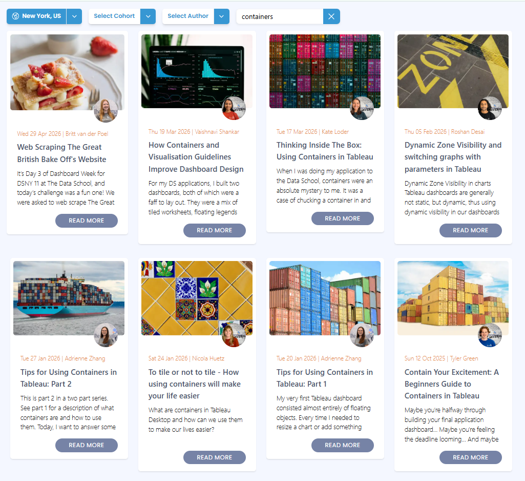
Captured from The Data School's website on 5/26/26.
When I type in containers, these are the first eight entries that appear. I can use context clues from my feedback - “organization, spacing, alignment” - to pick out the blogs that may be more relevant to that. I can also use the keywords from the blog titles (such as “Beginner”) to understand that certain blogs are aimed towards me, while blogs with more complex or irrelevant terms (such as “Web Scraping”) may not be aimed towards me.
Don’t: Be Overwhelmed at the complexity of certain articles
As seen above, searching for basic terms may yield complex results. I remember searching for “dashboard” during my application process and stressing out about the intricate articles that showed up in front of me. Everyone that creates articles on this website does so during their 2.5 years of training, with a strong upward curve of knowledge in the first four months during training. Understand that the only practical difference between you and any author is a few months of practice with the tool - and everyone starts where you are. It’s possible you’ll be the one in six months writing articles that stress applicants out.
Do: Use “Our Team” to navigate chronologically through training
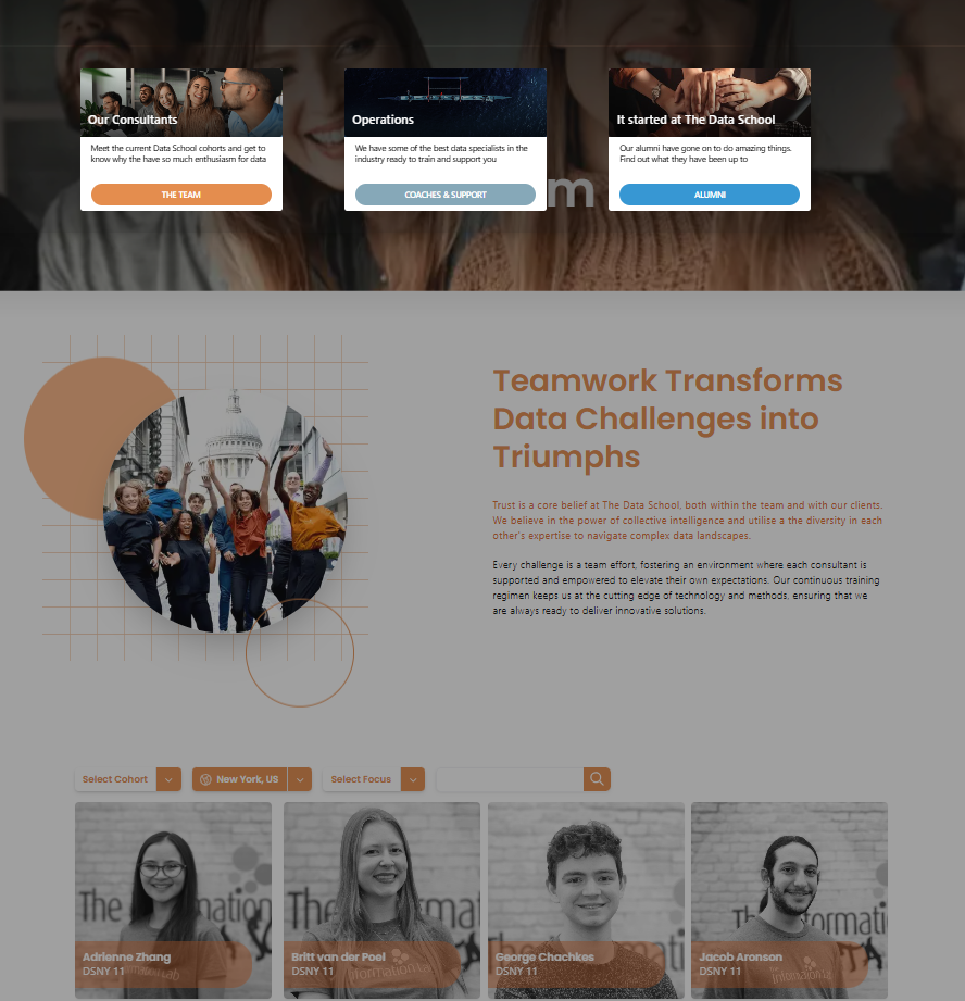
Captured from The Data School's website on 5/26/26.
A useful way to navigate through the evolution of training is to head to “Our Consultants” under “Our Team” and click on specific consultant’s profiles. You’ll be able to read a blurb about them, but also very importantly - you’ll be able to read their blog posts in chronological order. Most Data Schoolers develop the practice of blogging from the inception of their training. You might be able to follow their training arcs and learn as they learn. This is one of the easiest ways to separate “beginner” information from more intricate topics.
Don’t: Only Scroll the New York Location
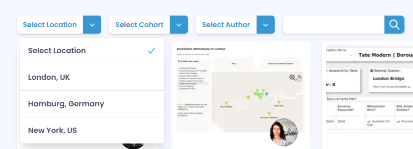
Captured from The Data School's website on 5/26/26.
The Data School was founded in the United Kingdom 10 years ago and has a considerable head start on Data School NY - while DSNY currently has 12 total cohorts, DS in the UK is on cohort 58! Data School Germany is also on 12 themselves. That is to say, if you limit the location to only New York, you are only getting 15% of the Data School’s combined knowledge!
Do: Reference ‘What it took to get into _’ blogs
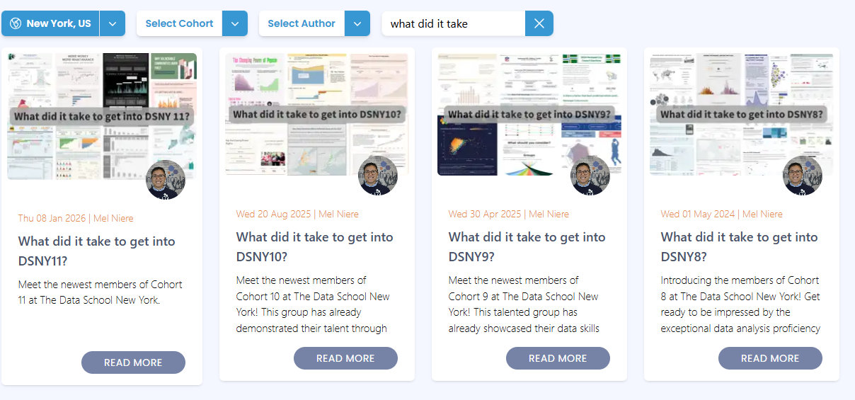
Captured from The Data School's website on 5/26/26.
A huge resource for me during my application process was referencing the blogs showcasing the dashboards that got people in. Every time a new cohort enters, their initial dashboard and final interview dashboards are posted together in a blog post labeled “What did it take to get into DS(location) (cohort #)?” I cannot recommend it enough. It’s one thing to understand what best practices your dashboard falls short in via feedback, it's another thing to see other dashboards implement those same practices effectively. Be sure to change the location to see what dashboards were made in the UK and Germany as well.
Don’t: Do it alone!
Learning Tableau alone is incredibly hard. Luckily, you don’t have to. Outside of even the Data School, the #datafam community is a vibrant and helpful set of people across LinkedIn, social media, and in person. Following current & former consultants can be a great way to pick up tips organically. Tableau also hosts multiple user groups across many cities - which all host in person and potentially online events as well. Know that if you have a question, it's likely someone else has had that question before and is more than happy to explain it.
Good luck to all applicants!