


Last week, we had our second Makeover Monday. We were provided with the following chart and asked to improve it.
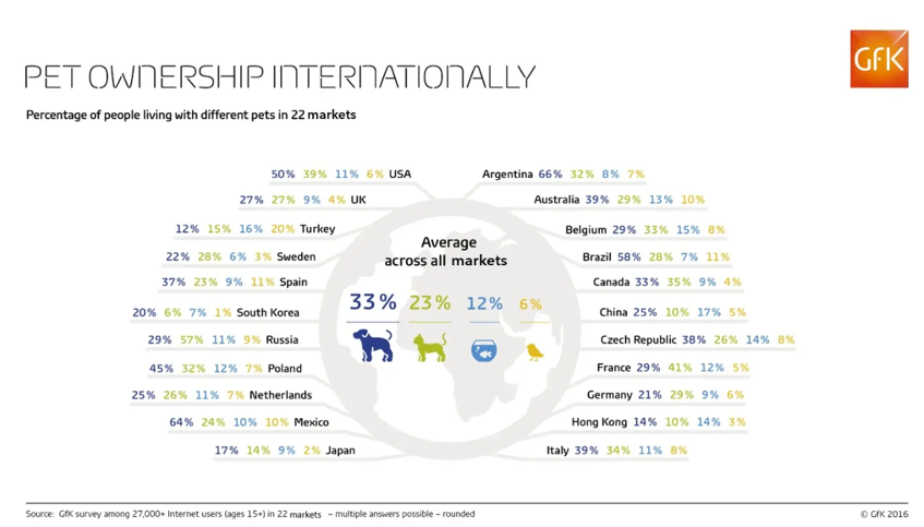
The first thing I noticed was that, despite being a visualization, the original chart still contained a lot of numbers. It was difficult to compare pet ownership rates across countries because the chart relied heavily on raw figures. However, I did like the center portion that showed the overall percentage of pet ownership by type across all countries—it gave a quick overview showing that dogs are the most common pets, followed by cats, fish, and finally birds.
My goal was to better visualize how pet ownership is distributed across countries, while still showing the global average for each pet type.
This was my initial idea:
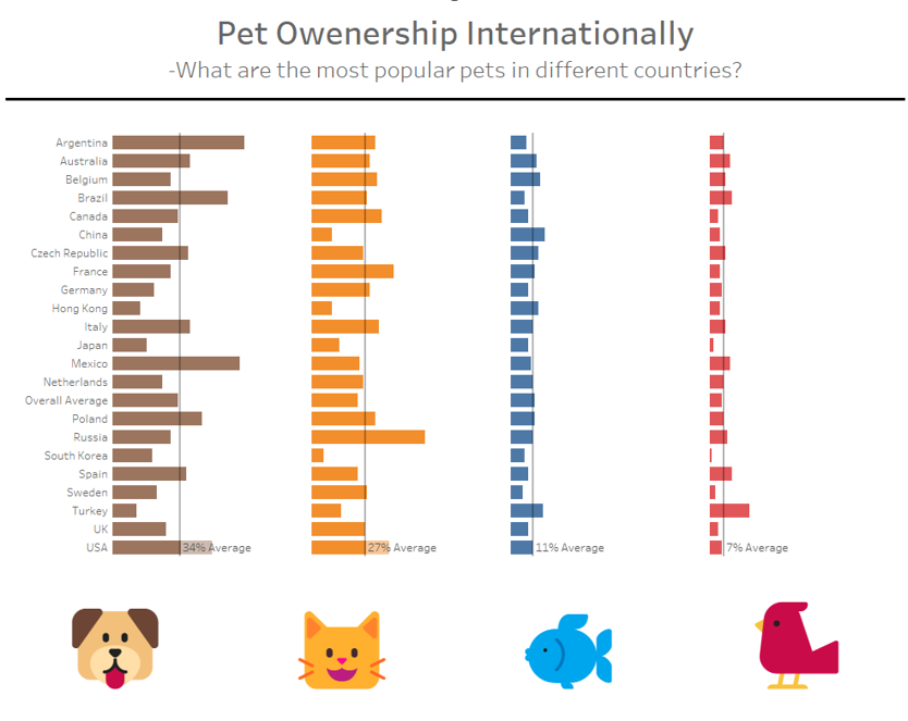
The visualization displays the distribution of each pet type across different countries. To make it easier to understand at a glance, I color-coded the bars according to the pet icons displayed below the chart. I also added an average line to indicate the global average ownership percentage for each pet. I deliberately left out individual percentage labels for each country-pet combination to avoid clutter and to keep the visualization clean.
With this setup, viewers can quickly grasp the overall distribution. It’s immediately apparent that dogs are the most popular pets, while birds are the least. If someone is interested in a specific country—for example, Germany—they can hover over the respective bar to see a tooltip showing detailed percentages for that country. This reveals, for instance, that in Germany, more people own cats than dogs.
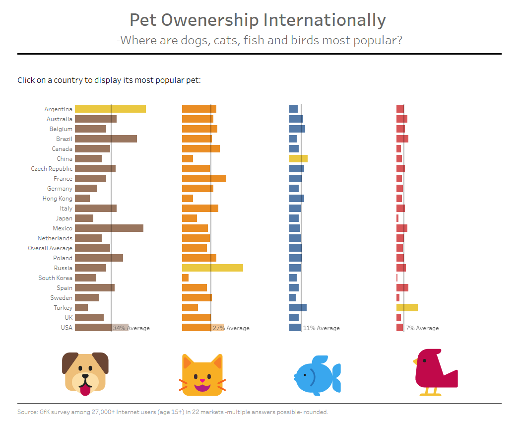
After sharing my dashboard, I received constructive feedback from a colleague. He appreciated the clean and visually appealing design but pointed out that the main question—what is the most popular pet in each country—was not easily answered with my current setup. He suggested either rephrasing the question, adding a field to explicitly show the most popular pet per country, or using highlights to emphasize it.
I found his feedback very helpful and decided to implement two changes:
- I added a field that displays the most popular pet in the country a user clicks on.
- I highlighted, for each pet type, the country where it is most commonly owned.
These changes significantly improved my visualization. Now, it not only shows the overall distribution of pets globally, but also allows users to quickly see which pet is most popular in each country with a simple click. Additionally, through highlighting, one can instantly identify which country has the highest ownership for each pet type—dogs, cats, fish, and birds.
Here is my final visualization:
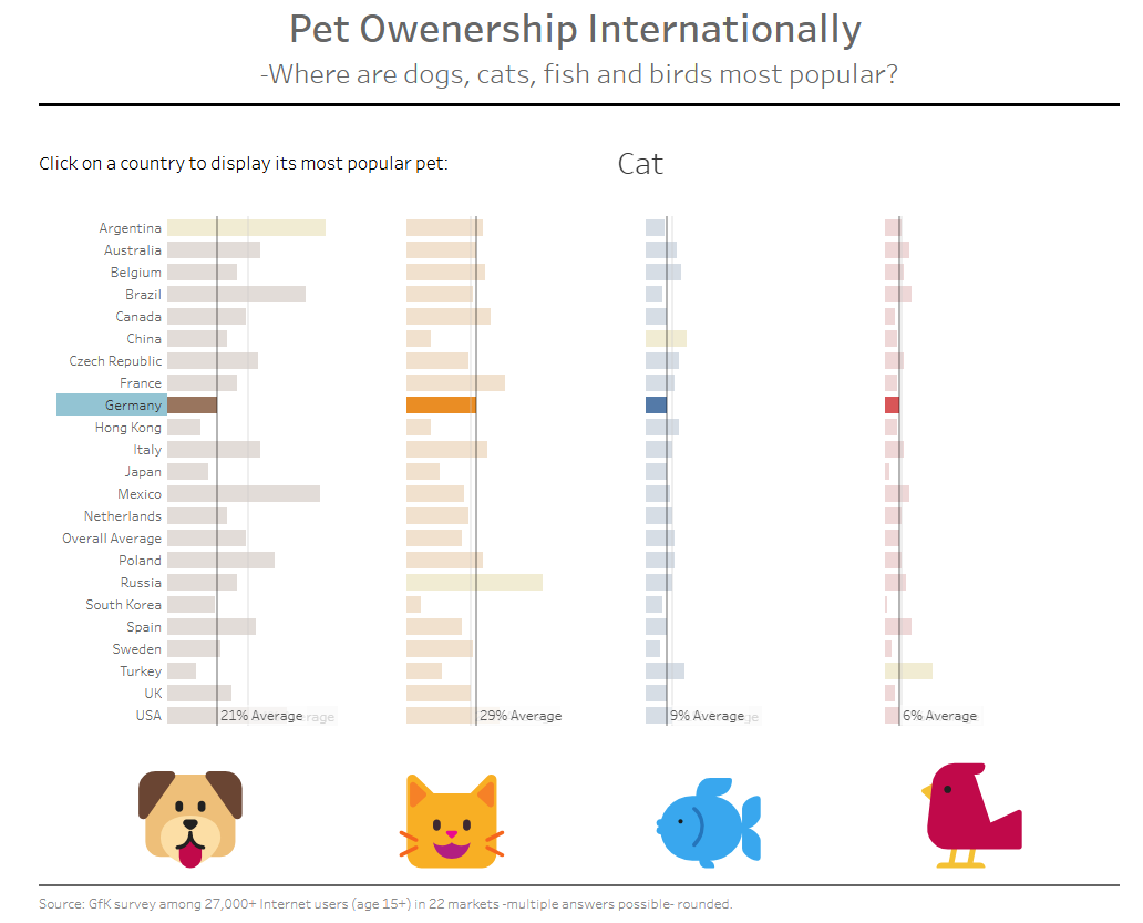
When you click on a country, the visualization displays the most common pet.
Makeover Monday has significantly enhanced my ability to think critically and creatively about data visualization. It challenged me to explore how information can be presented in the most effective and visually engaging way, ensuring that key insights are immediately clear to the viewer.