#MakeoverMonday is a big thing in the Tableau community, specifically for members at the beginning of their learning journey.
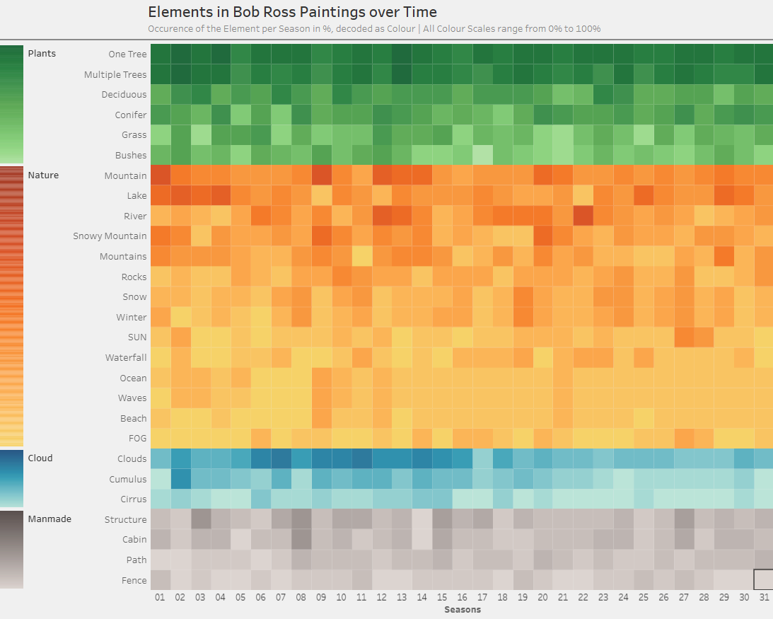
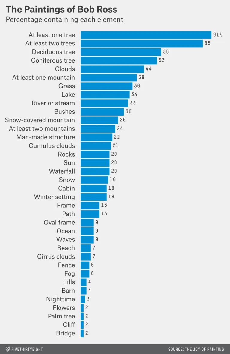
I was given the task to do a Makeover Monday, with a time frame of two hours. My target: A simple Bar Chart showing the occurence of elements in paintings by Bob Ross over time. Diving deeper into the underlying data reveiled that the Author filtered the dataset seemingly by hand. I was motivated to really one up this Vizz and dived into the data to see what shall be left out and what shall be reintegrated.
A huge amount of time I spent on grouping, regrouping and starting over. Probably needless to say: I wasn't finished after two hours, but at this point I had put too much effort in already to just publish a half ready makeover.
Continuing, I settled on four groups and decided to colour them independently. Since the chosen chart type was a heatmap and it was meant to be stacked on top of each other seamlessly, where would the four colour legends reside? Well, I wanted them to be vertically oriented, which is not a native feature in Tableau. To work around this limitation, a stacked Barchart seemed like the easiest solution. After finding a fitting Colour palette, it finally was done.
Rergardless of the original target, I proudly present to you my makeover:
Original
My Makeover