


A knowledge of statistics allows for an understanding of the data and how to best approach the problem presented. This blog will go over descriptive statistics, and some concepts within that: quartiles and boxplots.
Introduction to Descriptive Statistics
Descriptive statistics describes the data. The most common example of this is the mean (average), median (middle score), and mode (most frequent score in the data set).
Most popular of these three measures of tendencies is the mean, of which it's possible to take a weighted version of. When the data varies greatly, with some outliers pushing the average up or down, it is best to take into account which scores contribute more than others. This is called a weighted average and in this way, a knowledge of statistics allows for greater flexibility and accuracy in data analysis.
In descriptive statistics, quartiles allow for an understanding of distribution and are essential to understanding boxplots.
Interquartile Range and Quartiles
Quartiles divide the data set into four equal sections, with Q1 representing 25% of the data, Q2 representing 50% of the data, and Q3 representing 75%.
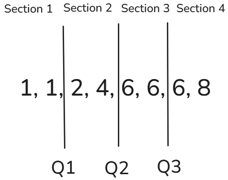
The interquartile range is the group of numbers between Q1 and Q3 (Q3 - Q1), representing the middle 50% of the data. IQR can be used for figuring out outliers. The formula for that is: 1.5 x IQR + median, 1.5 X IQR - median.
Now that we have an understanding of quartiles, we can use that knowledge to read boxplots.
Boxplots
Boxplots show the distribution of the data, making it easy to identify Q1, Q2, and Q3. By looking at the box you can visually see where most of the data falls.
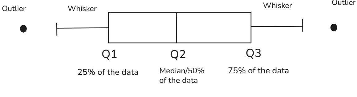
Remember the IQR formula mentioned earlier? The whisker represents that, with data falling outside the whisker being easily identifiable as outliers.
I hope that this blog helps you understand how descriptive statistics concepts helps with understanding data points for analysis!