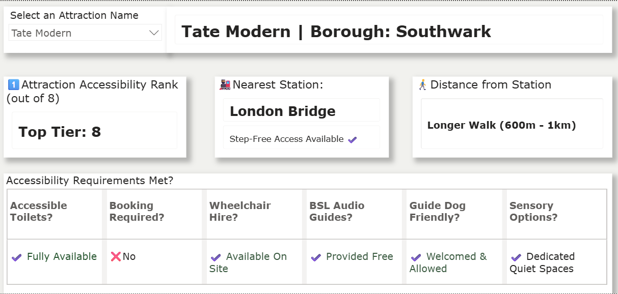
Day 1 of Dashboard Week and we had to build a dashboard to meet certain accessibility requirements. My focus was on Dyslexia and Dyscalculia.
I wanted the focus of this dashboard to be simplicity. Only one button would need to be toggled to get the relevant information out of it.
Steps I took to make this as accessible as possible:
Made the background colour not white
A muted colour is easier on the eyes as it reduces the glare. The less glare, the less chance of sensory overload.
Lots of "Whitespace"
Because my brief focused on dyslexia, I know my dashboard technically contains a lot of words, but the whitespace makes it easier to read and reduces clutter and ensures nothing blurs together.
Bolding Values
Again for ease of read. Easier to distinguish.
Minimal Colours
Minimising the colour noise, so the eyes can focus on the text/icons
Use of Icons and Words
Double encoding to ensure all information is interpreted the same. The Icons allow for easy eye tracking, and the words allow a deeper understanding, but one could choose one or the other if they so choose to.
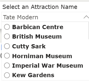
Having One Attraction Filter
This keeps things simple, the user can think of an attraction, find it in the dropdown and then see what requirements it meets.
Bolded again for ease of read.
Font: Verdana Size: 15-20
This font is the easiest to distinguish and the size 15+ ensures everything can be seen.
Dynamic Title:
Changes with the chosen Attraction so it can be seen in bigger letters.
Here is the Final Result: