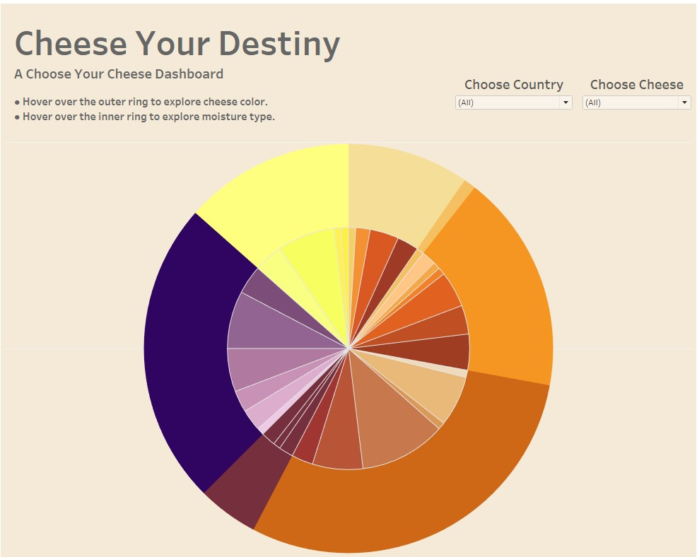
Today we were asked to perform webscraping from a cheese website (www.cheese.com). Since I was out sick for the webscraping unit, I borrowed a "pre-scraped" data set from someone in my cohort. I was determined to be more creative than my first dashboard from Day 1, and was inspired to make a cheese wheel. I watched the video "How to Create a Pie Chart Drill Down" by Andy Kriebel, to drill down from cheese color to moisture type. This isn't quite a logical drilldown, but I wanted to see if I could apply Andy's instruction my dashboard. Though, I was able to create the dual axis pie chart, I was unable to configure the filter actions like Andy. Instead, I added 2 filters, to allow the user to narrow down the pie chart by country and by cheese.

Since I really enjoyed making this dashboard, I plan to go back and reattempt the filter action. If color or texture is selected, then I would like to have a table appear with all the cheeses within that selected color or texture. Overall, I'm pleased with the progress I've made from the Dashboard Day 1 to Day 2.
