


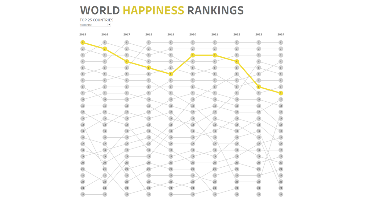
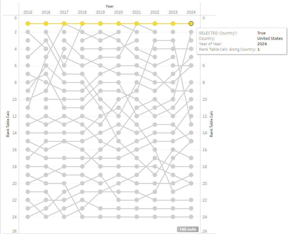
When the World Happiness Rankings were published this year, I decided to create a bump chart displaying the historical rankings of the top 25 countries. Bump charts are great chart for tracking rankings over time. Keep reading to learn how to build one.
Steps for Building a Bump Chart
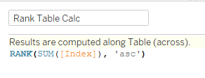
Below is the syntax for the rank table calculation. This table calculation converts each world happiness index score into a ranking. If you're making a bump chart using a different data set, you would use a different measure instead of an index score.
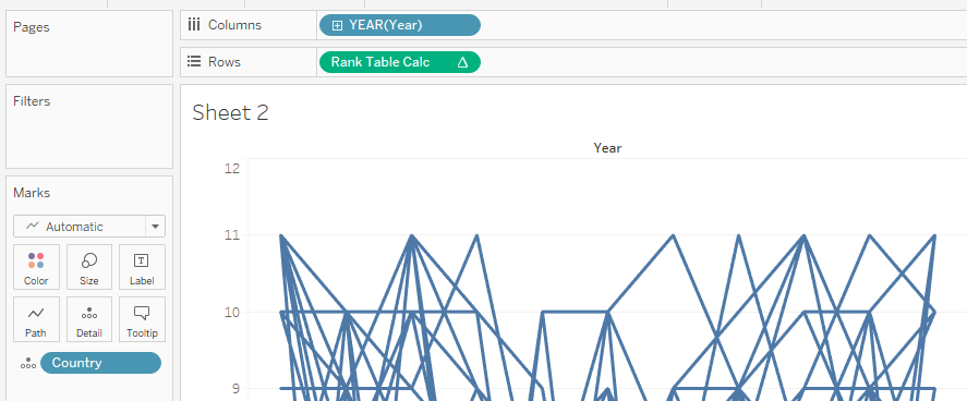
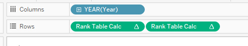
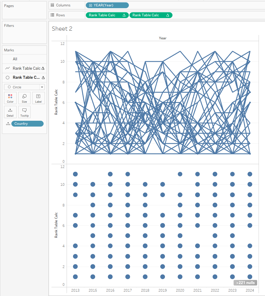
Place your Rank Table Calc pill on rows, your time measurement on columns, and your dimension on detail.
To duplicate the pill: click the pill, press ctrl and drag the duplicated pill to the right.
When you duplicate your Rank Table Calculation pills, initially you'll see two line charts and two new marks cards. Update the second marks card by changing the mark from line to circle.
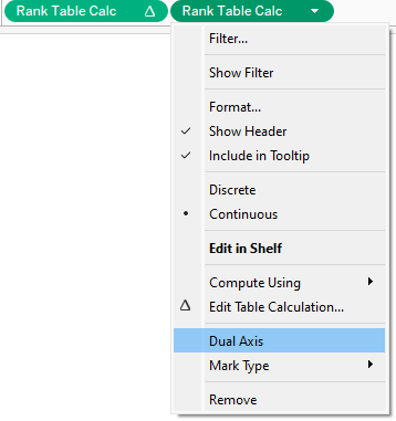
Once your duplicated table calculations are on a dual axis, you should see the lines and circles (or "bumps") start to line up.
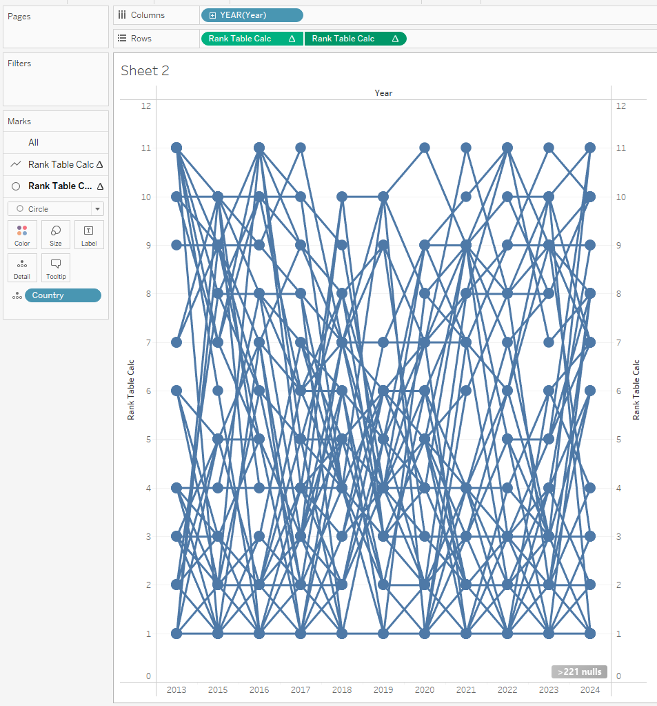
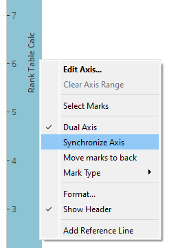
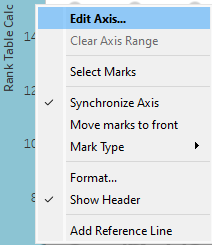
It is important to make sure your axes are synchronized so that measures for each individual chart are aligned.
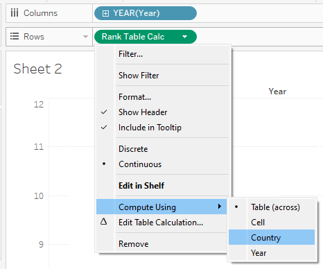
The table calculation defaults to calculating as table across, but for a bump chart, it needs to be compute using your chosen dimension (in this case, country).
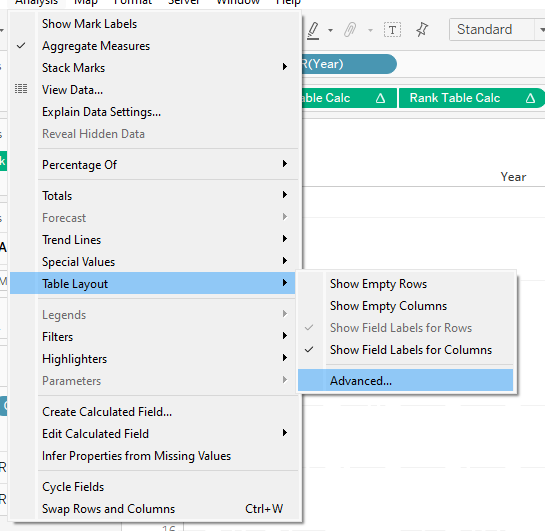
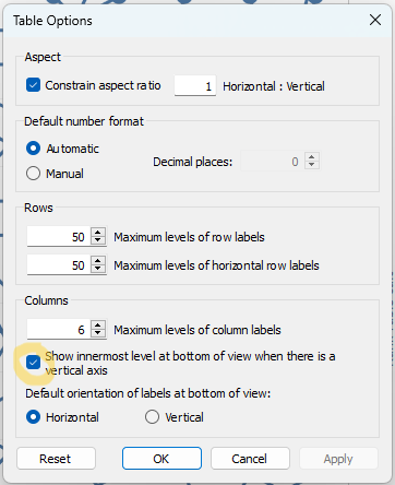
You can do this by clicking on "Analysis" in the task bar, then "Advanced...", and then untick the check mark next to the statement "Show innermost level at bottom view when there is a vertical axis."
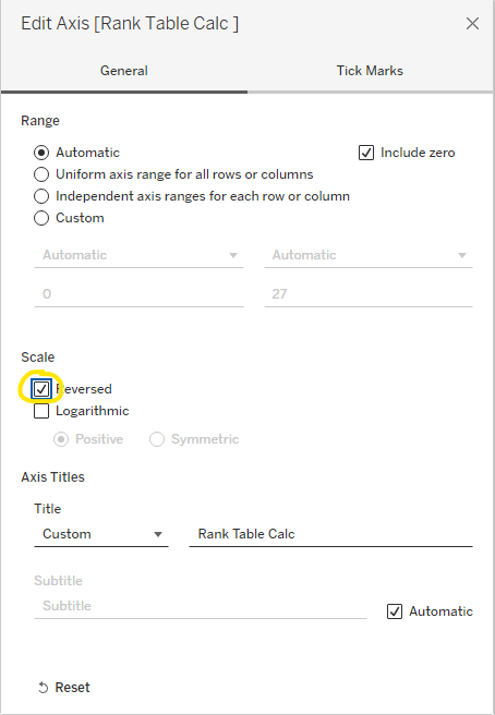
Reversing the axes will display the first ranking at the top. To do so, right click the axis, and then tick the "Reversed" box.
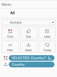
For my bump chart, I included a parameter that allows the user to select a country. When the country is selected, its rankings across the years are highlighted in yellow, while the remaining countries are gray. If you're interested in including a parameter in your bump chart, read on.
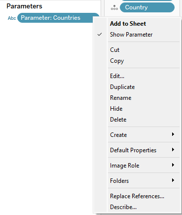
You can create a parameter by clicking on the triangle at the top of the data pane.
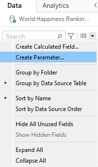
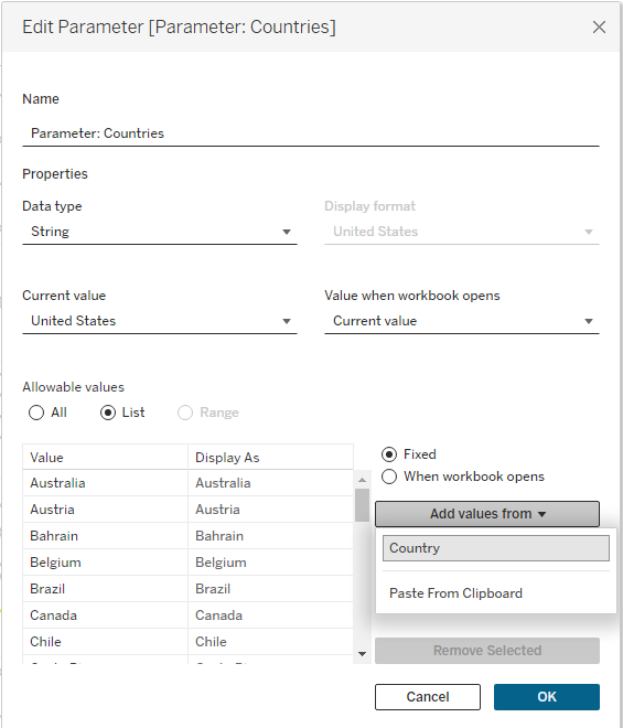
Then, name your parameter, choose "List" and then choose the dimension you want to display in your list.
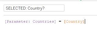
This calculation means, if the selected country in the parameter list matches the country in the parameter field, then display the selected country.
To test your parameter, click on the parameter, and choose "Show Parameter."
When testing it, you might notice your selected country moves to the top of the bump chart, regardless of its rankings each year. This is because the selected country (yellow) is only being ranked against itself. You can fix this in the next step.
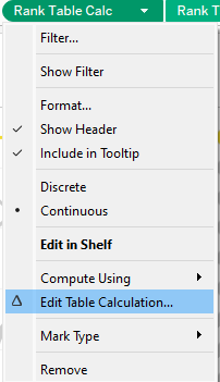
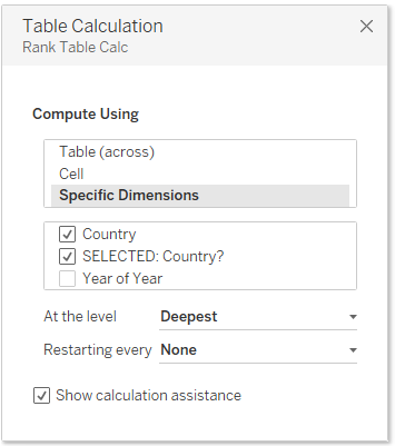
Instead of choosing "Compute Using," choose "Edit Table Calculation" to update it.
You can also update "Compute Using" here by ticking the dimension field (in this case country), as well as the selected dimension. By having both of these ticked, the selected dimension will be ranked with its unselected counterparts.
Go ahead and update your formatting by choosing your preferred colors, fonts, and include it on a dashboard if you wish.