The "So what" question is integral to the effectiveness of data visualization. It creates meaningful insights, provides context, supports decision-making, and enhances the overall impact the information that is communicated. When creating visualizations it is essential to ask what is the message? Why is it relevant? And what should be done about it?
Data Stories
A data story can be used to communicate what the data is telling you and get to the meat of the "So what." There are a variety of data visualizations that can be used to create a narrative. Below 7 visualization styles are discussed that can be used to tell your data story.
Change Over Time:
- Description: This type of data visualization illustrates how a particular variable or set of variables changes or evolves over a specified period. It is often represented using line charts, area charts, or other time-series visualizations.
- Example: Tracking stock prices over months, visualizing monthly sales trends, or showing the progression of global temperatures over the years.

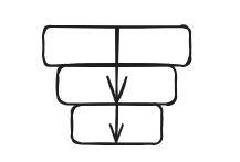
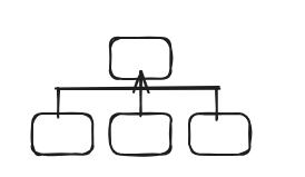
Drill Down:
- Description: Drill-down visualizations allow users to explore hierarchical data by navigating from a higher-level overview to more detailed information. It typically involves interacting with the visualization to reveal additional layers of data.
- Example: Starting with a world map showing global sales, users can drill down to see sales by country, and then further to view sales by region within a country.
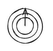
Zoom Out:
- Description: Zooming out in data visualization involves providing a broader or higher-level perspective of the data. It allows users to see the bigger picture or context of the information.
- Example: Beginning with a detailed city-level map, users can zoom out to view sales data at a regional or national level. Similarly, in time-series data, zooming out could involve looking at data over longer time periods.
Contrast:
- Description: Contrast visualizations emphasize the differences between two or more variables. It is often achieved through the use of bar charts, stacked bar charts, or other comparative visualizations.
- Example: Comparing the revenue of different product categories in a bar chart or contrasting the performance of teams by displaying their metrics side by side.

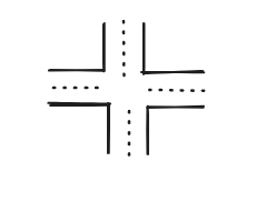
Intersection:
- Description: Intersection visualizations highlight the overlapping elements or commonalities between different sets of data. Venn diagrams are a common tool for representing intersections.
- Example: Visualizing customer segments by their purchasing behavior and showing where these segments intersect, revealing shared characteristics.
Factors:
- Description: Factor visualizations explore the relationships between multiple variables and how they contribute to a particular outcome. Scatter plots, bubble charts, and correlation matrices are examples of factor visualizations.
- Example: Analyzing the impact of factors like advertising spending, website traffic sources, or employee engagement on overall business performance.
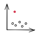
Outliers:
- Description: Outlier visualizations focus on identifying and displaying data points that deviate significantly from the overall pattern. Box plots, scatter plots, and histograms can be effective for highlighting outliers.
- Example: Identifying unusually high or low values in datasets, such as detecting outliers in sales figures or pinpointing anomalies in a set of test scores.