Gauge charts, often known as speedometer charts or dial charts due to their resemblance to automotive speedometers, serve as an engaging visual tool for showcasing data that reflects progress or performance against a particular target. These dynamic charts provide an at-a-glance view of key metrics, akin to checking your vehicle's speed, making them a favorite in dashboards across various sectors. They are especially useful for depicting data that represents a percentage of completion or the fulfillment of a quota.
In the use case I'll describe below a gauge chart was used to visualize max windspeed for different hurricanes to impact Florida. I leaned heavily on the Dueling Data and encourage you to check it out.
Check out my dashboard here.

Step 1. Normalize Your Measure
In order for the gauge chart to work your measure be normalized from a 0 to 1 scale. In my case this meant interpreting wind speed to a scale of 0 to 1.
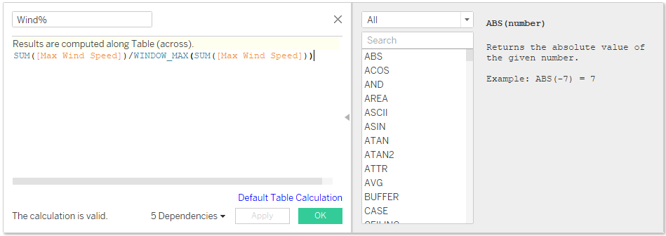
Normalized Measure
SUM([Your Measure])/WINDOW_MAX(SUM([Your Measure]))
Step 2. Create The Angle Value
Now that you have the normalized values they need to be converted to degrees. This can be done by multiplying the values by 180, if you plan on using a gauge chart that is smaller or larger than a half circle than adjust the number accordingly.
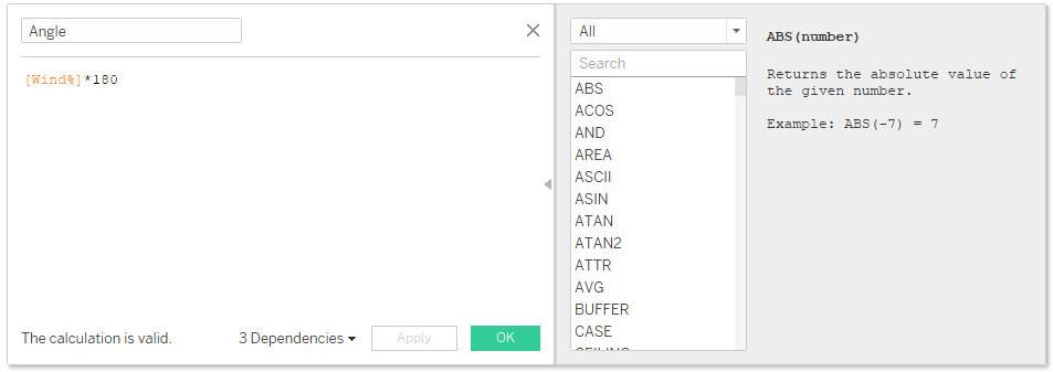
Angle
[Normalized Measure]*180
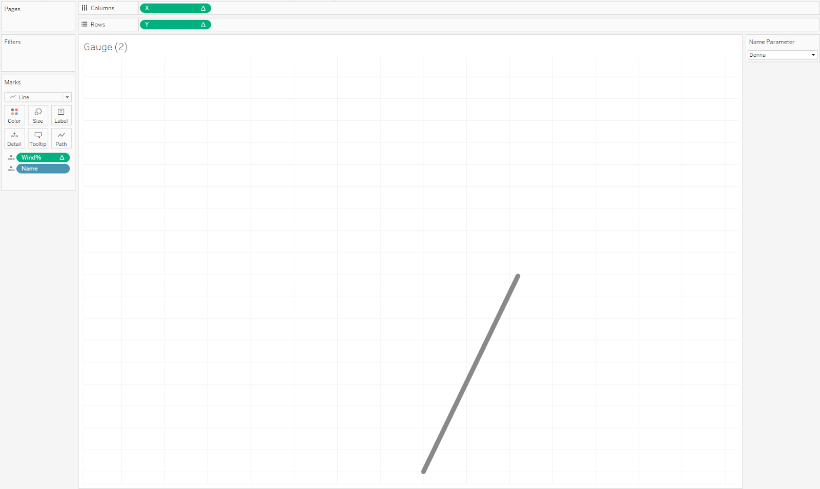
Step 3. Create X and Y Coordinates and Parameter
The next step is create X and Y coordinates that will become the points used to create the gauge needle. This gauge chart is a half circle, hence, it will only cover 180 degrees, if you need your gauge chart to be smaller or larger than this than adjust the 180 in the calculation below.
A parameter will also need to be created containing the categories you want to switch through. In my case I used the parameter to switch between different hurricanes.
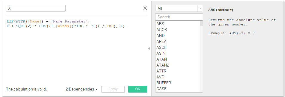
X
IIF(ATTR([Your Category]) = [Your Category Parameter],1 + SQRT(2) * COS((1-[Wind%])*180 * PI() / 180), 1)
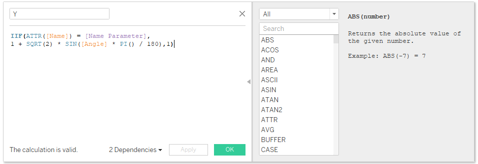
Y
IIF(ATTR([Your Category]) = [Your Category Parameter],1 + SQRT(2) * SIN([Angle] * PI() / 180),1)
Step 4. Put It Into The View
- Put X on columns and Y on rows
- Change the marks type to line
- Add your [Normalized Measure] to details
- Make sure that the calculated field is using [Your Category] to compute X, Y, and your [Normalized Measure].
Step 5. Creating and Adding a Background Image
Creating the Image
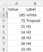
All we have created is the needle for the gauge, the actual gauge is an image that is created. I found the simplest way to create the gauge was to open an excel sheet and create two columns: Label and Value. This will generate the data we need to create a donut chart that will eventually become our gauge.
In the Label column create a row for each segment, plus an extra one labeled blank. In the Values column put the size you would like each segment to be. Take the total of all segments and put that sum in the value for your blank. You want the blank segment to take up half the chart.
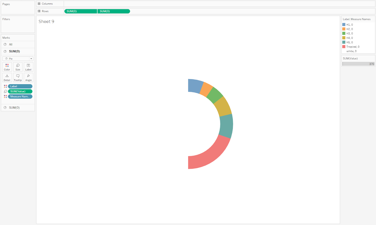
Making the Chart
Once you have that data bring it into tableau and make a donut chart using those values. To make a donut chart:
- Type in the 'avg(0)' on rows and duplicate it.
- Right-click on the second measure on the Angle shelf and select "Dual Axis".
- Right-click on one of the axes and select "Synchronize Axis". Then hide the header of the second axis by unchecking "Show Header".
- Create the Donut Hole:
- Click on the second pie chart in the visualization area or select the second Angle shelf in the Marks card to modify the second pie chart.
- In the Marks card for the second pie chart, drag the Size slider to the left to make the slices smaller, which creates the hollow center of the donut chart.
- Set the color for the second pie chart (the one that forms the hole) to be the same as the background or white to make it invisible.
- You can also adjust the borders and colors on the Marks card for both pie charts to make your donut chart more visually appealing.
- Put Label on color and value on size for the first pie chart.
- Remove all lines and formatting
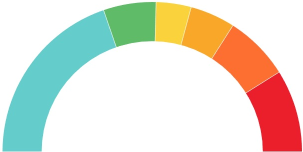
Saving the Chart as An Image
Save the image, in this case you will want to save just the chart and none of of the titles or legends
- Navigate to the worksheet that contains the chart you wish to save as an image.
- With the worksheet active, go to the "Worksheet" menu in the top navigation bar.
- Select "Export" and then choose "Image...".
- In the Export Image dialog box, you can configure the image options, such as:
- The name of the file.
- The format of the image (typically PNG).
- Resolution and scaling options.
- Whether to include the worksheet's title and captions.
- Save the Image:
- After configuring your options, click "Save" to choose the location on your computer where you want to save the image.
- Finally, click "Save" in the file dialog to export the chart as an image file
- Crop the Image
I found that for the image to work properly it needed to be tightly cropped. Open your favourite image editing program and crop the image to the edges of the arc.
Inserting the Image
- Open the map tab
- Go to background images
- Click the sheet
- Add your image
- Mess around with the X and Y field until its aligned properly
You've made a gauge chart!