


In today's blog I'll be demonstrating how to make a bar-in-bar chart where you have 2 bars fused together with one overlaying the other to represent 2 values for the same dimension.
For this example I'll be using the Sample Superstore dataset which is available in the saved data sources tab in the bottom left of the data source screen.
In this example I'm going to make a bar-in-bar chart looking at the sales according to sub-category for 2020 & 2021 separately.
We can't just add the order date dimension to the filter card and pick 2020 & 2021 because the 2 years will be conjoined into one set of bars.
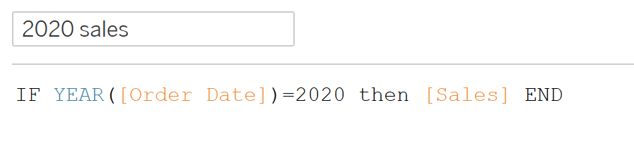
The first step is to create 2 calculated fields, each containing the sales measures for their respective years. To do this use the following if statement for each year:
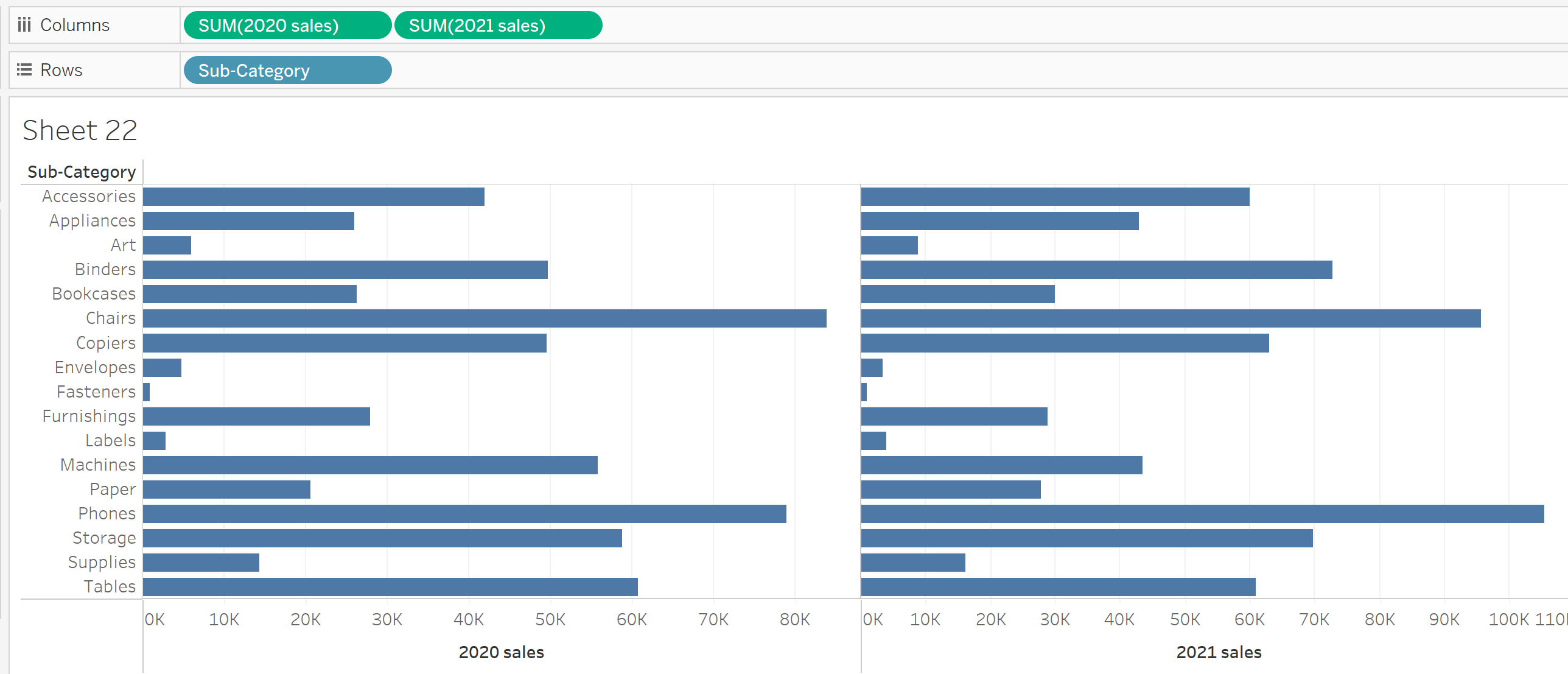
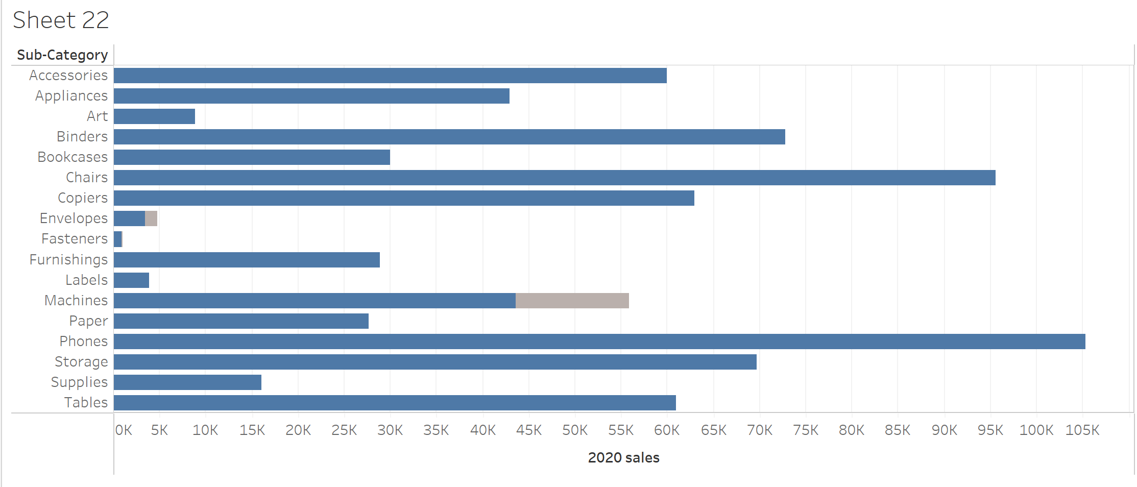
Add your Sub-Category dimension to the Rows field then add your 2020 & 2021 calculated fields to the Columns field (In that order), you should see the following:
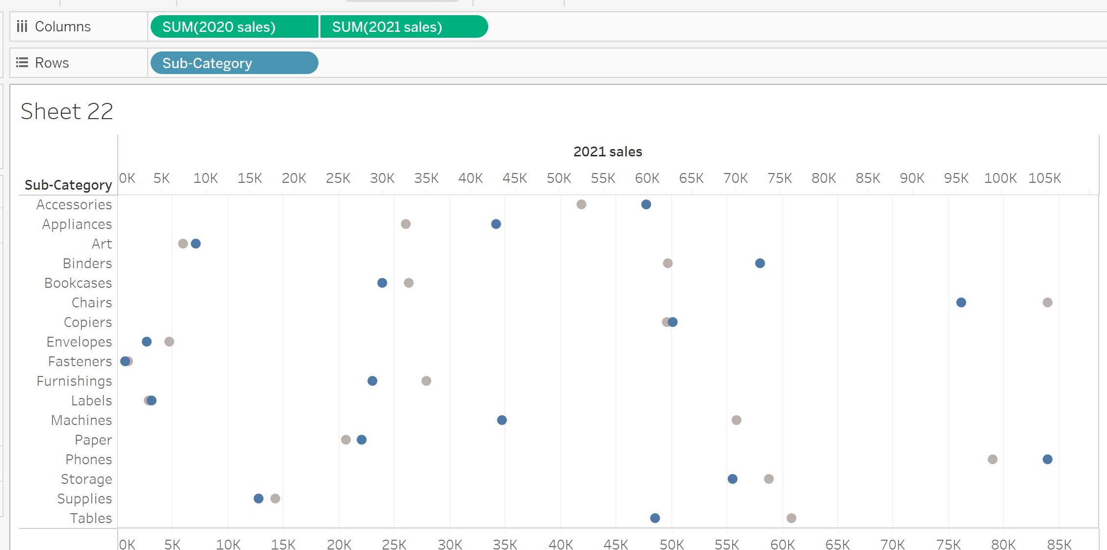
Right click on the 2021 pill in the columns field and select "Dual Axis" from the drop down. The chart should now look like this:
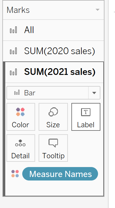
Now go into the marks card for each metric on the left hand side and change both of the drop down selections from Automatic to Bar.
Right click on the axis on the top of the graph, select synchronise axis and then uncheck show header, you should now have the following graph with only one horizontal axis:
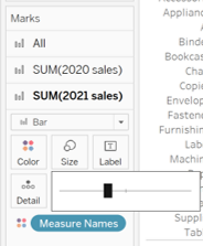
Select the 2021 sales card from the marks cards on the left, select the size option and then reduce the size by moving the slider to the left.
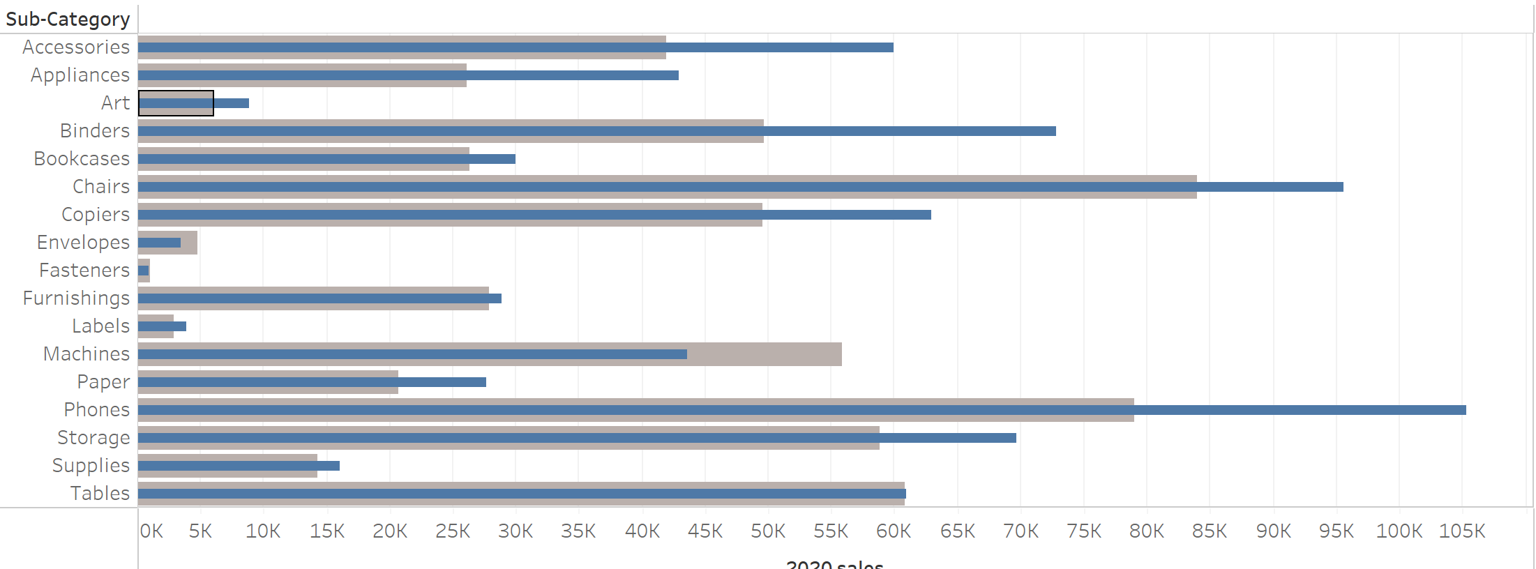
You should now have a bar-in-bar chart:
I hope this blog was helpful to you.